HOME | DD
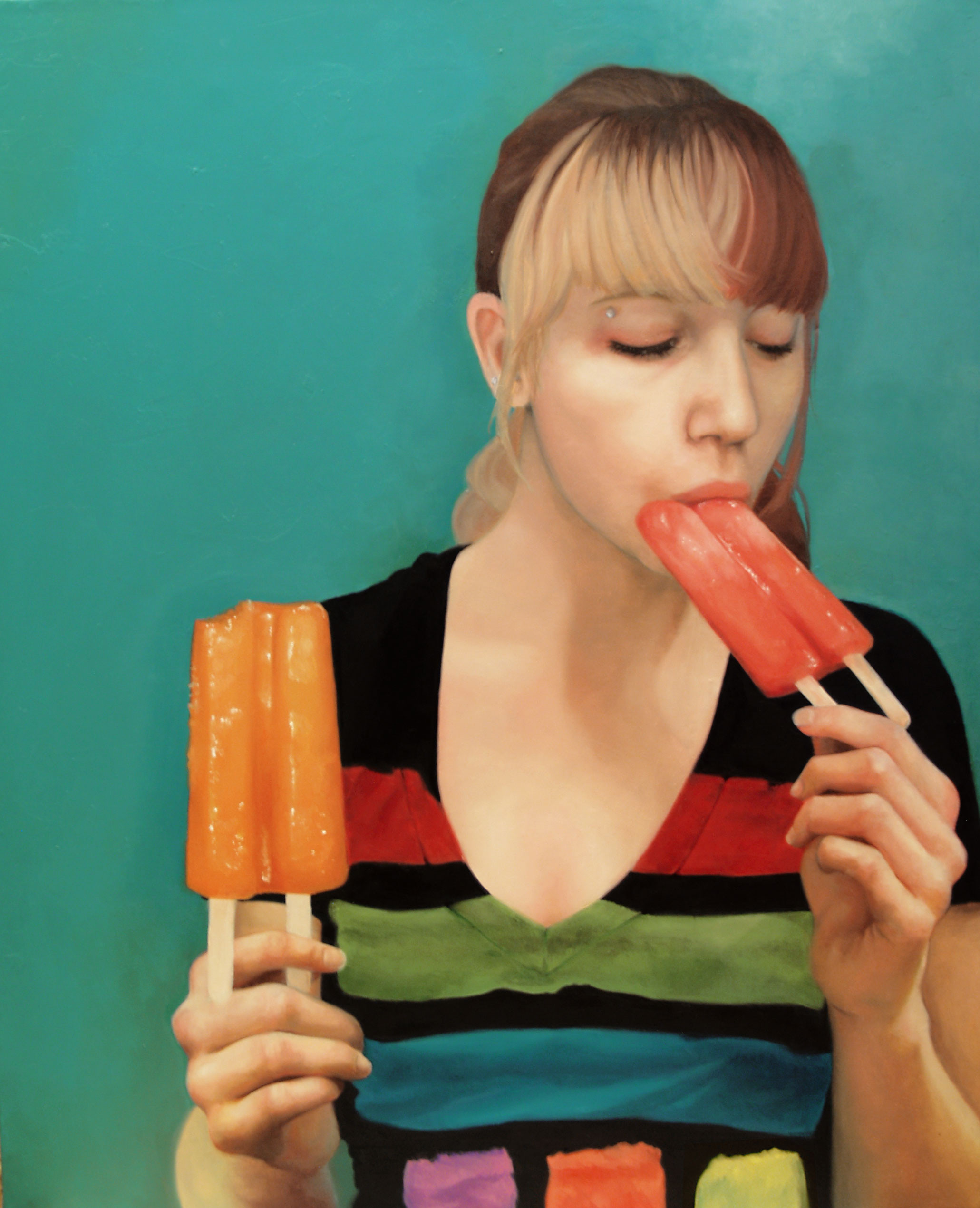
 toxicness — Popsicle series-Tyler

Published: 2008-06-14 02:06:34 +0000 UTC; Views: 3513; Favourites: 81; Downloads: 58
Redirect to original
Description
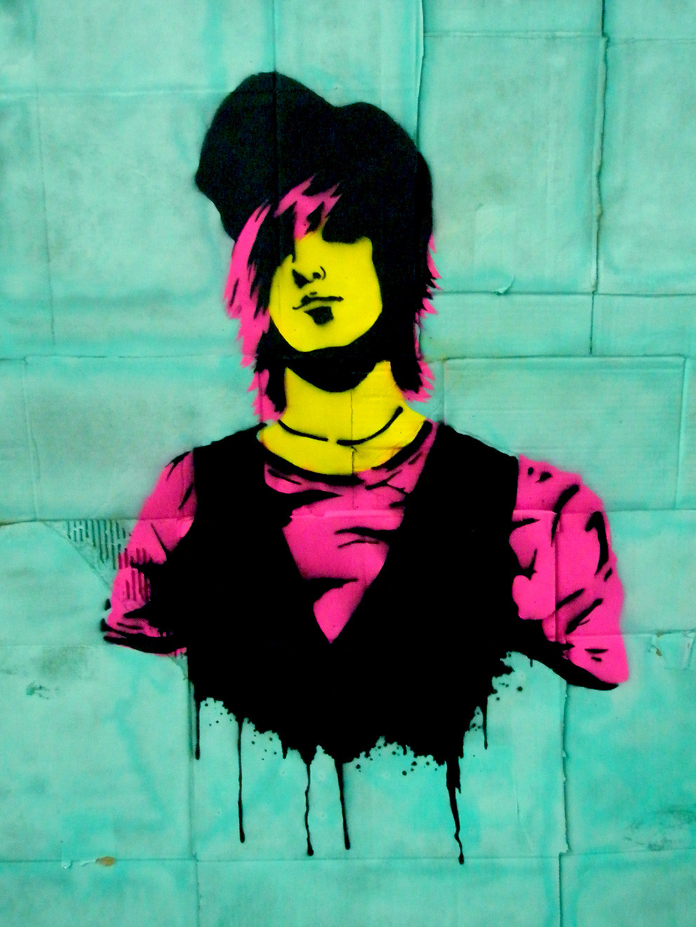
One painting of a series of three I did this past semesterThe series is three portraits of people I know with popsicles, I wanted it to be kind of popy but photo realistic...
I FINALLY FINISHED THIS! yay! C:
I wasn't able to finish this last summer and I couldnt work on it while I was at school, but I finally was able to get a good block of time in and finish this baby today! yay! now I just have to finish the other painting in this series, finish some commissions, then I can do my own work! C:
p.s. my documentation of this wasnt the best-the mid tones are too dark and that white jumps out-pretend for now that its correct baha
oil paint on canvas 22 x 18
close ups...[link]
Related content


Comments: 38

wow, this is my favorite of the 3 but all three are amazing!
")
👍: 0 ⏩: 0

...where's my comment?
...that's O.K., it was just goofing, anyway...
👍: 0 ⏩: 0


Thats so good! I love like cartoony but realistic things.
You must have so much patience to pay so much attention to detail, I can never be bothered!
👍: 0 ⏩: 0

 (Smile)")

hey these paintings look really great. i want you to know i'm looking forward to seeing your progress in painting at kcai and i hope you're having a good summer.
👍: 0 ⏩: 0

It's really photo realistic! And nice choice of color for the background
👍: 0 ⏩: 0


yes! you FİNALLY finished that one! And I loved İt!
")
👍: 0 ⏩: 0


YES! Finally! I love this series of yours! This looks amazing!
👍: 0 ⏩: 1

thanks! and I've been meaning to comment on the commercial-y stuff you've been doing lately but I've been pretty busy-but it all looks awesome!
👍: 0 ⏩: 1
You are most certainly welcome! Hell if I had the cash lying around I would totally buy this series off of you (or at least attempt to pry them from your hands). Seriously awesome work! Are you in any galleries yet?
Thanks! I'm trying to do alot more of that kind of thing. haha Know of any bands that need cover art? I've been dying to do that.
👍: 0 ⏩: 1
actually they have been bought by an artist named Meg Rye, she has them up in her public gallery and she's awesome. last year I had won an art competition and had them displayed at the Walker Art Center (even though at the time two of them were unfinished..) so that was exciting times. and because I know Meg if I ever need them again for a gallery I can just get them back...it's like a little safe place where I can store them and she pays me for it, ha!
If my friend's band Mojo Tone was still together I'd totally suggest you to them because you have the kind of style that my friend Drew would love, buuuuttt I don't think they are...I've been out of touch with what's going on :/ that's what college does to you.
👍: 0 ⏩: 1
Oh damn! Double damn! haha oh well! How is college? Fun? Stressful? Stupid? All of the above?
👍: 0 ⏩: 1
all of the above, the drama there is...worse than middle school. But next year will be so much better because I'll be in my major (painting!) and I'll be living in an apartment
👍: 0 ⏩: 0

It's a painting? Shit, before full viewing I thought it was a photo! :l
👍: 0 ⏩: 0


Wow Rachel, these turned out great. I don't know, I like the way this one turned out, landing somewhere in between the painterly and photo-realistic styles. The shirt looks great, and I like the colors that come through in his skin. I feel like the Kaelyn one could use some more development, though.
👍: 0 ⏩: 1
for sure, its a difficult one to do though because the photo itself is blurry, but I got some new oils and I hope to make it more clean and sharp
👍: 0 ⏩: 0


I don't feel like critique to the fullest right now, but here's what I really just want to say.
TIGHTEN UP THE FACE.
Haha, well at least the eyes, I was playing the sims earlier today and sometimes the skin stretches around the eyes and becomes very weirdly pixilated and purple and that's how I'm seeing Tyler's eyes in this painting.
The hand though is absolutely beautiful. Haha...
I don't think you need to worry about the shirt itself, I would go back and clean up around the edges of the shirt and make it more clear than it is now, such as around his right shoulder (our left).
👍: 0 ⏩: 1
ooooooooh BAH! the shoulders I wanted to clean up before the walker but I forgot all about them and theres also some white showing by his hand and thats my biggest uuuuurrrrrrrrrrhhhhhhhhhggggggggggggggggggggggggggIHATETHIS with paintings is when you can see the fucking canvas through and inbetween the paint because people are afraid of canvases...
anyway, I could heard your voice as I read your comments, I liked it a lot it was very comforting
👍: 0 ⏩: 0

You know let's see.
I like the painterlyness on these two, I almost feel like, and I think it's because me and you were really pushing the photorealism in the oil painting class...but I almost feel more impressed with how much more painterly these two are compared to the first. I agree with Ian, now that I look at them, I think the hair could be better, and if you work on that I'm sure you got it.
I do think the first one has more depth, because it was worked on a lot longer than this one, so there's you know more brush strokes, more color, and not so much that it's more photorealistic, but I think it's that it was worked on more. Each area has more time spent on it.
Maybe that's the thing with my hair. It just needs more time? Tyler's hair isn't that bad...in fact I kinda think it's fine, that's up to you if you want to work on it more..but that goes back to my being more impressed with the painterly than the photorealisticy.
As far as the background goes...I think it works well. You know, as a series it works well. Because the backgrounds in the others are very laid out, the different values and hues are there fromt he photo. But then in this one it's different and to notice the difference is refreshing. Then again, maybe if you saw all three all at once it could look like you got lazy? But I disagree with that, I think a successful series has to have enough different with each piece for each to be different. I can't explain it. I just feel like I'm really starting to understand what makes a good series, okay??
They've already got enough similarities, now they need something to make each different. and the simplicity of tyler's background is just fine.
There are some areas in the stripes of the shirt where the values in the green seem to avoid the black. I don't know if you know what I mean. For the most part, there's a strong sense of continuity, which makes the flawed areas stick out a little more. Maybe I'm digging too deep, like that chick from San Francisco haha! But at first I thought, aha you put the green down, with the values and everything, FIRST. THEN the black stripes. But then there's some areas where it looks like you put the green values in after the stripes, and avoided touching the darker value to the black for whatever reason. Or where it just seems like you weren't constantly thinking of continuity. I don't know. haha
The green brush strokes on his neck are beautiful. The string around his neck looks kinda funny. Crap it makes me want to paint. First I'm gonna go take a crap---haaa! jk
Okay, side note. I know this is long, bear with me.
I know we Perpies got good at picking things out in a piece to talk about. Pinpointing specifics, rather than saying I like it, we're able to say I like the right eye because of the red and yellow brush strokes.
But now I'm worried that that just means we've developed an ability to elaborate our compliments. Like if we aren't careful? I'm not sure, I think I need more practice. I hope this was helpful and not awkward lol
👍: 0 ⏩: 1
with the shirt-yeah I did put down the green and then put down the black however I messed up on the stripes sooooooo the waves in the black dont match up exactly with the shadows in the green D: and again his hair I want to add more highlights and shadows to make it pop more...the string on his neck was fine then I added more value to the neck and I coverd it up and forgot to go back and fix it so right now it looks like its digging into his skin and hes about to be decaputated by a fine, sharp wire..HA! and I like the green too!
p.s. I enjoyed your long comment :]
👍: 0 ⏩: 1
Aww man I was so afraid you were gonna get annoyed by how long it was, but I just kept typing and aaagh haha.
Glad you enjoyed it!
Alright, you've pretty much explained everything. Have you double checked it with an overhead projector? And now what's your next step?
👍: 0 ⏩: 1
dont have an over head projector so nope, I dont think I need to anyway, the shirt isnt whats bothering me the most so I think I'm going to leave it as it is, if I work on anything is pretty much gonna be everything but the shirt...ha!
👍: 0 ⏩: 1
Overhead- I guess I meant in general, to make sure you didn't, like, go outside the lines? But if you're fine with it then whatev's lol. You should continue though, l8iket hat was a pretty short deadline, yeah?
👍: 0 ⏩: 1
awww man! *like that* was a pretty short..
👍: 0 ⏩: 0

I really enjoy the background and I really like it overall. After seeing the first one that is really photo realistic, I'd love to see that done here as well, but it is really up to you!
👍: 0 ⏩: 0

The detail in the shirt, little creases, etc. are very believable, it has incredible depth. Compared to the shirt the hair seems alittle flat to me, not by much though, I honestly wouldn't know how to improve this.
👍: 0 ⏩: 1
hair was pissing me off the most, I think I'm gonna keep on working on that too because there were more highlights that I couldnt get in because the paint was wet so the white kept on blending in... D: the hair on Kaelyn's is the worst..ugh
👍: 0 ⏩: 1
lol, I just made that same comment on the kaelyn painting. I'm sure they'll both turn out beautifully- after all it is your work we're talkin' about.
👍: 0 ⏩: 0
