HOME | DD
 turbomun — Meta Origins cover

Published: 2010-06-12 02:26:50 +0000 UTC; Views: 1586; Favourites: 21; Downloads: 19
Redirect to original
Description
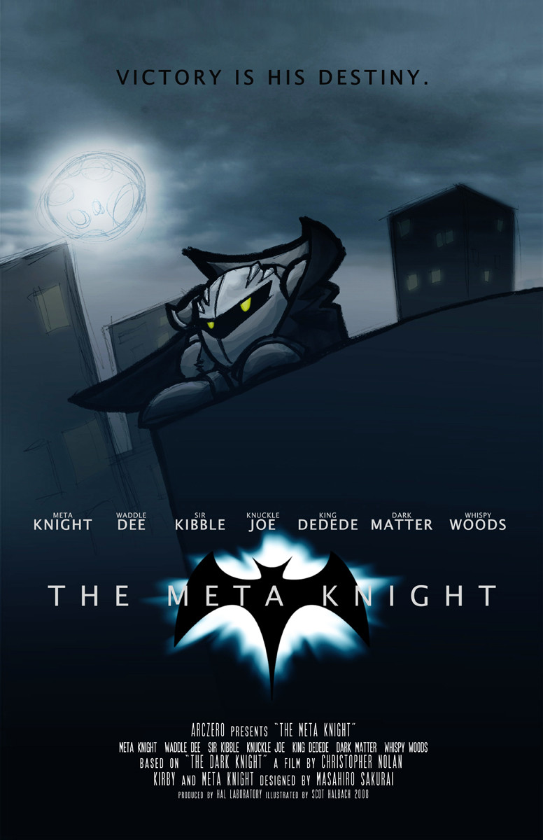
I was putting my only hard copy of Meta Origins into a binder and wanted to put a cover on it, so here it is. Done with Corel Painter and MS Paint.Hoshi no Kaabii (C) Nintendo/HAL Labs
Related content


Comments: 3

Very nice, clean cover for a story! I personally believe that clean and sleek covers suit a book better. Very professional fonts and placement for the title and your name that are not to difficult to read or something similar.
I love how MK's eyes glow and are the focus because they are the only things with color. I also like how everything is shrouded under the cover of darkness and especially since MK's past is unknown, it shows that directly in the cover. The split mask with half his face covered and the other half uncovered gives the feel that MK has something hidden behind his GSA status as a soldier and everything and that there's more to him than what may be seen.
I think the only thing that I can say against this at all is perhaps the eye shape. His right eye ( the one on the left) is a little wider than his left eye ( the one on the right) and his left eye is more oval than the other. I think the oval shaped eye looks a little better, but then again, were you perhaps showing his seriousness with the slightly wider eye that MK may have when he's the confident soldier and perhaps showing a little less sure of himself side with the other? If that's the case, maybe a more distinct line through the center would show this split.
Other than that, this cover is quite stunning and would definitely intrigue readers. Wonderful work!
 (Smile)")
👍: 0 ⏩: 1

As always, thank you for critiquing!
Adressing the eye thing, I have actually heard that before; someone told me that it almost looked like he had the whole mask on, and one eye was wider than the other, like o.0. The reason why it looks like that is really because of a matter of personal preference: when I draw Meta without his mask, the eyes in the mask are just fake ones, and his eyes are more ovular and look like Kirby's, but yellow. However, for the cover I didn't want to draw it that way, I just wanted to make both eyes pure yellow so it would be simple and clean. Unfortunately, I wasn't looking carefully enough and one eye wound up wider than the other
Glad you liked it, and thanks again for critiquing.

👍: 0 ⏩: 1