HOME | DD
 Typical-Trick — BitterSweet2
Published: 2012-05-17 20:15:04 +0000 UTC; Views: 300; Favourites: 15; Downloads: 0
Redirect to original
Description
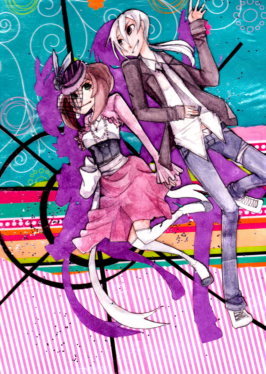
This picture's watercolor parts were a whole lot lighter then I wanted them to come out, and with such a loud background... idk I'm not so much in love with it. >.>;;;;But I do love the layout I came up with for it T: so that's cool.
Related content


Comments: 3

The design of the girl's outfit here is really really cool!
I think I see what you mean, though, because the characters in there don't seem to "pop-out" as much from the background as they probably would with a different coloring style... But even so, I still think the whole piece looks really good anyways!
👍: 0 ⏩: 1

Its not just the fact that it's done in watercolor that makes it dull....>.>;;; the actual picture is lighter then every other watercolor I've done... (tho I must admit that watercolor in general probably wouldn't be able to stand up to that background T: ) I don't know if I just used too much water with these colors or what. I guess this is just part of the things I need to learn to become a better watercolor-er... IF THIS WAS DIGITAL I COULD JUST SAY "MAKE THESE COLORS DARKER AND WITH MORE SATURATION TO STAND UP TO THAT BACKGROUND!" and then it would be done! *sha-ping* T:
👍: 0 ⏩: 1
Oooooh, that makes sense!
"IF THIS WAS DIGITAL I COULD JUST SAY "MAKE THESE COLORS DARKER AND WITH MORE SATURATION TO STAND UP TO THAT BACKGROUND!" and then it would be done! *sha-ping* T: "
And computers spoil people, sometimes

👍: 0 ⏩: 0