HOME | DD
 VNotebookPaper — Field (Portfolio Updated)

#anime #digitalart #digitalpainting #face #girl #green #nature #oc #red #eyesbeautiful
Published: 2017-10-20 01:09:46 +0000 UTC; Views: 281; Favourites: 33; Downloads: 0
Redirect to original
Description
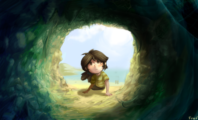
Hey guys I'm back! Sorry, it's going to be a long year and my art productivity is suffering due to school. Nevertheless though, I still felt like producing something. Here's another piece adapted for my portfolio.This is an updated version of my old piece "Field 2"
View the original here: rinklen.deviantart.com/art/Fie…
Change list:
-Fixed the extremely ugly facial proportions
-changed the hairstyle
-changed the color balance
-Made the piece brighter and fixed the resolution of the image
Follow me on Instagram: www.instagram.com/virtualnoteb…
Follow me on Tumblr: virtualnotebookpaper.tumblr.co…
Related content


Comments: 11

Hello, I'm here with a comment from
This is a significant improvement from the original image. The girl's face looks more realistic and soft. The coloring is better too, but I feel that the girl herself could use more prominent shading so she has just as much dimension as the background does. The other thing i think needs improvement is the head-piece she's wearing. It's hard to tell what texture the little beads are suppose to be, and because they're also lacking in dimension, it doesn't look like they're wrapped around the girl's head. It also looks like the gem in the center is glowing, but it's very dim. It's fine if the glow isn't suppose to look very strong, but right now it looks like random splotches on the center piece. Here's a simple glow tutorial that gives a few examples on different types of glows and how to create them.
That's all for the girl, and now on to the background of the pic. To me, there's so many colors, but instead of creating contrast, they clash and make the pic look disorganized. And i think the main problem is that many of the colors are the same shade (i hope that's the word). Take the grass for example, and the girl's eyes. While red and green are complimentary colors, sometimes using the same kind of red and green aren't the best way to go. Experiment with different shades and different tints. Like, i think laying down a darker color red, and then adding the grass texture on top would've made the green grass pop more instead of create a neon-looking landscape. Same thing with the sky. Don't settle with an ordinary light blue, but try out different types of blue (for this pic, i think a brighter blue would've worked better). And that's my main criticism for the image.
When it comes to colors, have a look at other pics and study how the artist uses shades to create good contrast and atmosphere. They can also help with making backgrounds.
I hope this comment is useful to you. Keep drawing!

👍: 0 ⏩: 1

Agreed! Thanks for the tips!
👍: 0 ⏩: 0

You're welcome; keep it up!!!

👍: 0 ⏩: 0

You improved well! I think it would look even better with a bit of atmospheric perspective on the grass. This would add some natural contrast between the character and the background ^^
👍: 0 ⏩: 1
Haha. Yes, that's a great idea. Thanks!
👍: 0 ⏩: 0

I love the use of color in this. The combination of red and green is very effective. The hair is a bit massive, but it can be seen as a stylistic choice and it makes it cute. The only thing that bugs me is the blades of grass on the foreground, but I can't pinpoint what it is about them that makes it look wrong. I think this would benefit from having a bit more space at the bottom edge, so that the grass had more room for height variations. It looks like it's forced to be approximately of equal height in order to fit on the canvas. It might be that it gives the impression that this is short grass that starts at the bottom of the picture and doesn't convey a sense of starting from way lower, so it makes it look like the girl is just a bust or that she's standing in a hole with most of her body being underground.
👍: 0 ⏩: 1
Agreed! Thanks for pointing these out!
👍: 0 ⏩: 0

Yeah. This piece had the potential to be one of my best compositions. I'm glad I revisited this one, because it turned out well!
👍: 0 ⏩: 0