HOME | DD
 VyletsAlterEgo — You Make the Sorrow Disappear
#barbara #fanart #francesca #horne #myart #sideshowbob #simpsons #terwilliger #thesimpsons #van #sideshowmel #francescaterwilliger #art #barbaravanhorne #franbarb #sideshowwives
Published: 2019-09-20 13:50:33 +0000 UTC; Views: 2801; Favourites: 22; Downloads: 25
Redirect to original
Description
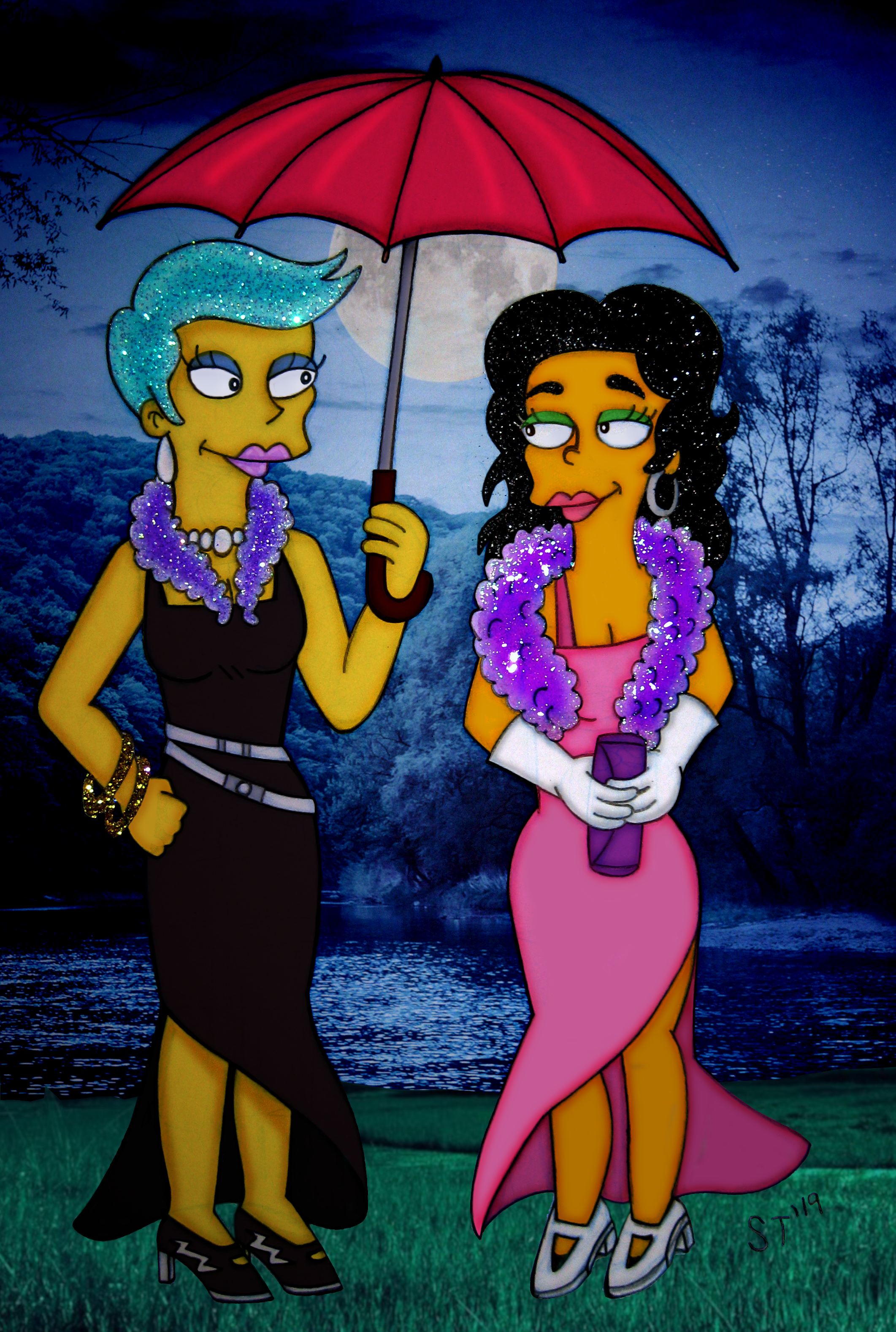
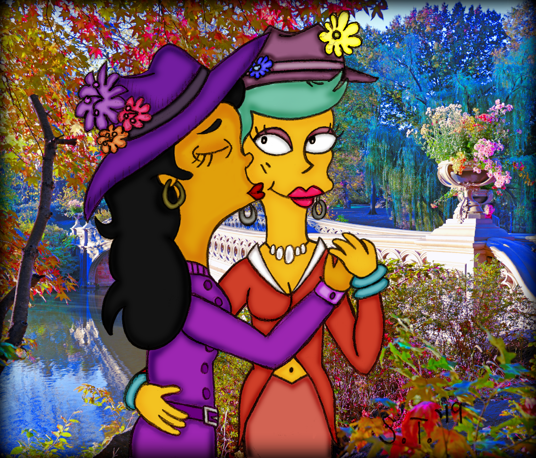
A random idea I had: Francesca and Barbara go on vacation with their families. The husbands take the kids to see a concert. The wives go to see an opera together. At night, when their events are finished, they agree to all meet up together at the hotel. It starts raining, but luckily, Barbara brought an umbrella! The rain starts to die down a bit, and the clouds disperse and you can see the moon. They decide to observe the beautiful lake for a bit. Then they smile at each other, knowing this was a good idea for a vacation. (Smile)")
Hope you like it!

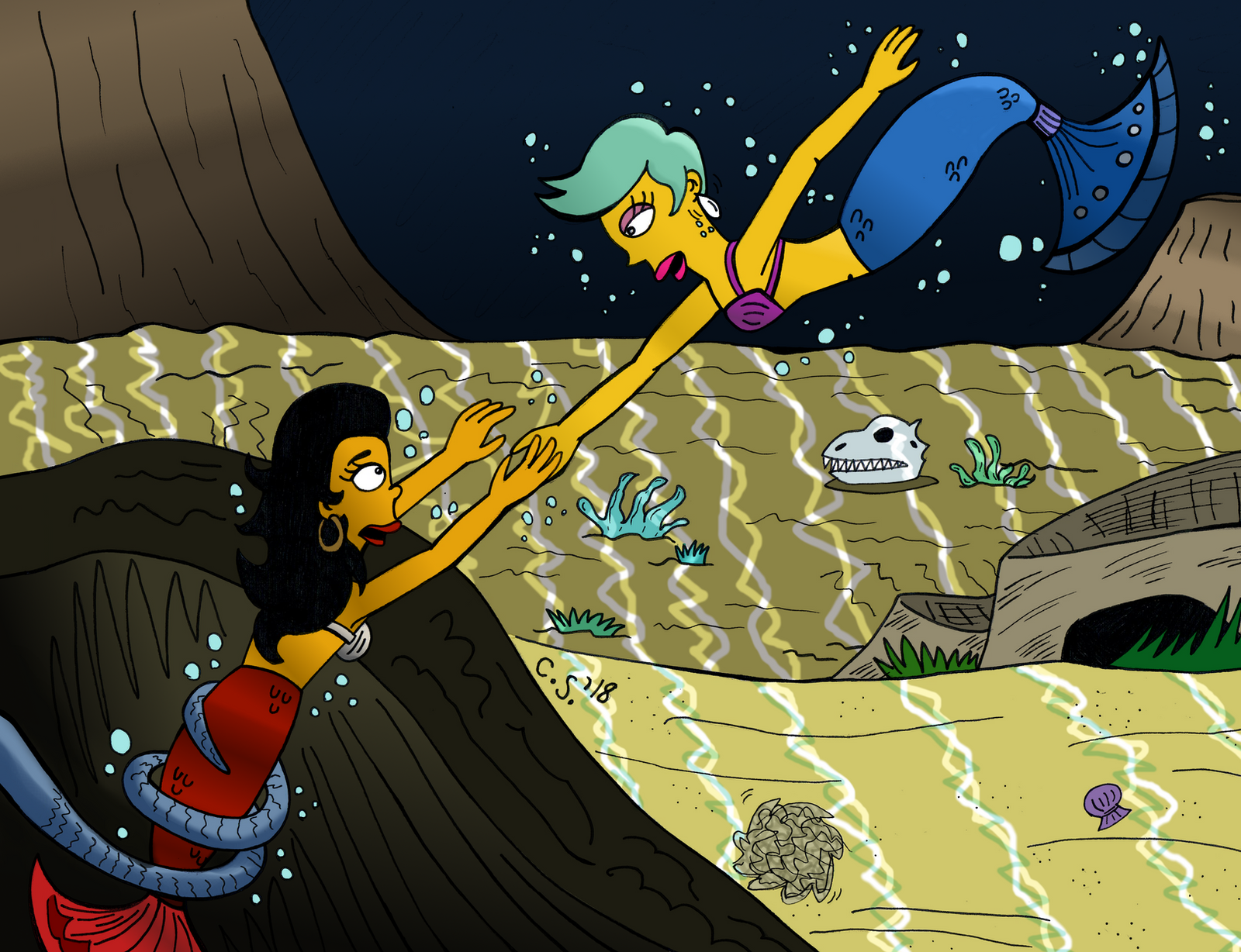
...
The Simpsons (c) Matt Groening.
Stock Backgrounds (c) Mike Pellinni technocrat and Colourbox.
Related content


Comments: 10

👍: 0 ⏩: 0


Vision

Impact
i really like this. i'm having a hard time telling what is digital and what's traditional. everything goes together so well. even the photo background matches surprisingly well.
i really like the glitter and it scanned perfectly. it's in just the right places with not too much or too little. the coloring and lines are so neat and tidy. i like the dark colors and atmosphere but yet everything is clearly visible and easy to make out.
if i were to give any sort of advice for improving, i'd go with:
- have their feet down in the grass so they're aren't floating above it, or what you can do if you don't want to mess with grass is put a path or sidewalk or something level there with the grass behind them
- have some actual rain, since they are holding an umbrella. i get that the rain stopped and the clouds parted and the moon came out, but maybe some puddles on the ground or drops coming off the umbrella to show that it WAS raining
- i would like to suggest weaning off the photobackgrounds, like pick one out and then redraw it yourself. this one looks very natural with the depth of the ground behind them but you can still tell that it wasn't drawn with the rest of the picture so it looks kind of lazy and i think it sort of impedes the overall affect of the picture in general
- the background is completely all in shades of blue with none of the other colors that were used in the actual drawing. it makes it look like it doesn't really belong there, like it was just tacked in so you wouldn't have to draw a background
hope that was helpful!?
-sora
👍: 0 ⏩: 1

Thanks for the critique!
My trick: take a photo instead of using a scanner!
I had the same idea, right after I posted it. They should be on a path, so their high heels aren't ruined by the wet grass!
Good point about the rain on the umbrella.
True, drawn bgs are more impressive.
So it should have some of the colours / shading from the actual characters, so they stand out, but not too much, so they don't blend in?
Thanks again, that all makes sense!

👍: 0 ⏩: 1
i think it looks nice when it's the same general color pallet but is lighter or darker than the characters are. i think usually lighter colors imply distance but it depends on the setting i suppose. but yeah you don't want them to blend in. i think for a night scene, where people can't see colors as well because there is less light, so things are more likely to have a certain color scheme like blue or purple or monochrome, i think it looks better when the characters are also done in that same color scheme. i think it looks best to have them normal-colored then put a filter over it with the colors of the background ( like i would do a gradient layer over them, set it to Color and then turn down opacity to 25%-50% )
and i don't think "impressive" is really the right word cuz i'ts not really a matter of impressing people ( like if you said "i did all of this picture with the pencil held in my teeth!" or something lol ), just that the picture itself looks odd when it's drawn but has a photo bg, it just doesn't match, it clashes and looks unnatural. it does look kind "lazy" but so do speed paints in my opinion, and sketches, but it's still possible for lazy art to look nice. you could trace a stock photo, and that still might be considered "lazy" but it would fit the look of the picture better. filtering the background so it looks more artificial can help too.
hope some of the critique was helpful ;;
-sora
👍: 0 ⏩: 1
Sure, you did make a lot of helpful points.
I really should watch more art tutorials so I can get better than I am.
👍: 0 ⏩: 0

This is so beautiful!!!~ X3 The sparkles really do make everything better! ;D Own it, girl!~
")
👍: 0 ⏩: 1
Thanks, hun!! 


👍: 0 ⏩: 0

Barbara and Francesca both look absolutely fantastic, And I really love the sparkles you put in their hair! 
👍: 0 ⏩: 1
Thanks, hun! 

👍: 0 ⏩: 1