HOME | DD
 webPHIX —
Typographic History Poster
webPHIX —
Typographic History Poster

Published: 2004-06-10 01:59:06 +0000 UTC; Views: 11231; Favourites: 105; Downloads: 2936
Redirect to original
Description
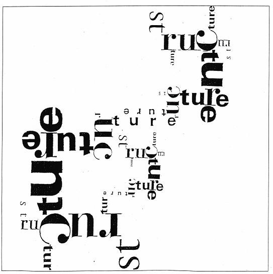
A class project from my 2nd year of Graphic Design. We had to create a historical poster designed with typographic elements (no shapes, no images ... just text).After brainstorming for days I finally thought about the atom bomb being dropped and saw the image in my head of the mushroom cloud being formed out of letters. Minimalistic approach, loved the white space and colours. Received a high mark.
Edit: Fixed the "to" typo in the body copy. Thanks to all who commented and +fav'd on the Daily Deviation.
Related content


Comments: 117


WOW very impressive
i like the colours and your style of writing
👍: 0 ⏩: 1

Thanks for the +fav and the comments.
👍: 0 ⏩: 0

wow amazing! it just takes a second to fill my head with an idea with the project i'm working on.
awsome for the inspiring work!
👍: 0 ⏩: 1
glad i could help, the limits are endless with typographic design ... all you need is an idea.
👍: 0 ⏩: 0

Wow, I had a similar project too. I absolutely love your choice of colours, the arranegment of letters and the simplicity of it.
👍: 0 ⏩: 0

what can i say..simply excellent, especially choice of font colors.
👍: 0 ⏩: 1
thanks for the comment and +fav, i appreciate it
👍: 0 ⏩: 0

This is a very nice concept ")
👍: 0 ⏩: 1
thanks, typography can be fun
👍: 0 ⏩: 1
Yup  (Smile)")
")
👍: 0 ⏩: 0

Very stylish, although I would have used less yellow
👍: 0 ⏩: 0

Nice to see typgraphical work get recognised. Also pleased because of difficult subject matter, the American holocaust in Japan.
A minor note on the text: the inital T might be better optically aligned, or treated as a raised cap (a coloured drop cap would be too distracting I think). Use of non-ranging (old-style) figures for the numbers would be better., giving a more even colour.
Liam
👍: 0 ⏩: 0

thank you, appreciate the kudos
👍: 0 ⏩: 0


Cool poster dude. I like the way you used the colors in the mushroom cloud text shpae. Reminds me of the fontshowcase in the June 2004 issue of in Computer Arts Magazine. Any chance you you were inspired by it or is it just a coincidence? Nice job either way.
👍: 0 ⏩: 1
this project was done in late 2003, i don't check out many magazines
👍: 0 ⏩: 0

This is a great idea. I love minimalism. I'm amazed your instructor didn't catch the typo "killing to". My instructors would have crucified me for that one.
Everyone is mentioning the layout itself but I feel attention must also be paid to the colour choice. The three colours used work perfectly together in helping the mind see the explosion. Nice work.
👍: 0 ⏩: 1
i think they did, i think i just submitted the unfixed version or never bothered to fix the digital copy
👍: 0 ⏩: 0

wow! i love it! 
👍: 0 ⏩: 0


Hey, I don't have money to buy a print, but I can make my own print quality version. I'm gonna print it and put it on my wall if you don't mind. I'll be sure to credit you on the back
👍: 0 ⏩: 1
Thanks a ton dude! I'll print out a little thing under it with the name of the piece, your da adress, and name. Want me to use a certain font?
👍: 0 ⏩: 1
It's your printout, the choice is yours.
👍: 0 ⏩: 1

cheers for the comment, glad you liked it
👍: 0 ⏩: 0


WWII Was so sad. Great idea, though, and congrats on the daily DA!
👍: 0 ⏩: 1
thanks, i still can't believe it was featured.
👍: 0 ⏩: 1
Congrats though, you deserve it!
👍: 0 ⏩: 0

Super variation to the usual stuff we see around DA =3 its nice to see some typography getting in the spotlight once in a while. Such a simple design, yet it has lots of thought and oozes with originality and cleverness. Kudos to you!
👍: 0 ⏩: 1
typographic work is a rare thing these days. far too often a nice work is ruined by someone's lack of knowledge/experience with typesetting.
👍: 0 ⏩: 0

Very nice. Currently I'm reading a book about the bomb on Hiroshima from the Japanese point of view. Its very interesting about what the survivors did.
👍: 0 ⏩: 1
i never really thought about their view of the event in great detail, i've seen a few TV specials but actual eyewitness accounts would be a fascinating read.
👍: 0 ⏩: 0

i love the arrangement of it all...
one thing though, i dont think there should be a "to" after "killing"
👍: 0 ⏩: 1
I'm glad someone else noticed; I thought I was losing my mind.
👍: 0 ⏩: 1
LOL yeah, i thought maybe everyone is just being polite in not pointing it out, but i thought...it'd be rude not to point out a mistake and let it go on being noticed.
or maybe no one reads the fine print

👍: 0 ⏩: 0

Wow,m am studying in Graphic Design, I started this year.
I must say, this pic is awersome
👍: 0 ⏩: 1
i hope you like the program, it can be very exciting if you develop your own style and have fun with it.
just rememeber your teachers aren't always right, they just might not like it based on their own personal taste.
👍: 0 ⏩: 0

the subject (nuclear bombs) is very sad but the picture is very well done.
of course I gave you a
I could learn so much from that work
 (Wink)")
👍: 0 ⏩: 1
thanks for the comments, glad you noticed it
👍: 0 ⏩: 0

YES!!!! +FAV a typography piece! This is cool. I love your minimalistic approach. SOmething so simple can be sometimes to the most effective.
👍: 0 ⏩: 1
one of my graphic design teachers once told me "never be afraid of whitespace. learn it, use it."
👍: 0 ⏩: 1
| Next =>