HOME | DD
 whimsi — Endless Struggle

Published: 2009-04-17 03:31:21 +0000 UTC; Views: 21028; Favourites: 150; Downloads: 109
Redirect to original
Description
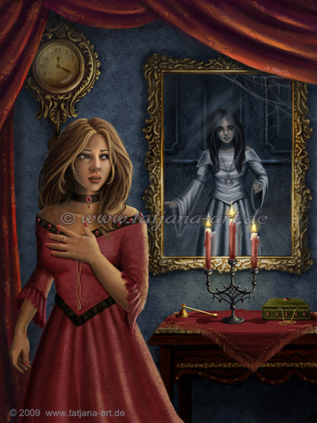
 Final version!---
I wanted to do something a little different than angel vs. devil, but still have two physical entities depicted in a struggle.
In this case, I used stock images of myself as reference for each of the entities...
This image isn't to be taken literally. There are two meanings behind this that are very personal to me, and I am sure many others.
The most obvious, it's about the struggle everyone has to be who they want to be... do you make the selfish decision, or do you make the selfless one... Sometimes I find my selfish self making the decisions more, and I have to fight her back!
It's also about fighting with your reflection. Who you think you are can sometimes be skewed by what you see when you look in the mirror. You don't always see yourself as the whole, but tend to nitpick on tiny little flaws. This is about the feeling each individual has when they look in the mirror, whatever that feeling is. Everyone has things they aren't pleased with about themselves whether physically or mentally, and they rear their ugly heads every time you look in the mirror.
Credit:
Wall texture by ~photodash
Many brushes by =yumedust used
Photo references were my own.
Related content


Comments: 86

First off, let me just say that I am extremely thankful for your very comprehensive and complete review, and your willingness to be truthful about the areas where I can improve.
I definitely agree with literally every suggestion you've made.
I definitely see the need to edit her face. It just isn't right for this piece. I have tried about five times to get the appropriate combination between shock, fear and fighting back. I am hesitant to give her a look of full on shock, fear or pain, because I do not want to make it seem like one side or the other is winning over the other. I think your suggestion of cruel amusement, mixed with maybe some determination might do the trick. I will certainly give it a try!
As for the suggestion about the position of her arm, I agree, now that I look at it with that thought in mind. I can see that based on how things are positioned, it looks like the arms should be on the other side of the glass, and would really make for a more interesting dynamic in the image anyway, in my opinion. I will have to play around with that.
Her arm IS too long. I have been trying to figure out for ages what looks wrong in that area... 
Increasing both the lighting and shadows is definitely on the agenda. I sort of ran out of time at the end of the contest there, to be honest.
I will definitely take a look at bettering the hair and dress. The last link is more what I was going for, but I will experiment and see what looks best. The links you provided will be most helpful.
Thanks again for the critique, I really (really) appreciate the time you took to give me an honest and critical critique.
👍: 0 ⏩: 1

I'm very glad to help. It's at this stage (almost finished, just need to tweak things) that I go begging friends for these sorts of critiques. Its so useful to have some outside perspectives for that final polish, particularly as it's easy to get so involved in painting that you don't notice little things. I often have problems with the dimensions of shoulders and arms, so I pay more attention to that  (Smile)")
Getting the right expressions can be so difficult. Hmmmm, to toss in a couple of extra suggestions...
from dA stock photos - Determined & annoyed eyebrows & eyes > [link] and [link] and a stubborn mouth > [link]
Alternatively, you could mirror the dark twin's grimace. Warmer lighting, less exaggerated, but a similar expression.
Good luck. I'll be interested to see the final result!
👍: 0 ⏩: 1
ooh, mirroring the dark twin's expression might be good. I used refs of myself for the facial expressions, so I would like them to look more obviously 'the same person' but with that ugly scowl, they look too different. XD
Those stock photos will be a great help! Thanks again!
👍: 0 ⏩: 0

Overall


Originality
Technique
Impact
Starting a critique always intimidates me, so I'll just jump in. I'm also making the assumption that you know how great this image is, so I'll just hit you with some nitpicking.
Frame - I'd slip another layer over the mirror frame for realism. The top right corner felt the most realistic for me, even if it doesn't really reflect true lighting. Speaking of lighting
there's some ambiguity of light source. The candle should be lighting her from the right-back, and the handlightning from the left middle front, but her dress (especially the white lace) and her arm and face appear to be lit from the front right, not front back candle. With the lighting as it is on the hair, there wouldn't be that amount of highlight on the corner frame. Perhaps this all could be solved by bringing the candles forward to stand right next to her arm on a stool or some other tall something. Light source ambiguity isn't the end, but it does affect realism quality, imo.
Her hand and the lightning. Generally, when there's bring light against which the hand is pressed, the skin is lit from beneath. Try putting your hand on a flashlight. You'll see how where there's less flesh, the light turns the hand red. That might be a finishing touch to add onto the image. Speaking of hands, the bottom right feels too square. She'd have to have farmers/ladle hands, and very severe ones to have that. I'd soften the curve slightly.
The trickle of black from the demon is wonderful touch, but unless she purposefully drooled, it's more likely that that drool would - oh hey, nevermind. Huh. I just tried it out and the image is right - it would slip out the center. (This is what I get for trusting vampire images and shows too much.)
By the way, that raised hand and the lighting there - absolutely fantastic!
Onward. If she is supposed to be freckled, I'd lay it on heavier. Right now, the faint spots on her cheek and shoulder appear to be faint discolorations and dots, rather than freckles. More and darker, I'd say. Heavier on and around the nose. Me, I'd not give her freckles unless you're planning to shade her hair a more orange/red/brown color.
I realise that because of the meaning, it might be intentional that she not look afraid, but it makes no sense, considering her posture and the attack. Though it could have been intentional, her eyes scream wariness and fear, but her lips and face looks relaxed. The viewer will likely assume a lack of skills here, rather than intention. The lips are what I think could be easiest change to express emotion.
Me, I'd try tilting the corners down and pressing the lips tighter together for the generic, I am upset feel. Or to pull the corners close and have the mouth slightly slack.
The next thing I'm seeing is that the darkened veins on the hand feel drawn on. I've no idea how one would fix that, but some tweaking probably won't go amiss. Focusing on that part of the image, the break in the mirror looks reasonable, even if fantastic, but her hand does not appear to go through the circle, but further back and higher than the hole. My intial impression, actually, was that the blond twin had slammed her elbow into the mirror, and I wondered why there was no blood there.
Only then did I understand that dark twin had slammed through and grabbed blond twin. Here I run into a bit of a realism issue (I know, I know, nitpicking over things you can't change!). See, I just acted it out. Say I was standing in front of a mirror and WHAM comes a hand to grab me by the wrist. Immediate response would be to straighten my elbow and take a step back, and then reach out and shoot lightening through the glass.
Now, perhaps the point is that because they're each other, she is drawn to the darkness and so doesn't struggle, but I wonder if there's anything you could do to make this clearer? A mocking smile on blondie's face? Orrr, pity there? Concern?
Moving on to the right, her dress felt like the least realistic part of the image for me. Mostly that was because of the very smooth line where it ended and background began. Also, on her breast, the skin line merges with the dress line, which means that the dress is skin-tight. With this kind of apparel, I doubt that's the case. The dress should probably protrude more. At the waist and down, like I mentioned, lighting could be tweaked. Also, there, the dress seems almost like an afterthought. And I'm not sure if it would be possible to line up the designs on the dress that perfectly when using several different kinds of material.
I don't know if this will be of any use, but it's the first dress tutorial I stumbled across when doing a quick dA search. There are probably many more out there.
And that's about it, I'm thinking. Running out of steam here, so I hope this is useful for this image and perhaps future ones too. Also, I can't stress enough that I like this image - it's clever, interesting, and I have a real weakness for all sorts of fantastical demonic manifestations. Especially those with another layer of meaning to them!
All my best and good luck with your art!
👍: 0 ⏩: 1
Thank you so much for the very thoughtful critique.
To be honest, I agree with you in entirety. Every thing that you've mentioned could, indeed be improved. I meant to work more on her dress and make it more realistic, but sadly, I ran out of time... I also redid her face about 5 times, but each time, I had the same problem. I wanted her to look sort of shocked or afraid, but I didn't want to make it appear as if one side or the other was winning, so I tried to tone it down... I think I need to give it a few more shots, draw some sketches and see what works.
I also modeled these women after photos of myself, to give it a real personal touch... I've got blond hair and freckles, but I can see how they sort of look like they belong on a redhead or brunette. I will definitely make them more noticable as suggested... I am always worried I will add too many details like that, and overdo it.
You're also right about the light source. I sort of meant to make it look like there was another set of candles in front of her, but never found a way to make it clear. I was wondering of I couln't improve the image by lessening the depth of focus, making the background slightly out of focus, and adding a second set of candles jutting up slightly in the forward right, also blurred. We'll try some things out and see.
I can't express how much I appreciate this critique. VERY comprehensive and it confirmed a lot of my worries with this piece, as well as brought new things I never noticed to the table. Thanks again, I truly appreciate it!
👍: 0 ⏩: 1
Very welcome! (You know, responding to a reply to a critique is more intimidating for me than writing the actual critique. And I have no idea why.)
Faces are one of the trickiest parts - probably because that's the focus point of most images. The brain automatically focuses the eyes on the face, and only then begins to observe the rest of the details. High bar.
Since you modeled it after yourself, I say try and keep the freckles. The difficulty you face is making it realistic enough to pull it off, but I'm certain you can do it. (It's the same issue as putting blue eyes and blonde hair on a dark skinned person. It's possible, but rare enough that it needs to be veeeery good to suspend disbelief). I's go all out on a top layer - you can always go back and make the effect lighter if it doesn't work.
I'm looking forward to seeing where you take this next!
Good luck!

👍: 0 ⏩: 1
I will definitely try some things out!
Don't be intimidated to reply to me XD I asked you to rip that painting apart, and I meant it ")
Thanks again, mate
👍: 0 ⏩: 0

Overall
Vision
Originality
Technique
Impact
It is a great work already, eventhough not fully finished yet! I love the idea and your style of drawing is really beautifully anyways.
The background is gorgeous already, the wall, and the candles, they do look very real, except for the smoke, it seems to be a little much, I don't think candles smoke that much already.
I love her hair, it looks beautiful and curly.
I think the skin is done well too, the textures look great, it just looks a little red, I would imagine it to be less red, and more yellow especially with the candle light.
I am a little unsure about her expression, it doesn't feel right to me, but then again I am not sure what you want her to look like. She does look surprised, but I would imagine her to look more afraid probably? Which she doesn't.
I find the expression of the girl inside the mirror a lot more fitting, she is coming great, can't wait to see her when finished!
But overall, well done!
👍: 0 ⏩: 1
Thank you very much for the input.
I have been fighting with her facial expression for a long time... I want her to look more afraid, but I am trying to preserve her beauty, which is hard with a strong expression of fright... I think I may end up blocking it out and starting the face over... I don't like that she just looks 'startled' rather than afraid. You are right there.
I also agree with you regarding the redness of her skin. I fully intend on yellowing it up a bit. I think my main monitor is a little yellower than it ought to be, causing it to look better as I was painting it. I just got my Cintiq back two days ago, and noticed that she looks much too red. Thank you for confirming my suspicions... I couldn't tell if my main monitor was too yellow, or my tablet screen too red.
I added the smoke from the candles, as I wanted them to appear more old timey, when candles were made with waxes and fats that smoked more... but I think you're right. There's no easy way to make that fit in. I think I will take the smoke out and see how it looks without it.
Thanks again, I really appreciate the input.
👍: 0 ⏩: 1
hey
for the expression, maybe try to go through some stock images, I am sure you will find some with different expressions and one that is at least similar to what you wanted, and then you can repaint the face with reference to that.
yeah it might be like that, monitors can really be stupid towards that. but i have a very light monitor, so I see lots of details!
mhm I can see the idea where the smoke comes from, but it doesn't really fit, I would try how it looks without it
No worries really


👍: 0 ⏩: 0

This is brilliant, I know that I'm late but wow I'm so glad I stumbled across this. I love this concept, and the way you've executed it is extraordinary. Well done!
👍: 0 ⏩: 1
Thanks
Was shocked to see comments from this YEAR let alone this month
👍: 0 ⏩: 1
Hey no problem! You're great and should do more art
👍: 0 ⏩: 0

This is brilliant, ~whimsi! (I'm a cobaltian too)
👍: 0 ⏩: 0

Thats actually quite scary. The bone structure in the hand is a clever touch. Nice work!
👍: 0 ⏩: 1
Thank you very much! I quite liked the idea, though I wish I had done a better job on many of the parts... I am considering redoing it some time, after I improve a bit
👍: 0 ⏩: 0

Thanks so much
👍: 0 ⏩: 1

I have featured this amazing artwork in my journal 'New Features For July 2009'. If you wish it to be removed, please note me and I shall do so.
👍: 0 ⏩: 1
Oh my ! It's an honor! You've just made my day ^_^
To be featured along side such beautiful works by a wonderful artist is truly an honor!
Thanks so much
👍: 0 ⏩: 1

Thanks so much
I love your icon. Crazy little pink emoticon XD
👍: 0 ⏩: 1

You're welcome.
Thank you so much. =Sam-Reynolds made it for me.
👍: 0 ⏩: 0

OMG That's amazing lol the lights are awesome o.o really great work <3
👍: 0 ⏩: 1
Thank you very much! It took me so long to get it all right, and even now, I still have so much work to do XD
👍: 0 ⏩: 1
>3< work work!xDDD And give us more awesome works like that! =u=
👍: 0 ⏩: 0

This is so SO beautiful <333 You're an amazing paintartist :3
👍: 0 ⏩: 1
Oh my! I am so flattered 
👍: 0 ⏩: 1
Thanks so much! I really appreciate the feedback
I am hoping to clean it up eventually, once I get the motivation to stare at it and work on it for another few hours XD
👍: 0 ⏩: 1

Oh, I hear you on that one.

👍: 0 ⏩: 0

this idea was very nice and I like the effect of the lighting and face of the girl
👍: 0 ⏩: 1
Thanks! I have many critiques on them that are waiting patiently for me to get off of my ass and make these corrections XD
I really want to correct so many things, but I spend like one whole month working on it every day after work! I got burnt right out XD
👍: 0 ⏩: 1
hhhehehe I like to correct my pictures but after some time to see the diffrence  (Wink)")
")
👍: 0 ⏩: 0

Hi,u're beautiful work is featured in my journal this week![link]
👍: 0 ⏩: 1

there are so many great things in this picture that are amazing! the melting candles, the attention to the light source, the visible veins, and the visible hand skeleton! wow, you really put a lot of effort into this piece and it shows ♥
👍: 0 ⏩: 1
Since my piece did not win the contest, I think that I am going to be working even more on it. There have been a great many people who have left me very long and precise critiques and given me a lot of great advice on what needs fixin'. I am really looking forward to correcting some of the mistakes I didn't get to before I had to submit the piece to the contest
Thanks so much for your attention to this piece, you are very correct when you say that I have put a lot of effort into it, so it really makes my day to hear that you enjoy it
👍: 0 ⏩: 0


hmm she doesn't look all that surprised to see a demonic figure in her mirror (or grabbing her arm).
Nice colour application though
👍: 0 ⏩: 1
I know what you mean. I had such trouble even getting her to look that surprised XD I tried 5 times, and my sketches always look great, and then when I paint her face, I always make it too soft and neutral.
Since I didn't win the contest this time, I am planning on working my butt off to fix all of the problems in this one that I have seen, and those others have mentioned.
Thank you very much for the feedback
👍: 0 ⏩: 1
have you tried using a mirror and trying to mimic an expression? that can really help if you're having technical difficulties with the expression
I'll be keeping a look out for an update
👍: 0 ⏩: 1
I actually used about 10 photos of myself, some for the eyes, some for the nose, some for the mouth, some closer refs for the freckles etc. This piece was sort of a personal commentary on how I feel about myself sometimes. And I suspect how a lot of people feel from time to time, so I wanted to add more 'me' into it
Thanks again!
👍: 0 ⏩: 0
| Next =>