HOME | DD
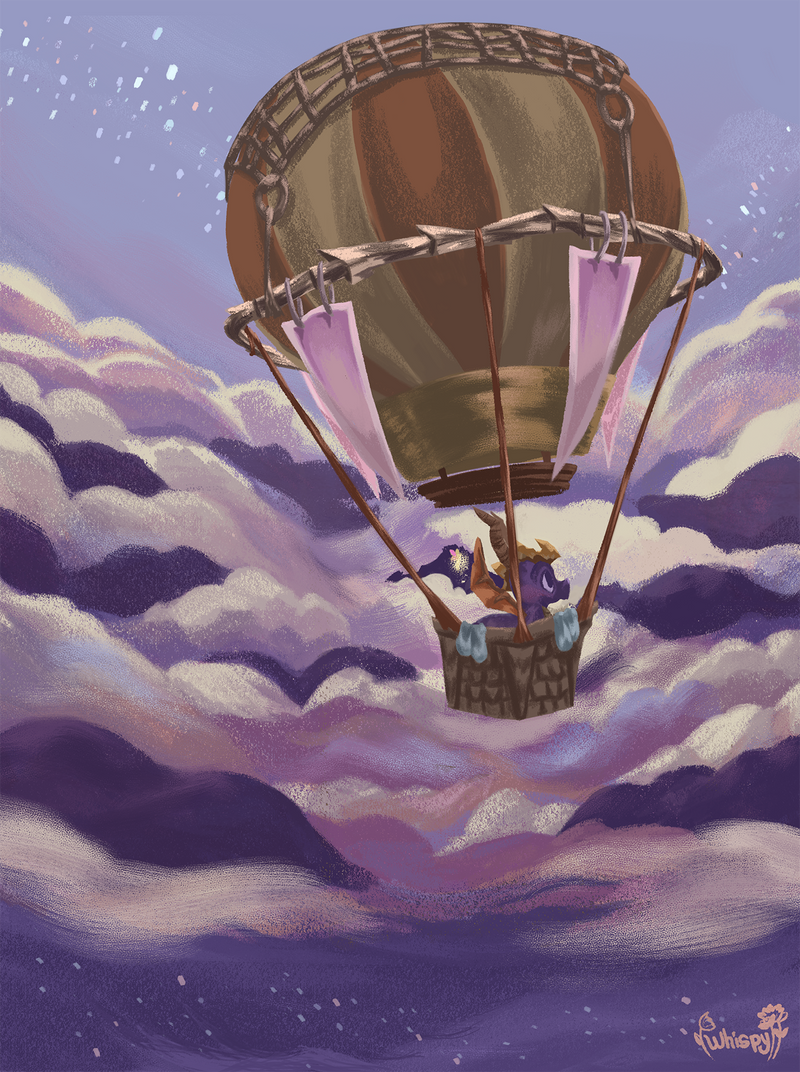
 whispywizbee — Spring

#dog #field #flowers #illustration #nature #spring
Published: 2017-04-18 21:50:48 +0000 UTC; Views: 381; Favourites: 55; Downloads: 6
Redirect to original
Related content


Comments: 14
This is really cute  (Smile)")
👍: 0 ⏩: 0

Greetings from Project Comment.
I am so pleased to be able to comment on this piece; it's truly a delightful image. I am drawn in to the scene by your superb expressions of light and shadow, motion, and space. You truly create a feel of springtime. Some flowers are shown as little standing spikes, others as horizontal wisps. This shows that the breeze is gentle, hitting some elements and not others, or not all at the same time. The blowing ribbon in the girl's hat and waist, also show this balance: the breeze is strong enough to move her clothes, but not so strong that she feels the need to hold her hat. I like that her shoes are off, as they are. She looks like she's climbing the fence to go get them and her expression reveals a sense of safe adventure so I'm comfortable that, despite the shadows gathered at the lower left corner of the frame, there is nothing ominous beyond the picture's border. This would make an excellent illustration for a children's book, or as a poster in the children's section of a library.
Nevertheless, I comment only when there is constructive advice to give, not mere encomium. The structure of the tree looks odd as the crotch between the two major limbs seems unnaturally square. It's awkwardness, especially since it is such a bold feature, detracts from the otherwise amazing impressions the piece gives. My other improvement observation is on a more subtle element: the fence. The horizontal rails seem to merge with the vertical posts. Sometimes the rails are nailed to the sides of the posts. Sometimes they are tapered at the ends and penetrate through holes cut into the posts. If this is the latter sort, I'd encourage you to show it with color changes (where the rails have been cut to fit into the posts), and shadows (showing the darkness of the holes in the posts or the rails' shadows cast on the posts).
Looking carefully at the girl's face, she has a doll-like appearance. That is adorable, and I wonder if it was your intention. Keep up the good work. You show great talent and I hope to see more from you soon.
👍: 0 ⏩: 0

Hello!
I am commenting from the group ProjectComment
I really love how you handled this image, especially the grass and the shadow of the tree, The flowers look gorgeous and are really well balanced. The variety of shades and hues of green in the grass is great and really give the painting a lot of dimension, I also think the textured brush you used on the grass really works and gives that great illusion of detail of the individual grass strands. In general I think the subdued colors with the small pops of intensity work beautifully and make the image very pleasant to look at. Also the little girl instantly reads as a young girl and looks really cute.
I think that the lighting is a bit off. While the individual parts of the image are shaded well, they each seem to have a separate light source that only affects them. the little girl and the tree and its shadow it casts seem to indicate it to be backlit from above and slightly from the right (the observers right). While the fence seems to be lit almost fully from the right due to there being a good amount of light cast on the poles on the side that faces us, if it where backlit it should only have a small rim of light on the right edge of the poles as well as a darker shadow on the middle and left area. This same issue presents itself on the tree trunk, it has light on the left side of the trunk and is in full shadow on the right, this contradicts the lighting the little girl has and the direction the tree's cast shadow is in. Then the little girls shoes are lit as if there was a light coming from the front. I think you should adapt one light source at the beginning and remember to paint around this. You also seem to be missing a few shadows, the fence should have a cast shadow on the ground that should be pretty strong and visible since its close to the ground, especially compared to the tree's leaves. Also the tree in the back lacks a cast shadow. Paying close attention to your light source and how it would affect objects can really give your image a lot of cohesion and instantly make every thing look like they belong together.
Also, another small thing, the brush you used is great and really helps give that extra dimension of texture, however I think it is a little over used. Since it was the only brush you used on the tree's leaves it makes the seem flat and too transparent (you can see the tree trunk through them). Trees can seem transparent because they have many holes in the foliage, but the leaves themselves aren't see through. Here is an example, you can see a couple dots of blue, but where there are many leaves and where there are leaves you cannot see the blue sky. I think the way you used the brush on the grass and the fence works perfectly since there you painted a base layer of color and then added depth and texture afterwords with the brush.
I'm sorry if this seems overly negative or if i did too much, but these really are all just small details and adjustments. I do think the good outweighs the bad, The colors are gorgeous and I really cant get over how good the grass and the shadow of the tree looks, and my first impression was OMG this is so pretty, I really had to look closely and pay attention to the detail.
👍: 0 ⏩: 1

Thank you so much for taking the time to critique this! I definitely see what you mean on the lighting issue--I actually came back to this one after leaving it alone for several weeks, so that's probably what created the dissonance. I think in the future, I'll make a top layer that has all the notes on lighting and that should help. I will have to go back and edit this one with your advice. Thanks again!
👍: 0 ⏩: 1
Uwaaa. I am glad my critique was useful! I also struggle a lot with lighting consistency so I am extra mindful of it. Btw that top planning layer idea is really good and I might borrow that to use myself \(>///<)/
👍: 0 ⏩: 0


This so adorable, love the sunlight, and pretty pink flowers. Definitely has the 'Spring' vibes!
👍: 0 ⏩: 1


Wow! Great work! I really love colors you used for the grass and flowers!

👍: 0 ⏩: 1