HOME | DD
 woweek — Logotype Design

Published: 2007-08-19 13:06:56 +0000 UTC; Views: 5814; Favourites: 69; Downloads: 291
Redirect to original
Description
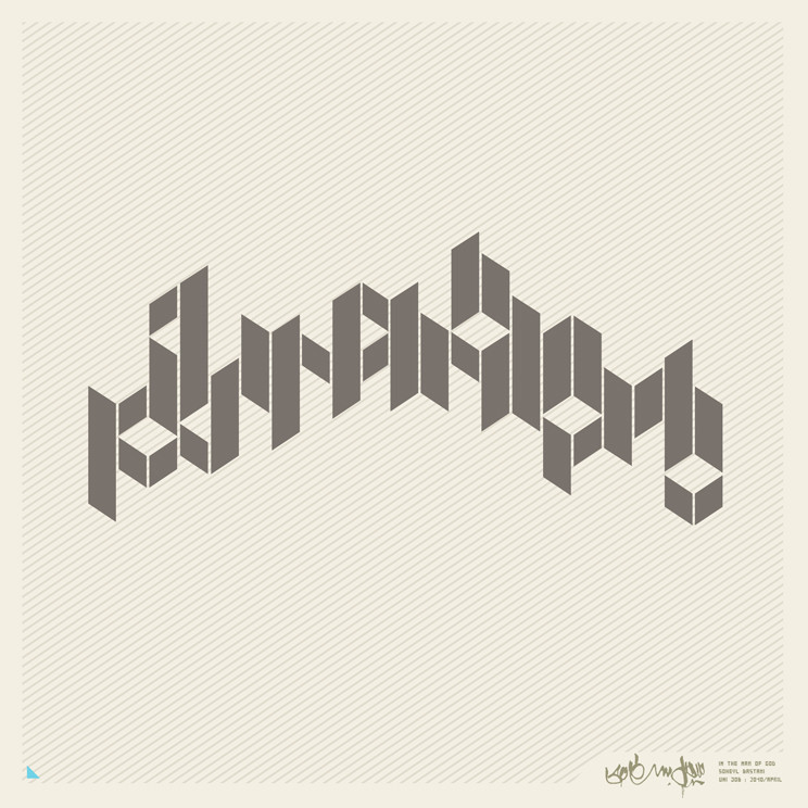
Logotype DesignDESCRIPTION: CHEEKY, HARDCORE, STYLISH,
UNIQUE HANDMADE TYPEFACE.
_________________________________
Copyright © 2007 Vladimir Ilnitzki (E2 DESIGN BUREAU)
Related content


Comments: 35


 (Wink)")


did you use calligraphic brush, normal shapes (rectangles + circles) or everything done by pen ? nice ")
👍: 0 ⏩: 0


pasibki!!! vdohnovlyon tvoimi rabotami!)))
👍: 0 ⏩: 0

oU!) Thanx for the comment!!)) I don't want to say! Can you read it ??? Very very interesting )))))
👍: 0 ⏩: 1

sorry, i had some ideas about, but actualy i can not read it.
if i take a look for typefaces or graffiti lettering theres plenty of possibility.
👍: 0 ⏩: 1
)))) Espesh for YA! "thisisme" is written! ))
👍: 0 ⏩: 1
i really had no clue. i though the "i" would be a "s".
interesting, the "e" is great.
👍: 0 ⏩: 1
YEAH!) thanx! I think that is only beginning!!!  (Smile)")
👍: 0 ⏩: 1
joa,
keep tuning those typefaces. lookin forward to your next job
👍: 0 ⏩: 0

THANKS MAN!!)) I'm really VERY glad!)
👍: 0 ⏩: 0
