HOME | DD
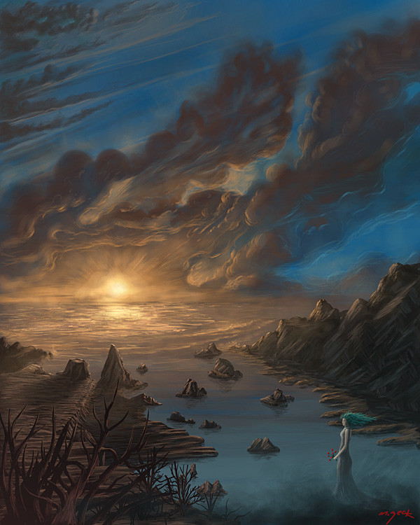
 xray360 — Off to Fish

Published: 2004-07-03 05:58:17 +0000 UTC; Views: 462; Favourites: 8; Downloads: 143
Redirect to original
Description
Thought I do a piece that had a summer theme to it. I started with blobs of colors, and as time went on it took shape. I wanted to do something quick, loose and easy since I haven't painted in a while. Anyway, hope everyone is having a fun summer! Enjoy")
Related content


Comments: 19


wow man, i love it. Hey i have some new work coming in soon. My old work sucks compared to my new stuff. Would you mind giving colors to my work when i get them in?
👍: 0 ⏩: 0

Wow I love the looseness. The colors are nice and the whole piece has it's own sense of style that just makes me think of sitting out and watching the sun set on a long summer day.
I am reminded why I love summer so much now...thank you
👍: 0 ⏩: 0

Beautiful, it's clear how much effort you have put into this piece.
The colours are wonderful, you've very much captured the feeling of a summer day in the picture, and it's got an incredibly serene feel to it, especially with the god rays coming off the trees and the figures standing in the corner.
Very well done.
Jimzip
👍: 0 ⏩: 0

All my negative issues have already been explain indepth with your comments between `coshdaddy and ~ekaj , So I'll tell ya what I do like....for one the scene, its a really great. emotive kind of scene. And, ofcouruse the sky, along with the beautiful uses of shade, nice work my man

👍: 0 ⏩: 0

this really is a fun piece man! lovely colours and summer feel
👍: 0 ⏩: 0

I was honestly preparing this very long winded comment and critique...and then I looked up and saw ~ekaj 's comment and it pretty much screwed up my whole plan. Pretty much everything that he covered there explains the weaknesses of this work. Doesn't seem to be the same style or standard that I'm used to seeing from you. Much more messy with the shading lines and sketching, not really as strong/solid in the detail of the rock and landscape.
The scale, like ~ekaj said, is the weak point of this piece. The people really through the whole thing off. They look huge, the scale to the ground looks small and the closer trees look just gigantic compared to the ones supposed to be closer to the lake. Each seperate part of the image is great (save for the people, which actually don't resemble much sense of realism) but together they just don't seem to scale well enough together. Other than that, and the disproportional look to the people, the picture's good. The sketchy style used for the rocks is interesting, and the light coming through the trees is really great looking. Considering this is quick work, you've really got a knack for the lighting and scenery. Overall, it's awesome work. Great job, Xray.
👍: 0 ⏩: 1

Thanks for the crit Senior cosh ")
👍: 0 ⏩: 0

i absolutely hate you mike. "Blobs of color" + "quick sketch" = i hate you so much. :jealous:
i like seeing your strokes on the rocks and the sky isn't so much blended as it is like, clouds on fire near the right. i thought you said you were going to do something like symbolismesq this time
you always do an awsome job.
love ya


👍: 0 ⏩: 1
No, symbolism stuff was going to come after I got this one out of the way  (Smile)")

👍: 0 ⏩: 0

The landscape is nice, but I can’t shake the feeling that the people are a little big. There doesn’t seem to be all that much distance between the foreground and background trees, which creates scale gradation discrepancies between the right and left sides of the piece. The trees themselves are well done though, and I like the hazy lighting effect in front of the foreground trees.
I think the whole thing would be improved if you had the sky bleed haze on to the mountains, which would also add some additional depth cues as well as make the it more cohesive overall. The reason I suggest this is that there are shadows on the mountains that are just as dark as the ones in the foreground, which doesn’t work well for the depth cues. Based on the hazy lighting effect in front of the trees I’d say there should be more haze in other places, too. Good job though, and nice use of colour.
👍: 0 ⏩: 1
Thanks for the crits. I agree with all of them and they will be good reminders for future works. I was aware of depth and scale issues. I had the people small to fit the layout, but at the size they should be it would have been hard to tell what they are. You also made a good point about the shadows being just as dark in the foreground as in the background. They should be lighter and have some hue of the sky, but to behonest with you I wasn't thinking when I was doing this 
👍: 0 ⏩: 0


wah! awesome! luv the way the sky is different shades of orange/yellow... 8)
👍: 0 ⏩: 0


