HOME | DD
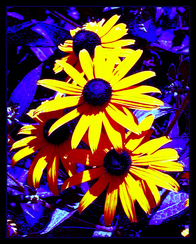
 xseption — Stark Contrast
Published: 2004-11-12 22:31:36 +0000 UTC; Views: 92; Favourites: 0; Downloads: 11
Redirect to original
Description
A study in stark contrast using content I am somewhat familiar with ... (Smile)")
PS 7 (2 hours)
stock: [link]
Related content


Comments: 24

hmm somehow it makes me think of "survival of the fittest"... I don't know why. ")
well, it's certainly something different from you - and I think it's kinda cool.. I like that blue/purple colour and that you've picked it up in the frame. The whole work has something... gloomy about it... it's almost melancholic.
Do I like it? I don't know... it's probably not something I should watch too often, it kinda hurts my eyes. LOL!
👍: 0 ⏩: 1

feel free to print it out as a poster and hang it on your wall or maybe Dani's wall
👍: 0 ⏩: 1
thank you
")
👍: 0 ⏩: 0

Definately has a 60's ish feal. I persinally don't like the 'Pop Art' look, it usually hurts the eyes too much. It's definatly a good photoshop job, I personally don't have the patience for 2 hours of photo work. I will say I like how the shadows look, reminds me of all the ipod commercials
👍: 0 ⏩: 1

the color contrast looks great ..its a nice piece!!!!!!!!!!!.........
👍: 0 ⏩: 1

Very dramatic, I love these two colours together, but I still like the original best.
👍: 0 ⏩: 1
wonderful!
thanks for sharing your thoughts
👍: 0 ⏩: 0

I LOOOOVE it! It looks like the header for a 60's concert poster...maybe Deep Purple or perhaps The Mama's and the Papa's. Mesmerizing contrast of colors.
👍: 0 ⏩: 1
thanks ... I dont recall posters from the sixties ... just slightly before my time
👍: 0 ⏩: 1
Well i didn't exactly see them when they were new but i've seen reproductions...
👍: 0 ⏩: 0

i like the high contrast between the blue and the yellow
if you want to get this result without the photoshop though you can always set your white blanace on your camera (if you have custom settings) to turn everything blue
it wont effect the yellow much at all
👍: 0 ⏩: 1
thanks for the tip ... I didn't know that
👍: 0 ⏩: 2
just trying to save you 2 hours of PS work
👍: 0 ⏩: 0
just trying to save you 2 hours of PS work if possible
👍: 0 ⏩: 0


I quite like it, I like this style of art, like Andy Warhol stuff but I don't investigate much in it so honestly can't give many suggestions since I don't work along the same guidelines. Somehow though I get a good impression of it, the blue makes me instantly think of "background noise" but I generally likes the effects. Did you say you manipulated it using PSP7?
👍: 0 ⏩: 2
Levels eh...well that stuff just flies over my head ^^ I've had psp7 for over a year now and I still can't work it!!

👍: 0 ⏩: 0
yes ... Photoshop 7, especially working with Levels and stuff
👍: 0 ⏩: 0

To be honest..I'm not sure I like this one. The stock imaged you used was good though. I think that the yellow is too bright and the purple areas are too dark. There's nothing really holding the two areas together. So it seems like two different photos slapped together.
If you wanted to make the flowers stand out more you might have tried upping the contrast/saturation after masking out the leaves behind them.
👍: 0 ⏩: 1
Interesting thoughts ... I was trying for a pop-art kinda feel and was exploring the idea of stark contrast
thanks for your comments and thoughts
👍: 0 ⏩: 1
I think in this case it's a bit much. Good try though.
👍: 0 ⏩: 0