HOME | DD
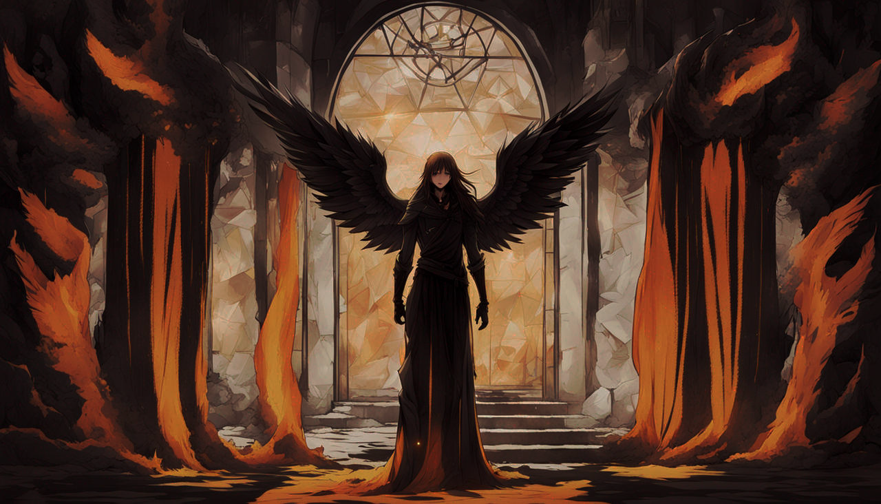
 yeo-ja — COM - F i r e a n d I c e

#anime #chibi #commission #digitalart #fantasy #guys #longhair #magic #fire
Published: 2018-07-21 14:55:08 +0000 UTC; Views: 472; Favourites: 106; Downloads: 0
Redirect to original
Description
Commission for KcMindsU ~ Aa thanks for commissioning me >V<
These two were so fun to draw and I experimented around with shading 0v0. I'm hoping to improve on the shading techniques I've come up with ~o vo~ And I went for more saturated colors than usual...°w ° I hope you like them!
Characters © KcMindsU
Art © yeo-ja
Commission Info:
fav.me/dbu5j7e
Related content


Comments: 10

Oh hi there!!! I'm from project comment xDD Didn't expect to see you here though!! To be honest, I didn't know if I should comment this because there were not many flaws, so i didn't know if i could manage to write more than 300 words but let's give it a try!
So first of all, this is a very cute drawing! I love the kind of alchemy between the two characters! The proportions seem to be very good for chibis, and the hands are well-drawn, even though I find the fingers' shape a bit weird on the hand to our right of the black-haired girl. I'm sorry, I don't know how to explain it but the fingers' tips should be... well, they should follow the shape of a square, to caricature. They shouldn't become that narrow... I'm sorry if I don't explain correctly, I'm not a native speaker aa....
The arms may be a little too long, but maybe it's a stylistic choice ...? For the black-haired girl's arm to our right (again), I think it is definitely too long. If it were down, it would almost be at her feet. Maybe that's a technique you already know, but to avoid issues with the arm length, I personally draw the hand before drawing the arm, and then I adapt the arm, so that i don't have to bend the arm to have the hand at the place i want it to be.
Another thing that disturbs me a bit is the fact that the eyebrows are above their hair. Well, this might be a personal pet peeve but it always makes me grimace when I see the eyebrows ABOVE the hair. We shouldn't... be able to see them... This "mistake" is so easy to fix, so I just wanted to point it out!! Maybe it's a stylistic choice again, but aaA... Moreover, the hair of the ginger-haired girl shouldn't be in front of the black-haired girl, since she's definitely behind her.
I think the nose is a bit too high for both of them. It's almost between their eyes...! It's another thing which is very easy to fix, so don't worry!
I wanted to say that I really like their lips, idk, they're... juicy?? Idk, but i really like them!! And I love their eyes and their expressions, I can see a kind of opposition between them and that's very nice!!
Now about the shading!! It is very detailed and nice to look at, congratulations!! However, there are a few issues that i'd like to point out :
- I would have gone for a softer brush for their hair. I find the technique very good, but with this brush, it may look a bit agressive. I think you should use (if you're on sai) the marker tool or the brush tool, with softer settings, or blend it on the edges with the watercolor tool. It's very easy to find ! It would have made the shading look more natural and,, relaxing..??
- I think it would be a bit better if you blurred the edge of some shades on the clothes. Your shading is very good again - we can clearly see the wrinkles and the texture of each piece of clothes -, however, I think it would just look a bit better if the "end" of the shades were blurred. I guess it's no very clear, so here's a screenshot of some parts which should be blurred in my opinion :
(I'll probably delete it from my sta.sh in a few days,,,)
Once again, it would make things look more natural and pleasing to look at, even though it's already very good !
- About the ,, elemental things?? the powers??? Idk what it's called ... I think there should be some airbrushing behind them, to fit more in the drawing. It would give a stronger ambiance in your drawing, and these kind of powers would look instantly stronger and more,, striking i guess..? I feel like you've done this for the blue force, but not for the red/orange one!! It's not that important, but i think it would look better if there were more blue and red/orange highlights in and around where the powers are.
And i think that's it!! I'm sorry if this looks very negative, because your art is very, very good!! This piece is so cute and,, alive ...?? But since it's a critique, I had to make the small flaws stand out!! I'm sorry if there are english mistakes,,,
👍: 0 ⏩: 1

HeLLo! >w< And aa thanks so much for your comment! And actually, the way you explained things were so clear and helpful! >///< Your English it really quite good! I really appreciated your insight on this piece cause I tried so many new things and it was nice to know what I should prioritize *v*
Your tip on the fingers was really helpful =v= Sometimes I point my fingertips way too much and it's true that in actuality, they're more of a rigid shape throughout. And the arms were definitely not meant to be that long (>o <) Aa and I really want to try drawing hands first from now on;; it actually makes so much sense since I have issues with arm proportions!
And you were pretty right about the eyebrows being a stylistic choice...before I decided to try out drawing out lineart so I could color them in xD Cause before they were just one line, but after trying this out;; I decided nupe, eyebrows over the hair's gotta go xDD In the next piece I hope to make the hair above them sorta transparent like I see some artists do~ See if I like that better ^^ The high noses are actually a stylistic choice for me ^///^ Cause one day I'm hoping that I'll be able to work out all my chibi proportions and lose the need for noses on my chibis at all;; but at this point, I feel like it looks nicer when it's higherr?? aa >//< and hehe I love juicy lips too xD
I love Paint Tool Sai brushes!! As of now I'm using custom brushes for FireAlpaca though ;u; I'm hoping to recreate the perfect SAI replicas of those brushes that you mentioned because they seem to color and blend so WeLL! The need to soften the hair shading and blend the clothes shading is something I really hope I can accomplish cause right now, they're a bit too sharp for my taste as well >3< And thanks for pointing out the lighting! I was worried about going too overboard with it but it's nice to know that I had loads of extra room to work with =u= -3
Thanks so much again! Indeed it's a critique and you were very unbiased about it ^v^ Also you're so sweet and your detailed feedback genuinely helped me out~! Thank you!
👍: 0 ⏩: 0

T e a c h m e y o u r s h a d i n g s k i l l s
👍: 0 ⏩: 1
>///< hAha whAt shAding skiLLS *^*
thank you for such a kind comment though >v> This shading style is new for me but I'm feeling abit more confident about it now =v=
👍: 0 ⏩: 0


evn though its just chibi the details are stunning <3
👍: 0 ⏩: 1
<33 aA thanks!~ hoping to incorporate these newer methods into my non-chibi works next time around ò3ó9
👍: 0 ⏩: 0

Woooah. I love the way this looks. The shading is so eye catching, nice job!
👍: 0 ⏩: 1
Aa thank you so much! That means so much! ~>v<~ It took me a while to get to this point, but I'm glad I was able to pull it off >///<
👍: 0 ⏩: 0