HOME | DD
 yolks — Vector - Pixie Gal

Published: 2004-09-03 14:49:25 +0000 UTC; Views: 2549; Favourites: 14; Downloads: 942
Redirect to original
Description
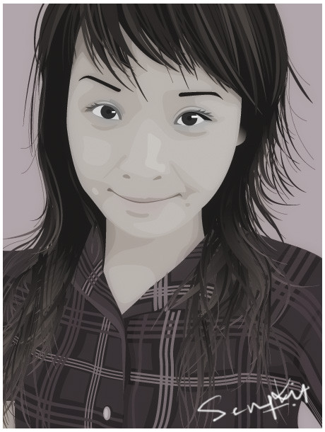
My latest illustration. I promised to do this for pixiegal long time ago. So here it is. Hope she likes it.Traced in illustrator, and playing with different colour mood in photoshop using the blending options.
Which one do you prefer?
Related content


Comments: 31


Nice. #1 is great for the pure vector look, but #4 has very realistic blends in the skin tones.
👍: 0 ⏩: 0

great work. nice contrast on skin tones vs flat hair
i like 1 the best
👍: 0 ⏩: 0

woooowww. i am amazed with all your illust!!!. great great great job!
👍: 0 ⏩: 0

niiiice, 5&3 for style  (Smile)")
👍: 0 ⏩: 0


I personally favor number 1 its stands out as the best one to me.
Dsnmgr
There is a place for you among us... Join Vectorizers Today!
👍: 0 ⏩: 0


They re all good, its a hard choice I think I prefer number 7, somehow the best fitting contrast and the colorsaturation is best..good work as always.
👍: 0 ⏩: 0

Jaw dropping presentation my man, can't expect anything less from the best illu. on devart. I've always wanted to comment on your stuff but couldn't find the time to do it, but here i am! ")
👍: 0 ⏩: 0

I'd go for something between #1 and #7, I think. #5 is really nice also.
👍: 0 ⏩: 0

#1 is so nice, #4 too. i think #7 looks natural. the camara is so nice.
👍: 0 ⏩: 0
i think the fourth picture looks great.
And the 7th looks natural.
👍: 0 ⏩: 0


I think #1 is proabaly the most realistic.....darker skin tone with the contrasting background. But I think I like #4 the best, they all look great, nice job

👍: 0 ⏩: 0

EXCELLENT work as always! I like 2 and 4 personally. But of course- all of them are lovely.
👍: 0 ⏩: 0


i like 1, 4, and 7. but i think 4 is my favorite. the camera looks really good. awsome job on the whole thing indeed.
👍: 0 ⏩: 0


omg, this is just awesome!
but what new did i say? u were awesome all the time
👍: 0 ⏩: 0

hehehe at last SK!
well 1 and 4.... but by some reason I love 4.
")
 (Wink)")
👍: 0 ⏩: 0

great work number 7 looks the best but number one looks good too great work!!
👍: 0 ⏩: 0


1 4 and 7 i like, but i think together they make a cool peice of art. i like
👍: 0 ⏩: 0


Great work, as always. Your stuff always impresses me.
I like number 1 personally. The soft and bright colours make it stand out amung the others. Keep up the amazing work!
👍: 0 ⏩: 0

I have to agree, #5 and #7 are great, especially if the camera would have been more visible in #5. Great work once again
👍: 0 ⏩: 0

5 and 7 are brilliant, but i like all together as well.
👍: 0 ⏩: 0