HOME | DD
 yorgash — AMD theme preview

#amd #preview #red #screenshot #skin #suite #theme #windows #windows7 #question #wip #workinprogress
Published: 2014-09-02 04:25:12 +0000 UTC; Views: 3253; Favourites: 5; Downloads: 20
Redirect to original
Description
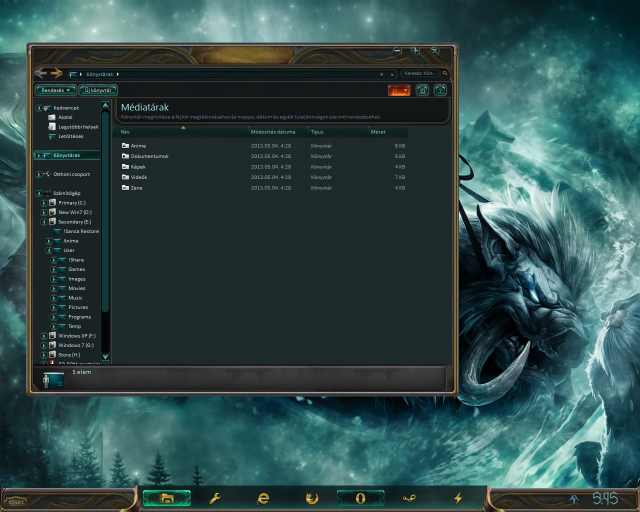
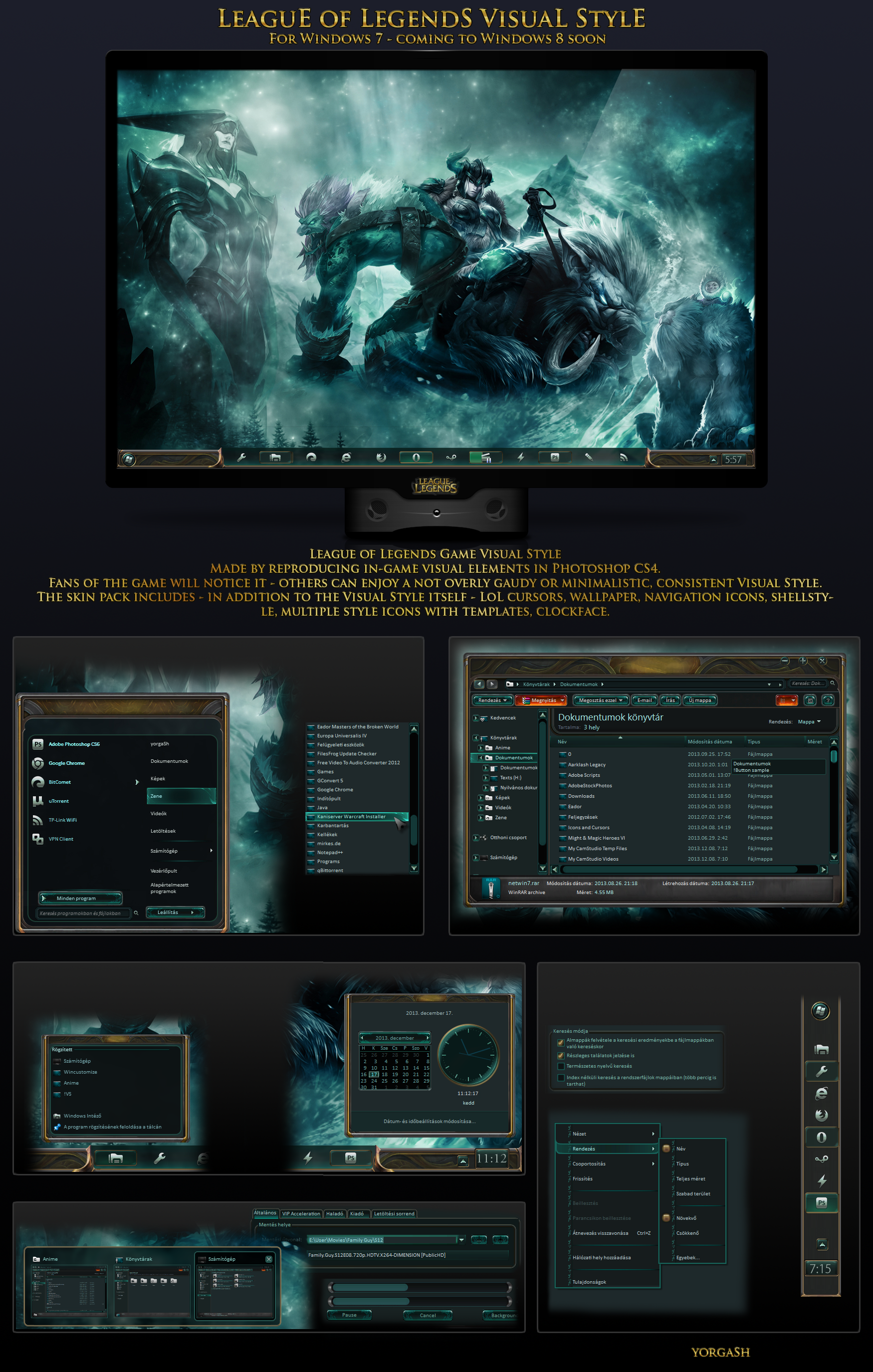
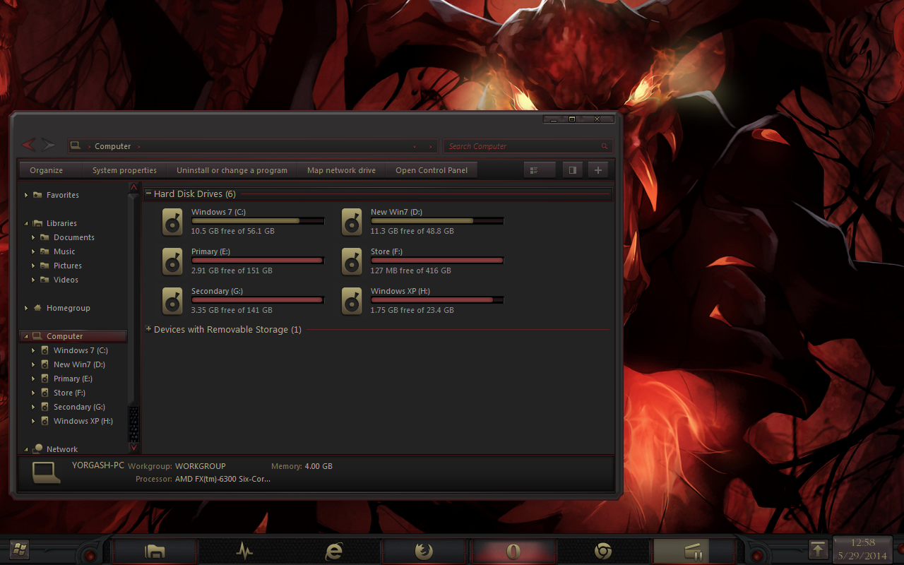
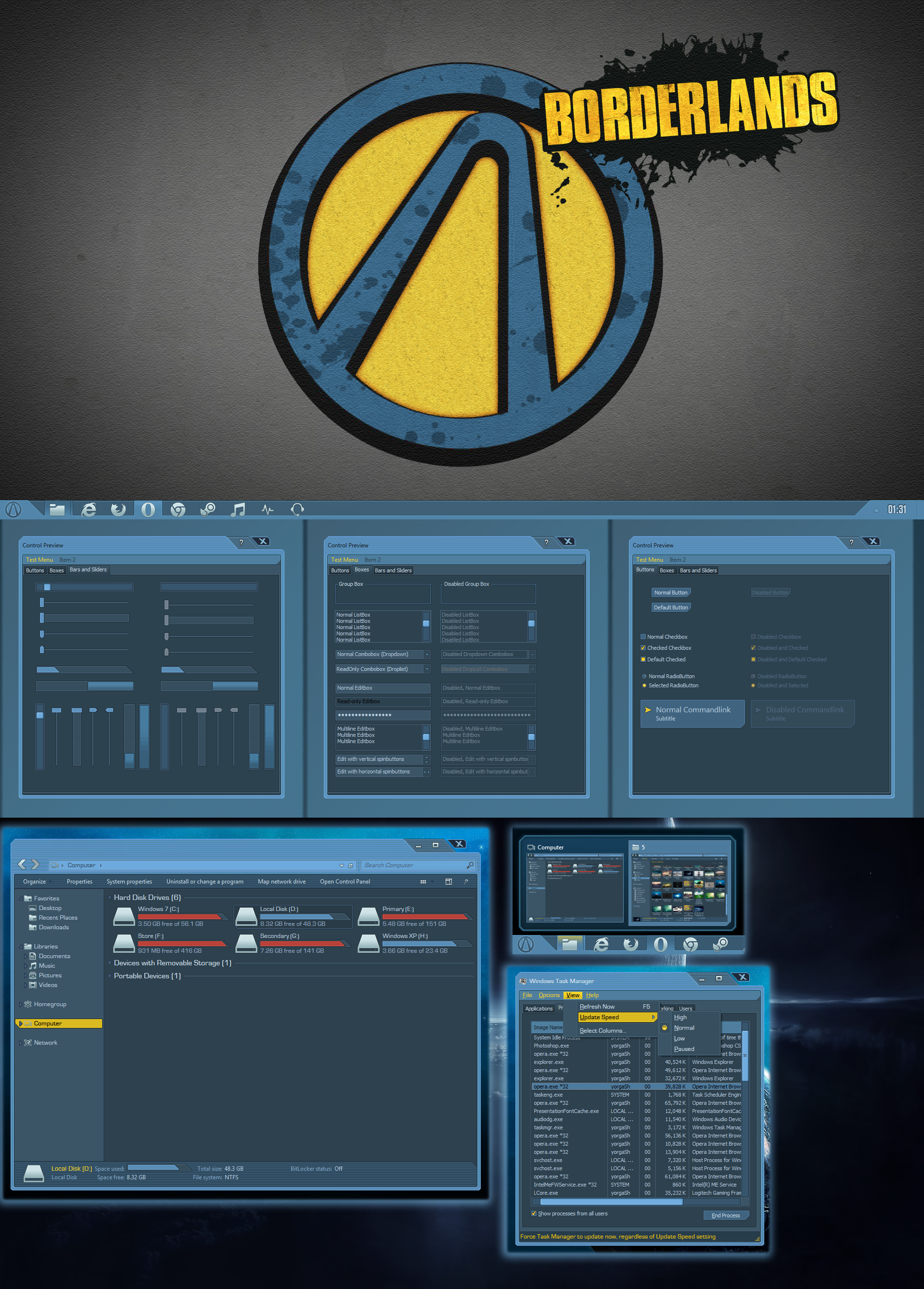
I have finally ported the concept into an actual visual style.Still not dead set on the color scheme, and might include some substyles for the final release, but for now I went with a lighter shade for the main window.
Other styles:
sta.sh/0ej7khsl0nh
Suggestions on what to remove, recolor, combine, etc are very welcome!
----------------------------------------------------------------------------------------------------
With any questions, requests, suggestions, feedback, or help contact me:
- Mail: yorgash@mailbox.hu
- Steam: yorgash
- Skype: yorgash
Or leave a note here.
-----------------------------------------------------------------------------------------------------
If you like my work and want to see more, or support the making you can donate via PayPal at yorgash@mailbox.hu.
Related content


Comments: 16
AnEmptyBlank [2014-09-05 03:28:45 +0000 UTC]
I would prefer if that lighter grey in the content of the window was a darker shade, similar to the Steam theme you created, but that's just personal preference, this theme is looking great so far
👍: 0 ⏩: 1

Thanks for your feedback!
Will consider it, though this far I'm making this theme easier to recolor, so might include substyles too.
👍: 0 ⏩: 0

I like the red on the left one but maybe combine it with the lighter grey on the right? So it`s like the best of both worlds
")
👍: 0 ⏩: 1
Thanks for your reply! Will see how the final concepts come together, and probably let them up for a voting session again, just had some distraction for the past few days.
👍: 0 ⏩: 0

I like the left one a lot aesthetically, but the gradient on the lower grey section bothers me.
Are flat colors a possibility or are the gradients something that is sure to stay?
👍: 0 ⏩: 1
Flat colors are a possibility, I'll make some more designs, and put the final ones on a voting again.
Thanks for your input!
👍: 0 ⏩: 0

Left one is as dark as the Steam theme, its readability in word or excel is not the best. But I like both, just not for presentations with my laptop in university. The projectors get problems with grey on grey
👍: 0 ⏩: 1
Oh yeah, I can relate to that - that's one of the most annoying shortcoming of dark themes that have to be manually changed in Office programs every time, sadly.
👍: 0 ⏩: 0

personally id go with left as i like dark shaded colors with a couple bright stand-out-ish colors
but knowing the masses right might be the best
👍: 0 ⏩: 1
Nothing's set in stone yet, I might even combine the two to a degree.
👍: 0 ⏩: 1

maybe you can make an Borderlands 2 or Pre-Sequel theme for next?
👍: 0 ⏩: 1
Yup, that's more than a possibility, Borderlands has been requested quite a lot.
👍: 0 ⏩: 1

Thanks, I'll probably go with that then
 (Smile)")
👍: 0 ⏩: 1