HOME | DD
 z-design —
AdvancedUI: Status Screen
z-design —
AdvancedUI: Status Screen

Published: 2009-04-30 07:56:41 +0000 UTC; Views: 435072; Favourites: 3269; Downloads: 46806
Redirect to original
Description
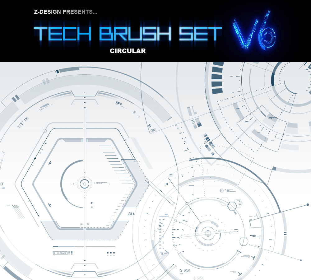
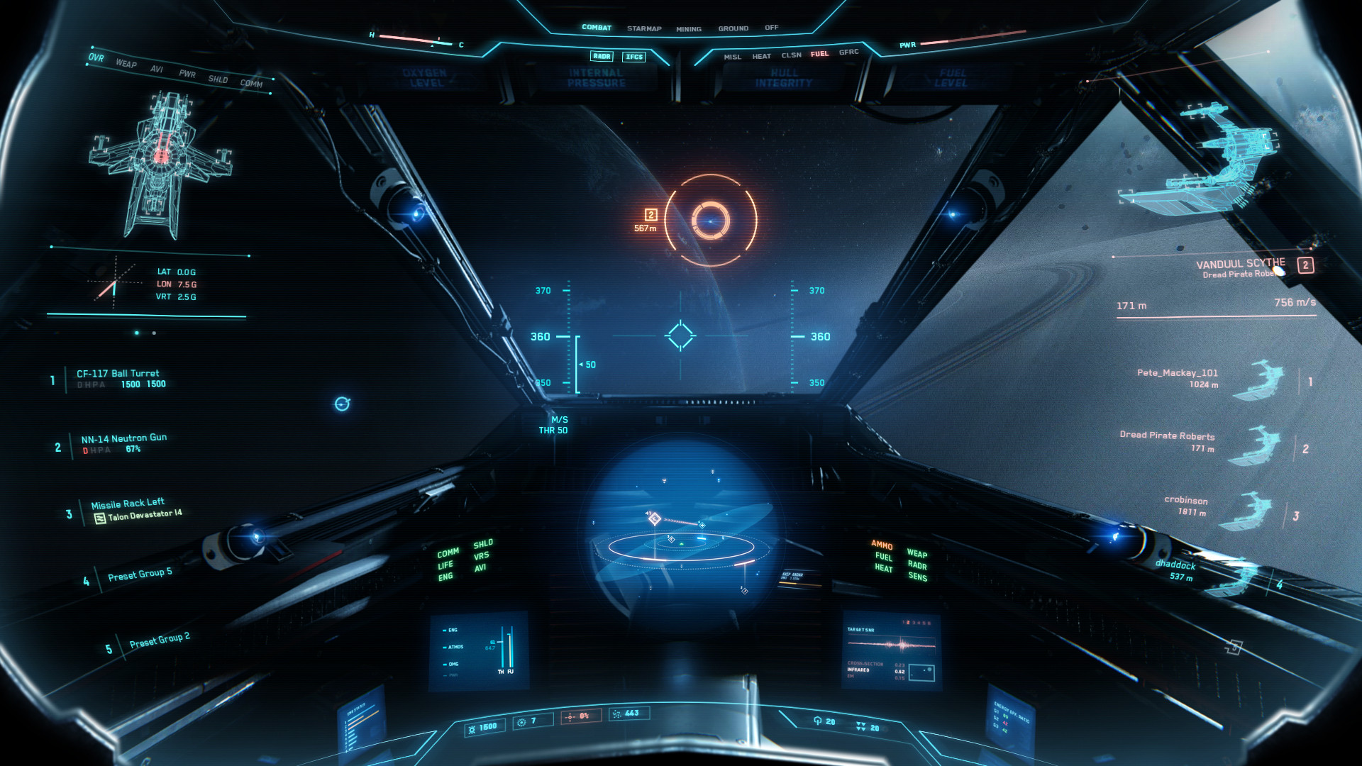
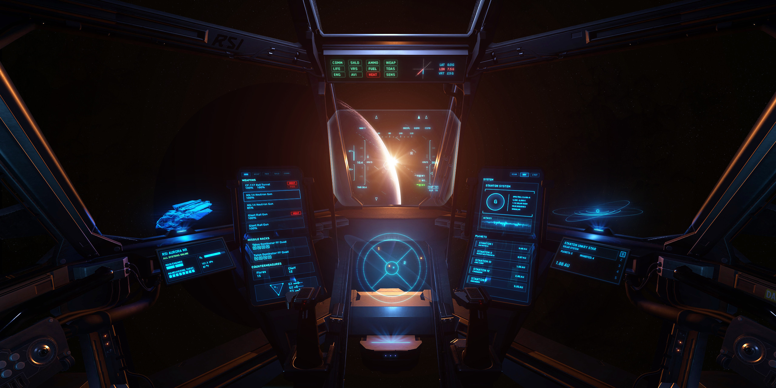
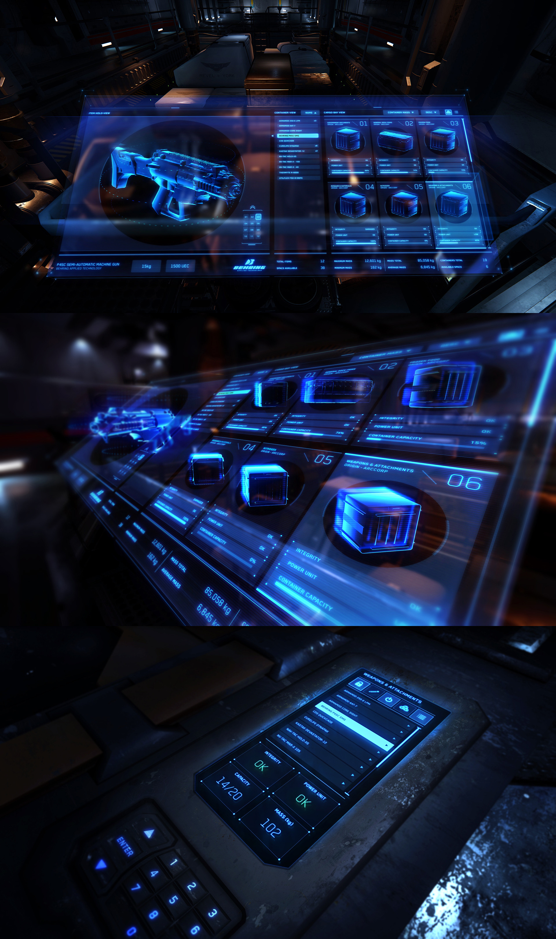
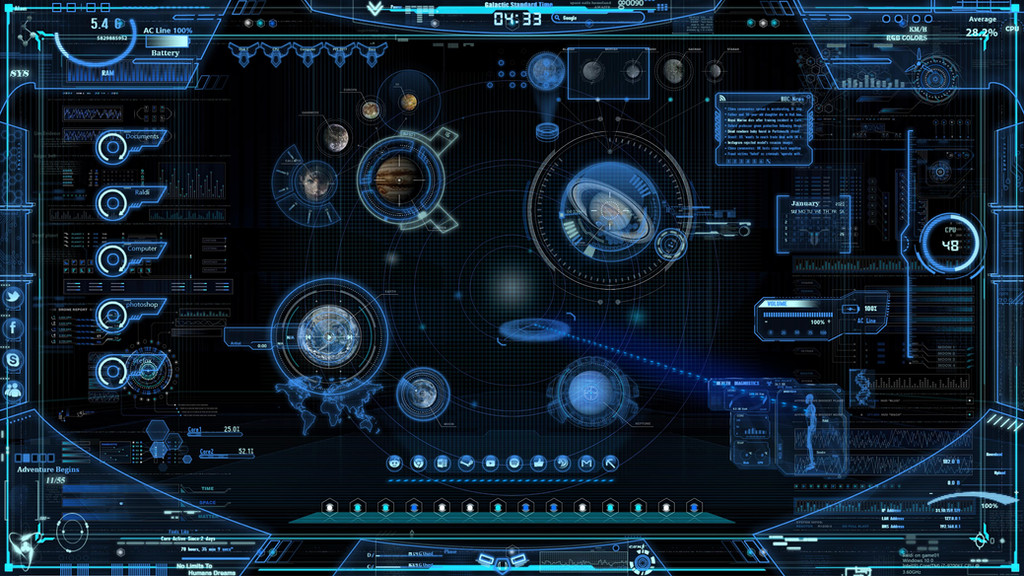
The Zanimation Starship MainframeFinished earlier than I expected
Fictional GUI, 2045 A.D.
PSCS3
1113 Layers
Stocks used:
[link]
[link]
[link]
Inspiration:
Mark Coleran
Related content


Comments: 468


This is great. But what is it for? GUI for what?
👍: 0 ⏩: 0


OMG what a wonderful piece of work O_O
I can't believe the number of layers ...
Great !
👍: 0 ⏩: 0


beautiful work.
and wow! 1113 layers?!
that's very impressive.
i'm sure bazillions of people have asked this..but what exactly is it for? is it a skin for music/mp3s?
👍: 0 ⏩: 1

Just a fictional application GUI, nothing practical or real-world... kind of like the interfaces you see on the screens of sci-fi movies and such.
 (Smile)")
👍: 0 ⏩: 1
ahhh...okay..i see now. ")
👍: 0 ⏩: 0

That looks really great, futuristic yet realistic!
👍: 0 ⏩: 0


Very nice conceptual interface. And blue is a nice relaxing color for what must be a high stress environment at times. ;) Also has a nice handy clock at the top. Handy!
Hopefully you won't mind a crit, even though it is more a conceptual interface.
Personally, I'd split communicay off to another screen. Everything else seems to be concerned with keeping the station/craft functional, afloat, and in one piece. Infirmary Status oughta be shunted off, too, outside of perhaps life-support status thereof. (Keeping your staff fit is pretty important...)
The biggest thing that gets me, though, is that so many status elements have huge meter areas, but tiny little indicators. The two most obvious instances being the round meters at the top and the "Primary Systems Temp" thing in the lower left. The full circles (With their glowy ends.) and full bars (With yellow and red) are far more indicative of being maxed out than the little yellow arrows and green bars they overshadow.
I do love the style, though, and having a mostly pushed back blue for the ground color means ample opportunity to color and value contrast.
👍: 0 ⏩: 1
Awesome, thanks for that. I welcome any critique.
I didn't really design this with ease-of-use in mind, but rather to emphasize on the overall appearance rather than on minute specific details. All measurements and functions I put on here are just random... to act as a filler to contribute to the overall.
When you watch Iron Man for example and see Tony Stark's screens, the interfaces are cool, but you're not going to scrutinize the little bars on the top right of the screen and say "Wow, he must have a hard time reading that measurement" in the theater lol. Same thing applies here. Perhaps the second best category I could have submitted this to was "theater design" under designs & interfaces, but this whole thing IS basically an application... just not real-world.
I hope that makes sense. Your critique gave me some insight into perhaps more user-friendly interfaces that I will design in the future emphasizing this same futuristic glowy blue style, but can be realized into practical applications.
Thanks
 (Wink)")
👍: 0 ⏩: 1
Actually, yeah, I am the sorta person who does that in theatres. Oh lolme. :B
No prob and thanks!
👍: 0 ⏩: 0


this is amazing! the details are brilliant ... i had to make it my wallpaper, gives my computer a whole new sci-fi feel, hope you don't mind XD
👍: 0 ⏩: 0

epicness, reminds me of all those days spent playing homeworld2
👍: 0 ⏩: 0


looks really cool, but i hope our future is more usability centered
👍: 0 ⏩: 0

Wow
You should really sale this for prints


👍: 0 ⏩: 0

I am not all that into starships and related, but this interface looks definitely cool.
👍: 0 ⏩: 0


That is just phenomenal. There's no other word for it. Stunning, amazing, awesome - they don't do this enough credit.
Phenomenal. Just phenomenal.
👍: 0 ⏩: 0

wow very cool
I see the word ZPM was used in the top left, I don't know if that's universal sci-fi language but I recognize it from StarGate, great show!
👍: 0 ⏩: 0

Okay, this is pretty wonderful.
I want you to design my next car cockpit! Seriously though, you should be designing for movies, or concept cars, or SOMETHING. Just too spectacular. You Rock!!
👍: 0 ⏩: 0

That is immensely cool. It'd make an impressive design. Well done.
👍: 0 ⏩: 0

Holy crap! That's amazing work!! And all those layers...*drops dead*. Just amazing. That would look killer in a video game, you know that?
👍: 0 ⏩: 0


1113 Layers?? omfg i cant eaven think of this ^^
Great Artwork there!
👍: 0 ⏩: 0


simply incredible...you're an inspiration to us all
👍: 0 ⏩: 0


What would be really interesting would be if you made this so it moved, just a little bit - the dials move and adjust themselves, the numbers change, go up and down, the little bars shift back and forth, etc. So it seems alive.
Saved as a .GIF, i think, it would be a moving image, which people could set as their desktop, for example.
Anyways, nice work, great detail!
👍: 0 ⏩: 0


yeah, z-design always shows you the best of sci-fi that can be found on DA
👍: 0 ⏩: 0

This is really excellent work. I'd love to see more like this.
👍: 0 ⏩: 0


Turn this into a skin suite and I'd promote the hell out of it.
👍: 0 ⏩: 0

THIS is overwhelming!!!! how long did it take you!?
👍: 0 ⏩: 0

It's very nice, but i think not so useful. Too many small things in one place make it hard to read by starship pilot. In my opinion the whole image should be larger to contain bigger separating fields and some lines should be bolder.
👍: 0 ⏩: 0

Damn, i wished there would be a animated version... ^^
👍: 0 ⏩: 0


<= Prev | | Next =>