HOME | DD
 z00tz00t — Testing 1 2 3 4

Published: 2007-01-31 05:45:59 +0000 UTC; Views: 1024; Favourites: 27; Downloads: 16
Redirect to original
Description
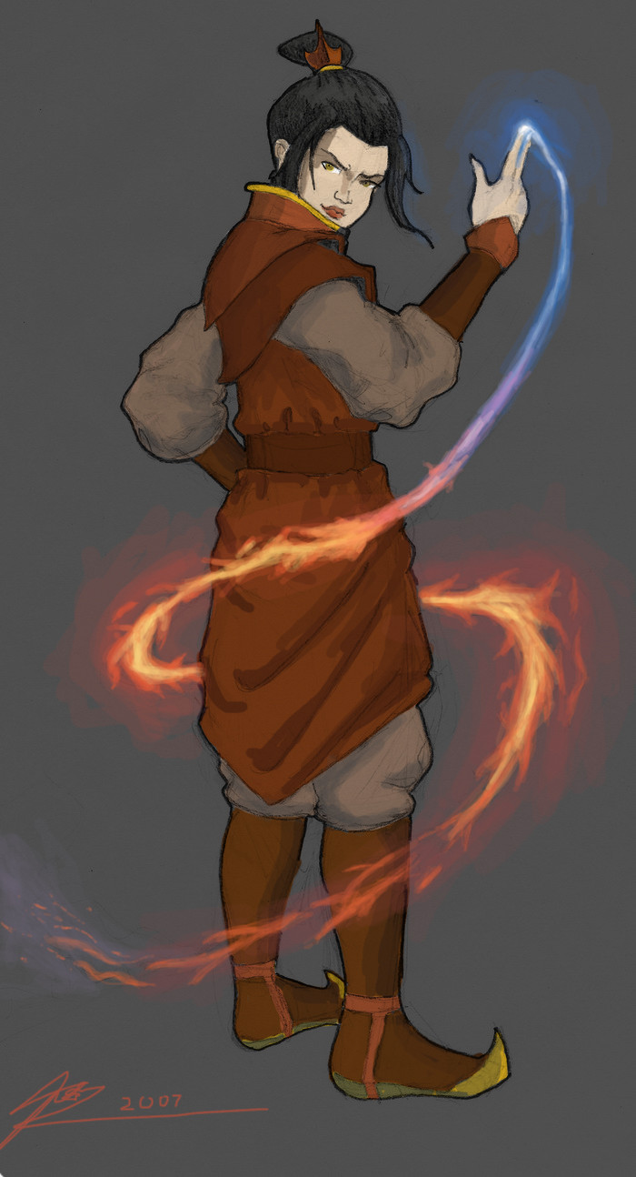
Thats funny, I thought I uploaded this, but it seemed to have failed.Anyway, this is me trying to colour that Azula sketch I made. As you can see, I'm not very good at it. The last time I tried colouring humans looked like this: [link]
So as you can see, this is quite different. I didn't initially plan on putting in so much detail into my character, but due to a lack of scanner, I was forced into doing so because of the grey background
") . If I had a nice white background I could just colour it in like I did with that angel, and then spend all my time making my fire look nice and cool. Unfortunately, now I need to spend even more time on the character.
. If I had a nice white background I could just colour it in like I did with that angel, and then spend all my time making my fire look nice and cool. Unfortunately, now I need to spend even more time on the character. Still, this is also a learning exercise. As you can see, I'm trying to be less shy about contrast between dark and light areas...although since I have no reference, I'm still quite lost.
I think the skin on her hand is better than on her face. The skin on her face just looks...zombie-like
") . Maybe it'll look alright once I add the red of her outfit...
. Maybe it'll look alright once I add the red of her outfit...Comments, crits, and LOTS of advice is welcome!
 (Wink)") Please try to give advice in layman's terms, as I am newb to photoshop and all you see here is the result of nothing more than the airbrush tool and varying the opacity levels. Did I mention I did this with a mouse? I have no neat tablet thing.
Please try to give advice in layman's terms, as I am newb to photoshop and all you see here is the result of nothing more than the airbrush tool and varying the opacity levels. Did I mention I did this with a mouse? I have no neat tablet thing.Ugh...it took me like...half a minute of thinking to come up with 'tablet'. I think my brain's exploded with the time I spent on this...
EDIT: Gave her a healthier skintone
.EDIT 2: Updatred with current status
 (Smile)") . Her outfit is by no means finished yet!
. Her outfit is by no means finished yet!
Related content


Comments: 10

Awesome. She looks just like she did when she was about to attack Aang in The Chase... only better.

👍: 0 ⏩: 1

Hehe - I was never really happy with this one, so it's never going to get finished 
👍: 0 ⏩: 0

Hey grunt, I found an example of the kind of art you're doing here, take a look and tell me what you think - note the light reflected on their faces/bodies
[link]
👍: 0 ⏩: 1
Not quite the effect I was attempting to achieve, but I'll keep that in mind- it's very good!
👍: 0 ⏩: 0

Wow! You should color more! Your AMAZING!!!!!
👍: 0 ⏩: 1
Regretabbly, I'm also ridiculously slow at doing it
But thank you!
👍: 0 ⏩: 1
You're quite welcome! 

👍: 0 ⏩: 0
I didn't see the first couple, but what I would say is your colors now are good, the features are pretty good. What I have a problem is that EVERY feature and area of this work is blended together. There are no crisp sharp lines. The lines you need to sharpen are:
1. the edge of her collar
2. the highlighted strands of hair on her head
3. The edge of the comb in her hair
4. the outer edge of her ear
5. her eyes, although they work alright now - I think they'd be much more powerful if they were sharp and focused.
I also think she needs a light blue background, just a couple degrees darker than the light she's emitting from her fingers, and use much more blue highlights on her hand and face (the arch of her nose). The grey isn't doing it for me.
This is definately good enough for the critique forum on conceptart.org You'd get much better advice there.
👍: 0 ⏩: 1
THanks for the tips- I'll keep it in mind when I work up the courage to finish this
👍: 0 ⏩: 0

Mice are excellent, they stutter and move inaccurately, its great....
So far the detail is great, the lighting on the lips are done well. Hmm... if only i knew some more i could help you out
👍: 0 ⏩: 0