HOME | DD
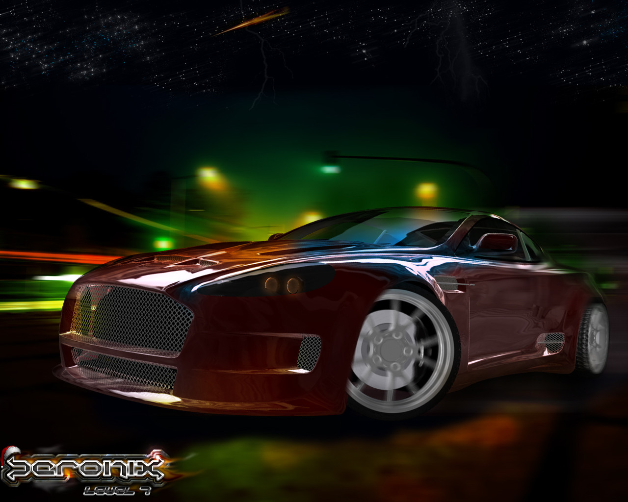
 ZeroniX-Designs — Concept v1
by-nc-nd
ZeroniX-Designs — Concept v1
by-nc-nd

Published: 2007-06-25 06:21:38 +0000 UTC; Views: 5624; Favourites: 15; Downloads: 0
Redirect to original
Description
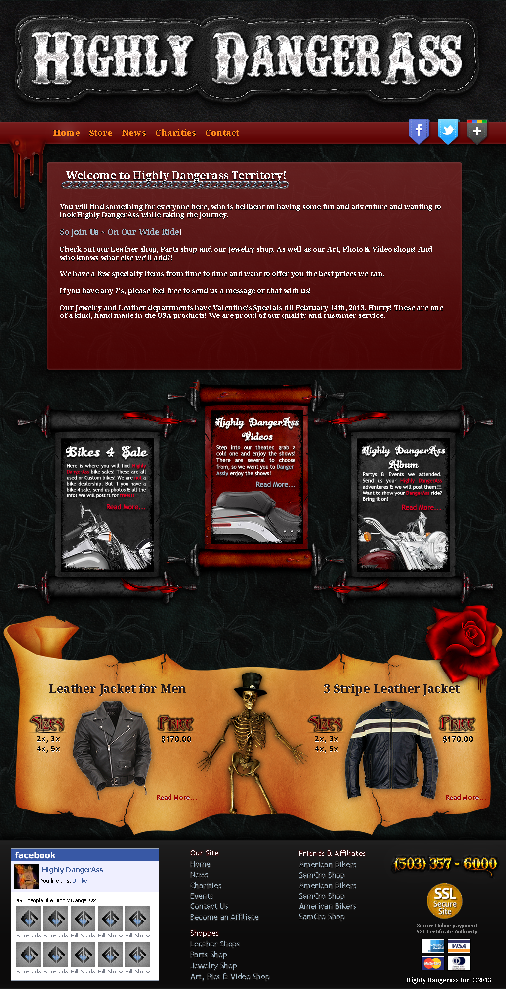
Made this on saturday for my personal portfolio.Im not shure if i use it because the plan was to create a full flashsite of it and thats alot of work.
Actually it´s a work in progress and im not happy about some parts but i´d like to know what you think about it.
When it´s perfect i may start with the flash.
")
Related content


Comments: 30

Do you use tutorials? And where can i learn to do these designs.. I do templates but not as detailed compared to yours.. I would like to learn more.
👍: 0 ⏩: 0

Gewritet und Tech ineinander sehr geil^^ <3 +fav ^^
👍: 0 ⏩: 1

Danke für den Kommentar und vor allem für den 
👍: 0 ⏩: 0

Thanks alot
Not shure about using it really but yes, i hate the speaker idea aswell
👍: 0 ⏩: 0


")

boa der heador is der megabrüller...is die schrift selfmade??
👍: 0 ⏩: 1
Hab´s mit Hilfe einer Font erstellt aber um einiges abgeändert
👍: 0 ⏩: 0

I like this one a lot better than your last portfolio site I saw with the mootools expanding stuff.
Keep working on it man, maybe some more small details to funk it up a bit more
👍: 0 ⏩: 1
Yeah, thats true.
Only thing is: I´d like to have a modular News system which is not possible with flash.
Maybe i´ll work with frames - we´ll see
Thank you.
👍: 0 ⏩: 0


It's so simple, but I really like this a lot! I LOVE the logo! What font is that?
👍: 0 ⏩: 1
Thank you - meanwhile its reworked a bit
Will update here tomorrow.
The font is a commercial one called Raise One
👍: 0 ⏩: 1
Where'd you buy it from? I can't find it on google.
👍: 0 ⏩: 1
in a fontshop from a hiphop site...
Let me search the link tomorrow and i´ll send you
PS:Small update uploaded - hope you like the new header and navi
👍: 0 ⏩: 0


I think its a good start, the noticeable gradients are what bother me...just brush up a few areas and add more color
👍: 0 ⏩: 0

i dont like the blue text and work in some more rustic colors
👍: 0 ⏩: 0
Dank Dir
Hab´s nochmal nen wenig überarbeitet und das update hochgeladen.
Wenns perfekt ist werd ichs flashen und codieren
👍: 0 ⏩: 1

buhja  (Smile)")
👍: 0 ⏩: 0


Bohaa diese geile Schrift schon wieder im Header o_O ich will das auch können das sieht sooo geil aus!!
👍: 0 ⏩: 0

hmm to be honest , i think you need to try and take your personal style in a new direction , the doubled borders etc , i know youtr a very talented artist mate , it just seems your holding back for some reason , the layout is pretty cool with the media player , but i just feel you can still do much better , as for the logo it's far to small in size to show it's true details , i would use a different more simplified logo for your portfolio mate , like your old kIller giant " Z" thats was insane , but this is just too much for to little , but man keep ya head up i got mad love fo ya art , and i know that inside you there is a perfect design just waiting to get out  (Wink)")
👍: 0 ⏩: 0

I like the Blue Zeronix logo
👍: 0 ⏩: 0

niceee i like the feeling. as suggestion ill change/add the colors to some brown/orange and lights or rusty
👍: 0 ⏩: 0