HOME | DD
 zeruch — blueblack v4

Published: 2005-08-23 23:06:22 +0000 UTC; Views: 1701; Favourites: 28; Downloads: 283
Redirect to original
Description
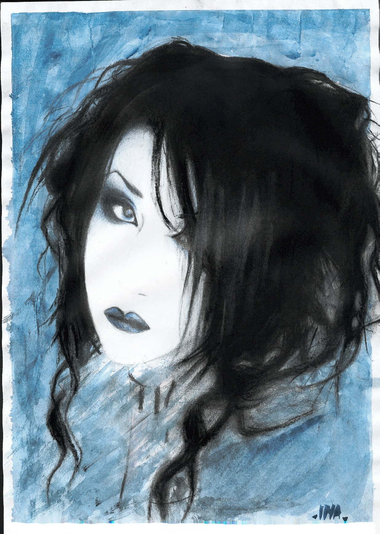
Many months ago I pulled a reference shot from ~Blue-Stock and then let it sit on my HDD for months. Then I did some pencil work and sat on that for a few months. Then I got to this stage, which might be WIP or somewhere near release candidate quality. I don't know yet, as I did this under extreme sleep dep and pretty much purely by will. Oddly enough it took so long that =BlueBlack closed the ~Blue-Stock account.pencils, gouache, acrylic ink, watercolor on bristol + digital
Related content


Comments: 30

I love your style, the colours, details and use of line all combine to make something very interesting.
👍: 0 ⏩: 0


I love the colour around the eyes and the great use of line.
👍: 0 ⏩: 0

Brilliant use of line. Well done and thanks for sharing
👍: 0 ⏩: 0

")


This is really well done, I love the colours and the jagged dimensions you've given to the face

👍: 0 ⏩: 0

Creativity under such extreme conditions, can bring out the best of one's skills. Obviously that was the case here, I really like the style & feeling in this one. Finding a style is half the journey for any artist, are doing commercial assignments yet?
👍: 0 ⏩: 0

Very good facial expression. Melancholy and sultry.
 (Wink)")
👍: 0 ⏩: 0

uo!! this kind of drawings reminds me Demian Johnston stuff, just how you framed the face ... do you know him?
amazing use of colours...
👍: 0 ⏩: 0

your use of color never ceases to amaze me
i must ask, what made that bright orange color around the eyes? and what part of it is digital(you use so many things that i cant tell whats what).
by the way, it is nice to see her in a different light, it is def not the same look as her work yet it still has a strong dark feel to me.
👍: 0 ⏩: 1

your use of color never ceases to amaze me
That makes 2 of us (because rarely do I actually understand how I get to a particular color scheme...it is mostly fortuitous accident), although my amazement usually takes the form of "now how in blazes did I do that, and how do I do it again?"
i must ask, what made that bright orange color around the eyes?
Mostly gouache and acrylic ink, and a fair amount of digital post-production.
and what part of it is digital(you use so many things that i cant tell whats what).
Anything color-wise gets the digital once over. In this case the color schema here varies strongly from the physical original, as well as quite a bit of changes to the contrast and saturation among other things. I do very little painting in digital, but a lot of tweaking of the textures and colors and balance.
by the way, it is nice to see her in a different light, it is def not the same look as her work yet it still has a strong dark feel to me.
The melancholy in here face comes through I think almost any treatment I could give, and I like that about her features. Half of her gallery is a bonanza of potential, and I may ask her for something new (if she would be so generous). But looking at what others have done, they kind of trawled the same thematic "look" for her, which i would imagine gets a bit unexciting after a while. I wanted something more vibrant.
👍: 0 ⏩: 1
fantastic, thanks for the lengthy reply.
i wonder what the original looks like, then? i dont know if id have the patience to tweak things in photoshop, id go insane with the possibilities(i already do)
id love to see more of your interpretation of her, and her face indeed has that feel no matter what style its in.
👍: 0 ⏩: 1
i dont know if id have the patience to tweak things in photoshop, id go insane with the possibilities(i already do)
It's what I do now.
I stop because I know I have other ideas to get to. That is about the only delimiter.
👍: 0 ⏩: 0

I have always had a fascination and like for work done in a "sketchy" kind of style... there's something that intrigues me, and I really have no idea what that it is. Anyway, I like your incorporation of a few different types of media.. something to experiment with myself.. Other than that, I just wanted to say "great work", really.. so great work!  (Smile)")
👍: 0 ⏩: 0

Hmm, something about the way it's cropped and composed makes i so beautiful, and allows you to dream up a narative in it.
👍: 0 ⏩: 0

Really nice, I love your style so much, Have you ever thought of doing someone like Cristina Ricci? She has an interesting face,
👍: 0 ⏩: 1
Ricci has an intersting look, but I have rarely done actors (although I have been interested in doing renditions of folks like Stanley Kubrick, Toshiro Mifune and John Rhys-Davies). Considering my propensity to randomly pick new subject matter...who knows?
👍: 0 ⏩: 1
True true. I would love to see.
👍: 0 ⏩: 0

Brilliant work as always, I'm having some trouble understanding a portion though. I'm sure the reference photo would shed some light on it but I will ask you outright. What is that line that splits the image plane in two? Just a bit of constructive critique, but it throws the balance just a little bit.
👍: 0 ⏩: 1
If it is the line I suspect you are referring to, it corresponds to the section of parallel line running in the bottum left corner. It has to do with strands of brighter colored hair (which I have yet to make bright or colored. who knows...)
👍: 0 ⏩: 1
I get it now, I revisited the picture and the line I was originally referring to was the larger break that runs in front of the ear and splits the plane in two. It didn't occur to me that it was brighter hair, or would be in the future.
👍: 0 ⏩: 0

i love your works so much
the lines and colors
i am happy that you made something from my stock
thank you

👍: 0 ⏩: 0

I love the line work. The use of color is somewhat odd, but that can be a good thing, and it seems to be your style, so i'm not gonna knock it. I sometimes wish I could still draw like this. Good work.
👍: 0 ⏩: 1
use of color is somewhat odd
I have pretty much always had a completely skewed sense of color. It isn't planned, but so far so good...
👍: 0 ⏩: 0


these ink paintings of yours remind me of jazz paintings. do you listen to jazz whilst doing them? they're very very good too btw.. heh
👍: 0 ⏩: 1
The short answer is actually, I am a music collector and jazz is a large component of that collection.
I do have a short series of jazz portraits I have done, and they were definately done under the influence of the music of the subject matter, but in this case, I do not recall what I was listening to when I did the pencils, and the latest work was done listening to a bunch of brokenbeat and fusion.
👍: 0 ⏩: 1
heh.. so i guessed. still if it's not jazz, the paintings have that smoky 'lounge' feeling u know? they have 'class' written all over them..
👍: 0 ⏩: 0