HOME | DD
 AbhaySingh1 — Logo Folio October 2008

Published: 2008-10-15 15:39:40 +0000 UTC; Views: 23065; Favourites: 94; Downloads: 665
Redirect to original
Description
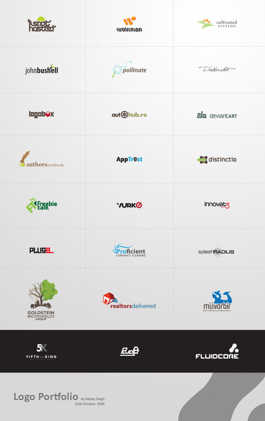
A collection of some of the good logos that I've worked on over the last one year.All comments and favorites appreciated


Related content
Comments: 48

Where do you get your fonts from?
👍: 0 ⏩: 1

I mostly either make my own logotypes or get them from font websites. FontShop.com even gives out a few commercial fonts for free as a sort of promotion.
👍: 0 ⏩: 1

Cool, the site looks very usefull
Thnx!
👍: 0 ⏩: 0

they all look soo cool but will anyone of these be available to download in the future ?
👍: 0 ⏩: 1

Thanks 
👍: 0 ⏩: 0

Realtors Delivered is my favorite! It has some dynamism compared to the rest, may be more of a touch sensation. It looks like something I can pick up and turn around. I like.
Awesome you are Abby!
👍: 0 ⏩: 1

your logofolio is looking good bud keep up the work.
👍: 0 ⏩: 1

Very nicely done, I'm a little jealous of your skill. My logos don't compare to yours yet.
👍: 0 ⏩: 1

Aw well I might have a bit of an advantage, seeing how I'm a 3rd year Graphic Design student and all 
But anyway if you keep at it you'll definitely improve
👍: 0 ⏩: 1

I'm a BTEC Art and Design Student 
👍: 0 ⏩: 1

lol then there's no explanation for it
I guess if you have a good base in art/design you can improve just by practising even without a proper course to guide you
👍: 0 ⏩: 1

Base? 
👍: 0 ⏩: 0

Goldstein and the pollinate one - real tight. Love the style for 'distinction' (is that what it is?) Very good work on a whole.
👍: 0 ⏩: 1

Thanks a lot 
👍: 0 ⏩: 0

I really like the Goldstein one. It's pretty. ^_^
They're all quite amazing, though.
👍: 0 ⏩: 1


