HOME | DD
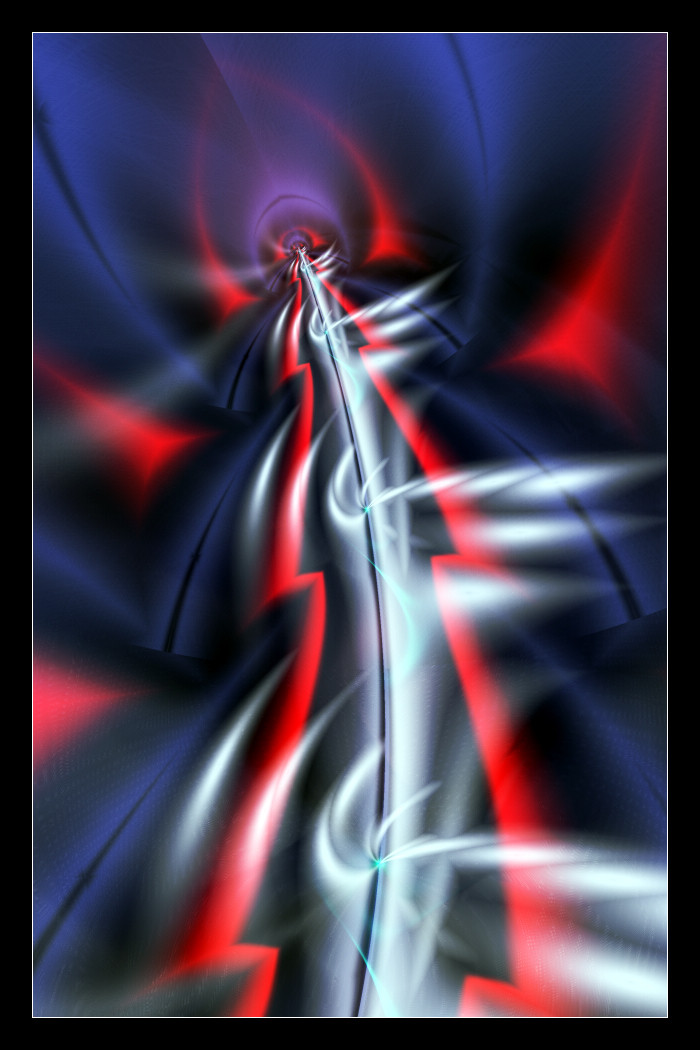
 Aeires — Architecting Madness

Published: 2006-12-31 02:46:26 +0000 UTC; Views: 3573; Favourites: 108; Downloads: 0
Redirect to original
Description
This was probably the image I should have made after Winter's Grace, it felt good taking my time and working on this with no pressure from other sources. Brutal file, it's never a good thing when the pixels/second drop to less than 25 and the remaining timer counts upward for your render. I was going to render for print but this one took over 8 hours, this size.Completely made with Ultra Fractal. Somewhat my traditional style but slightly new techniques tucked away here and there.
Related content


Comments: 143

YW
It really is beautiful... shame it's not a print.
")
 (Wink)")
👍: 0 ⏩: 1

I tried rendering it in sections, UF lets you split the image up to shorten each pieces render time. After two days it was only half done, and the worse areas weren't rendered yet. Don't know if it's worth the wear and tear on the processor pushing it 100% for 5 days or more.
")
👍: 0 ⏩: 1
Hmm, I know what you mean... I killed my pc last year, trying to render pieces in Bryce... it jus wasn't up to it. 

👍: 0 ⏩: 0


Thanks, this combination works for me.
👍: 0 ⏩: 0


Letting madness run wild in the fractal gallery.
👍: 0 ⏩: 1

Wow, this is very intricate. I like the lighting and colors a lot, and the shapes/nets really draw you in. Great work!
👍: 0 ⏩: 1
Thanks. I think I like working with blue the most but red has always been good to me. Took a long time getting the glassy look, but it was worth the painful render.
👍: 0 ⏩: 0


This reminds me of a bicycle tire, I keep looking for the cards and the clothespins we used to put on ours to make noise.
👍: 0 ⏩: 1


The coloration is superb, and I really enjoy the 3D feel of the upper area in particular (where the pattern of red looks especially dimensional).
Great work
👍: 0 ⏩: 1
Thanks for noticing that, I tried real hard to give it that glassy, freshly painted look.
👍: 0 ⏩: 0

very nice layers and details for this piece..I like those colors too. (Smile)")
👍: 0 ⏩: 1
Thanks, Yulii. Felt good to do red again.
👍: 0 ⏩: 0

Excellent form and flow! I love the symmetrical swirlys.
👍: 0 ⏩: 1

Very nice, has a gory aspect to it, great work
👍: 0 ⏩: 1
Dark has been creeping into my work lately.
")
👍: 0 ⏩: 1

like string art from the 70's
👍: 0 ⏩: 1
No, lost all my string art a long time ago. Be cool to see people get back into it.
👍: 0 ⏩: 1

I cannot believe that this is actually what I am looking at!
I wanna get that good someday. But first... I must work to save money for the program.... *sigh*
Awesome job on this one. I love the colors and the contrast... such fine lines make me believe that it took forever.

👍: 0 ⏩: 1
It's cheap compared to a lot of programs out there, and totally worth it.

👍: 0 ⏩: 1
Oh I know that definitely! I'm just strapped for cash at the moment...
I will get there though...
👍: 0 ⏩: 0

wow nice lines, bit chaotic some parts but its very eye catching... good
👍: 0 ⏩: 1
Thanks. The chaotic parts influenced the madness in the name.
👍: 0 ⏩: 0

The title is very fitting, Jeff
Nice work on this one ... all those twists ...
👍: 0 ⏩: 1
Thanks, Adam. Kinda moving in my strenghts at the moment.
👍: 0 ⏩: 0


Amazing intricacy in the detail, the textures of each of the individual elements and still a lovely bold and sweeping overall composition. The sense of a sidewise frame made up just of the black and red elements is very elegant.
👍: 0 ⏩: 1
Thanks for noticing that, Elly. I used masking to create the frame, then masked another texture layer on it. Kinda thought that having similar elements on the sides would tie it together more.
👍: 0 ⏩: 1
I've just recently caved and got a copy of Ultra Fractal. I can now appreciate much better the incredible planning and control that goes into your finished fractals!
👍: 0 ⏩: 0


Yep madness and associated danger come through loud and clear, a great colour choice ... I really like the frame on this one!
👍: 0 ⏩: 1
Thanks, Sal. I think this might be the third time using a side only frame but this was the first time that I through a texture on it. Just seemed to need it.
👍: 0 ⏩: 0

Some rendering times can kill you. It's a pity this isn't a print though, I think it would look great on paper. The flow of lines is intriguing and I like your choice of subdued colours. You're one for dark ones, aren't you?
👍: 0 ⏩: 1
| Next =>