HOME | DD
 arpad — SHIFT Logo Competition 4
by-nc-nd
arpad — SHIFT Logo Competition 4
by-nc-nd
Published: 2008-03-15 04:32:23 +0000 UTC; Views: 22246; Favourites: 143; Downloads: 0
Redirect to original
Description
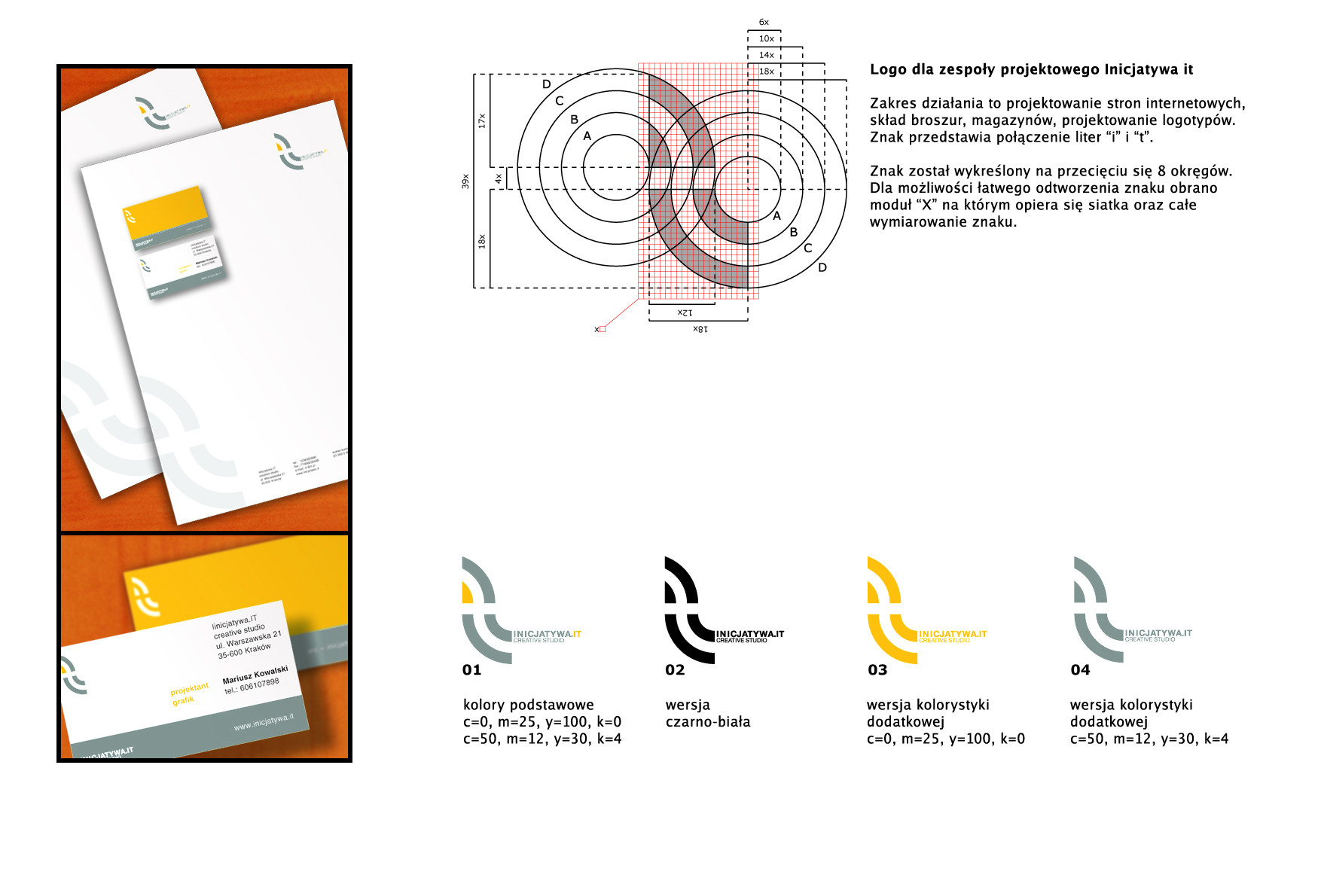
SHIFT Japan Logo Competition+Concept Four+
Related content


Comments: 27

Wonderful and distinctive work...
-
You can also Find Free PSD Logo Templates Renewed Daily Here: PSDFly.com
👍: 0 ⏩: 0


I love the perspective and the blur in the big logo. It gives a cinematic feel.
👍: 0 ⏩: 0

Wow, amazing!
I love the font!
Is it custom made, or a modification of an existing one? if so, which one?
👍: 0 ⏩: 1

Hello and thanks for your comments. No font, sorry...
👍: 0 ⏩: 1

Love your post work, its really awesome
And the logo is really nice
")
👍: 0 ⏩: 0

Faved!
You should have won. This thing is genius. It reminds me of the WRX STi logo.
I run a nonprofit indie video game called SHIFT and I just had to ask, Can we use this !? Its bloody brilliant. If not, then how much for it! We already have a site design in the works and we tried using this logo for kicks, and its B E A Utiful!
Cheers!
")
👍: 0 ⏩: 0


This is my fave. But I reckon it would look better with rounded corners
👍: 0 ⏩: 0

I think this one is the best concept. Really interresting shapes, it can be read easily big and small and i really love how the F and the I get along together.
Really nice work for every concept you posted though, it's an amazing research
👍: 0 ⏩: 0


I think this one is the strongest, though I think it can be pushed just a little further. I like the concept of what you did with the letter 'i' and feel that right now it's getting lost in itself just a bit. I think, maybe, adding a bit more separation like you did for the 't' might be in order.
Great set of concepts!
👍: 0 ⏩: 0

man you're a branding genius. hope you win - sure deserve it.
👍: 0 ⏩: 0

this is the good looking one out of the bunch... the rest all just seem like bad versions of this concept.
👍: 0 ⏩: 1
sorry, too early in the morning on a saturday. what i really meant to say is the others are poor implementations in comparison. doesn't that sound nicer?
👍: 0 ⏩: 0


definetely my fave of the lot  (Smile)")
👍: 0 ⏩: 0