HOME | DD

Published: 2008-03-15 04:30:22 +0000 UTC; Views: 16879; Favourites: 115; Downloads: 0
Redirect to original
Description
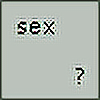
SHIFT Japan Logo Competition+Concept Two+
Related content
Comments: 19
DelinquentDesigns [2010-02-17 12:03:46 +0000 UTC]
wow that's a lovely logo, nice and simple
π: 0 β©: 0
arpad In reply to timaarts [2008-06-05 00:32:52 +0000 UTC]
Thanks, I think its my fav too!
π: 0 β©: 0
MatyasSvejdik [2008-03-20 20:45:01 +0000 UTC]
Great... Maybe even better than mine anyway I like the style and the simplicity of it... I would maybe open letter S to one side... It seems to me more closed than the other letters...
π: 0 β©: 1
arpad In reply to MatyasSvejdik [2008-03-21 01:48:31 +0000 UTC]
Thank you Matyas, I was aiming for a labyrinth concept so I had to close it somewhere, but thanks for the advise!
π: 0 β©: 0
cukie [2008-03-15 14:20:30 +0000 UTC]
Simplesmente adoro No entanto o F parece mais um P pela ligaΓ§Γ£o que tem com o T. Acho que deveria ser melhor estudada esta relaΓ§Γ£o, mas de resto estΓ‘ muito bom. ParabΓ©ns e boa sorte!
π: 0 β©: 0
Kip0130 [2008-03-15 12:41:59 +0000 UTC]
im not sure of the I it makes it read SHAFT to me
π: 0 β©: 0
Raven30412 [2008-03-15 11:33:32 +0000 UTC]
this one's the best. I'm only not sure about the "I" letter. Otherwise it's perfect.
π: 0 β©: 1
arpad In reply to Raven30412 [2008-03-21 02:00:14 +0000 UTC]
Thank you, the "I" was my question mark, lets see..
π: 0 β©: 0
nesto [2008-03-15 10:14:00 +0000 UTC]
5,4,2 FTW! dunno what better
I think this one! :+FAV:
π: 0 β©: 0
brook-house [2008-03-15 04:33:49 +0000 UTC]
i believe i like this one the most..
it seems more interesting than the others
π: 0 β©: 0
B-neoZEN [2008-03-15 04:31:19 +0000 UTC]
this is a really cool logo. . . very simple and easy to read. . . yeap i like it! hahaha
π: 0 β©: 0