HOME | DD
 ArtbySandiJohnson — Snake
Published: 2005-03-11 18:28:04 +0000 UTC; Views: 5304; Favourites: 226; Downloads: 1032
Redirect to original
Description
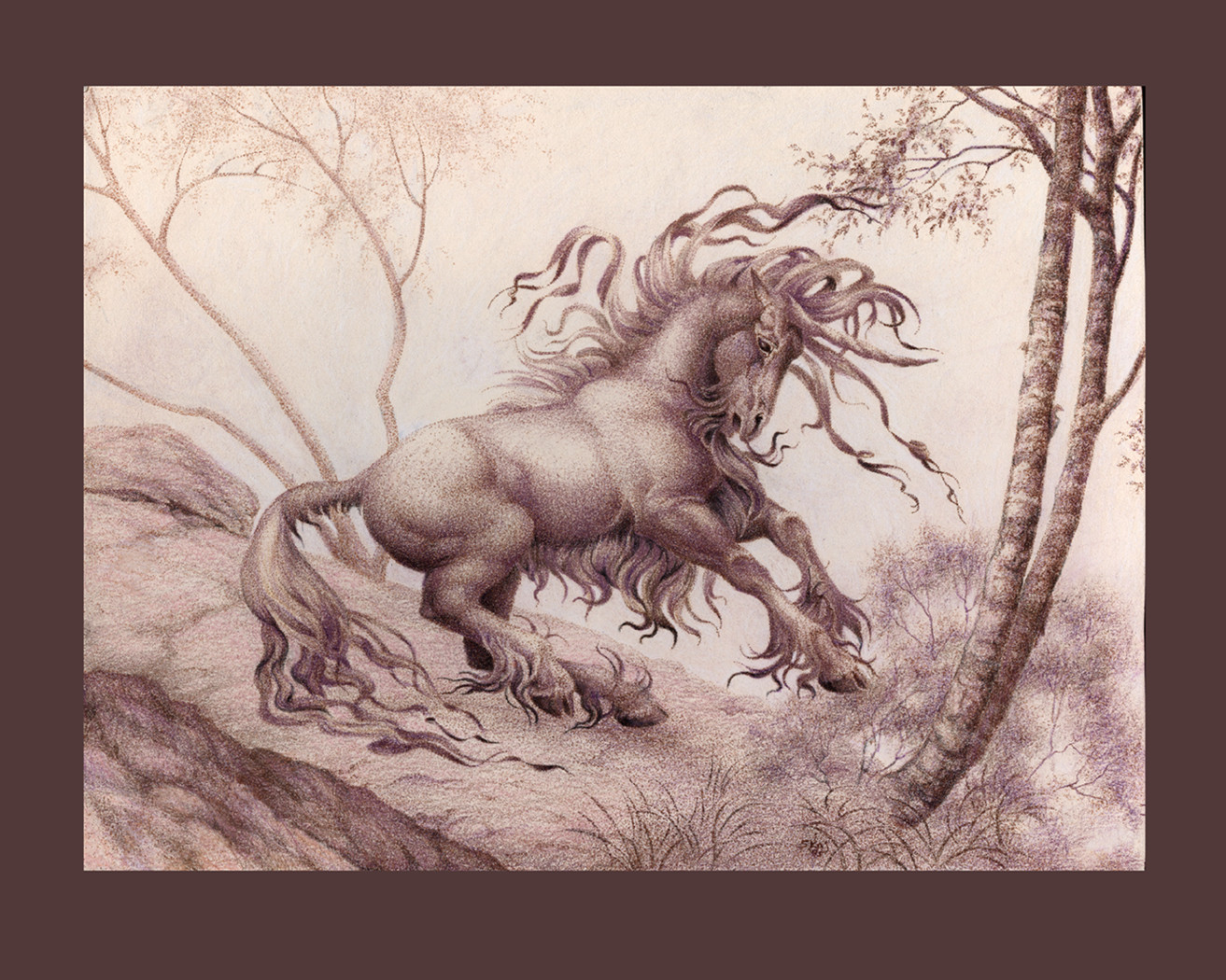
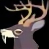
An ink drawing (sepia, stippled) enhanced with prismacolor. First done in 1995 in ink, it was too pale and weak, recently added prismacolor to give it more body and prescence. I like it better this way.Related content


Comments: 118

Excellent work! Fabulous!

👍: 0 ⏩: 1

Hi, thanks
 (Smile)")
👍: 0 ⏩: 1
You're welcome!
")
👍: 0 ⏩: 0
amazing. your gift for unicorns/horses is just outstanding. more please?
👍: 0 ⏩: 1
Thanks, and I'll try
👍: 0 ⏩: 0

cool, you used stipling! (either that or I'm just seeing things)
The prismas do add a nice little kick here and there. Your unicorns are always so wild and elegant looking.
👍: 0 ⏩: 1
Do NOT make an appointment with your eye doctor!! You are NOT seeing things! hehe It is stipling. Glad you think the prismas work. They were a last ditch effort to pull together an image that I liked the idea of, but was just way too weak.
👍: 0 ⏩: 0

Awesome! Moremoremoremoremore...ack... *falls over and flops around on the hardwood floor. Catches breath and sits up.* .....new artwork from GS!!!!!!!!!!
Oooooooooooooh. Monochome. Me. Like. Lots!!! Okay, I admit, the purple really sets it off, but it would have been just as stupendous in monochrome only!
I love the power of your animals. It gives them great presence. The shading on the mane and other wisps of hair are of particular note. You have really captured the little tree in the background well, pushing it back with you lighter leaves and such.
A beautful image!
*looks for the next image on his deviantwatch*
Er...whatayamean that's all....
👍: 0 ⏩: 1

Thanks! Glad you liked it. If I had had a darker version of copper or brown I would have used it. I was going for a darker value. I used metalic gold, metalic copper, metallic purple and dark brown to build up the ink, not in that order. It really was weak before. I had watered down the sepia for the tree in the back and used stronger ink as I moved forward. I even added a little bit of black to it for the darker tree and grass in the front. I constrictions when I planned it was to use just ink and just stippling to create the image. And when I was all done it was too weak and vague. You had to be close to look at it. It could never be hung up. I finally decided this week to go for broke and try the pencil.
👍: 0 ⏩: 0

Wow, It's so amazing! I adore this picture! 
👍: 0 ⏩: 1

👍: 0 ⏩: 1
haha Nah! You're embarrasing me! Hehe
👍: 0 ⏩: 0

<= Prev |