HOME | DD
 azarath — You're So Deadly
Published: 2005-04-14 19:28:00 +0000 UTC; Views: 2782; Favourites: 66; Downloads: 987
Redirect to original
Description
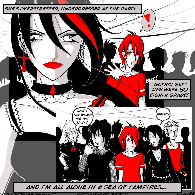
Wow i had no idea how to catagorize this.")
OH CGING HOW I HATE YOU. HATE HATE HATE. I want markers again. I'm sick of Photoshop.
[/whining]
Ahem. I was asked to contribute artwork for the new Self b-sides CD. I was flattered and honored and giddy as a schoolgirl about it, but i only had about a week to do so. This was much harder than it sounds. So i picked my second favorite of the b-sides, a song called "(You're So) Deadly".
Done with much haste with pen and photoshop 7. Lyrics (c) Matt Mahaffey/Self, so if you steal this you'll have much more to deal with than me. Lyrics: [link] Download the song and CD art FOR FREE at Selfies. [link]
Related content


Comments: 99


as a goth i find this funny as hell lol! i love how u did that one girls eyes !
👍: 0 ⏩: 0

Cool. I like black and red. 
👍: 0 ⏩: 0

I think it looks great! And the cging and the colors you used is very well done! I really hope that the band likes it. Good for you!
👍: 0 ⏩: 0


Bright and stylish. An interesting idea, by the way!
👍: 0 ⏩: 0

Artwork so clean ")
👍: 0 ⏩: 0

WOW!!! I can say no more for fear of losing impact on the matter! Have I lost any impact? No? Good! WOW!!!
👍: 0 ⏩: 0


very interesting i love the expressions the up-close pic of the girl looks very coo great work ^^
👍: 0 ⏩: 0

I like the limited use of color. It really make piece stand out. Also, nice layout/composition. ^^
👍: 0 ⏩: 0

Fits the song perfectly, and the way you used the red and black like that... very stylish and cool... Great layout also... intertwining the lyrics with the pics like that, I love the look of it all
👍: 0 ⏩: 0

wow, really showshow hes all alone, funny about the vampires tho. this defo geting faved 
👍: 0 ⏩: 0

It reminds me alot of sin city. It's not bad at all.
👍: 0 ⏩: 0


The composition isnt bad, but yeah squares are so dull. I love the artwork though!
👍: 0 ⏩: 0

Wow, CD Cover? That's great! I love it, especially the comic, it's funny. Hehe. anyway, great job here! =3
👍: 0 ⏩: 0

NOW THATS WHAT IM TALKING ABOUT!!!! great style!!! greatlineart! I loe the simplistic colors and shading. I really dont know whats going on in the comic, but it looks good!! great work!
👍: 0 ⏩: 1

er, you can't? is my composition that bad?
well... glad you like it anyway. thanks for the +fav.  (Smile)")

👍: 0 ⏩: 0

thats a really great visual style. I like the two colour look also (well, its a few if you count the shades of the black and white spectrum, but ya know).
im not really sure what to make of the girls eyes.
👍: 0 ⏩: 0

I wouldn't be so hard on yourself, you got skillz. Your digital colorin needs work, but that's just practice... no big deal. Awesome!
👍: 0 ⏩: 0

wonderful, and I can identify with the guy in red. Why can't I where 'skater gear' to a goth-fest, darn it?
Lovely use of colours too. Pretty!
👍: 0 ⏩: 0


i'm not found of manga style, but why not?
there's interesting things here, I espoecially appreciated the 1st panel; the girl sound great.
i'm ok with you with the square size: it sucks 
👍: 0 ⏩: 0
thanks. hmm, you really think so? first time i heard that...
👍: 0 ⏩: 1

Thats what i think
👍: 0 ⏩: 0

i really like the use of color. it makes it look really cool
👍: 0 ⏩: 0

The composition looks just fine and dandy to me. It appears a bit more, well... crowded than the scrap you posted, but given the subject matter, I'd say that's a good thing. It also can't really tell you were having problems with Photoshop here, I really like your shading. It's simple, but that befits your linework, and especially the shadings on the faces show that you've got a firm grasp of the shapes you're working on.
On the downside, you seem to have problems with hands. They're a bit under-rendered and oddly shaped compared to the rest, which kinda leads me to believe you were doing what I do when I have a hard time drawing something 
Otherwise, this looks really slick and stylish. And since you mentioned it on the forum, I actually think you have kind of a blend of Western and Japanese styles going on here, which is really cool.
👍: 0 ⏩: 1
thanks for all the constructive crits. people don't give enough of them.
anyone who knows me for more than 2 minutes knows how i hate to draw hands. i just can't do it. hell, i can barely draw at all, so hands aren't really my specialty either. heh.
as for the red shirt in the bottom panel, maybe it's not noticable, but the main guy isn't wearing ANY black... while everyone is at least wearing some. that was what i was aiming for anyway.
👍: 0 ⏩: 1
Yeah, I got that about the no black at all, but everyone else is only wearing a little red, and then you've got that one guy with the red shirt that's pretty noticeable.
And I agree there's not enough constructive criticism around here, that's exactly why I'm doing this.
👍: 0 ⏩: 0

I love the creative, punk/gothic (whichever word you want to use) style of your art. It's awesome!

👍: 0 ⏩: 0


I saw this at Selfies, which led me here. ^^ I like the art, and I like how it's illustrated from the song.
Good work! XD
👍: 0 ⏩: 0

The lineart and cell shading is very nice though the girl's right eye...is uneven with the other side, other than that, very good, and keep up the good work na ka!
👍: 0 ⏩: 0


I love the look on the womans face and the selective color, as well as the panel positioning, though the male figures hand seems to be a bit off. Very graphic and appealing.
👍: 0 ⏩: 0

Great contrast between all the red, gray, and black! Very cool work.
")
👍: 0 ⏩: 0

Wow, it's good! I have it saved as a favorite! Good job!
👍: 0 ⏩: 0

hah i love it! love ur use of only red and black, makes me quite happy
👍: 0 ⏩: 0


Superb stuff Az. Your use of limited colour is extremely rich and eye-pleasing -- I especially like the lady in the first panel, you've done a great job on her. Nice use of the lyrics as a script for the comic by the way, the art and words meld together extremely well.
Great stuff, off to my faves with ya!
👍: 0 ⏩: 0

awe!! the song is soo awesome--I love it too totally rocks my socks! I really love your coloring on this--and how you've put it all together!! Great work!!

👍: 0 ⏩: 0


WAH HA HA HA HA HA HA HA HA!!!!! Well... I'M with ya man!... Me and you!... Takin on all them faggy little goth kids!...... Oh.... Life is pain.... Heh.... I'LL show um what PAIN is!..... *Charges up proton beam genorator....* But... Ummm... Heh heh.... Yes...... Verry nice work here Lan!......
- Professor Thorn

👍: 0 ⏩: 0

lol, this is a neat concept, which i'm sure most of us are farmilliar with. Again, i admire how great you can make a piece look with only a few colours.
👍: 0 ⏩: 0
| Next =>