HOME | DD
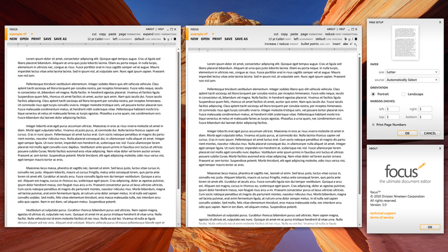
 BassUltra — Word Processor in fullscreen
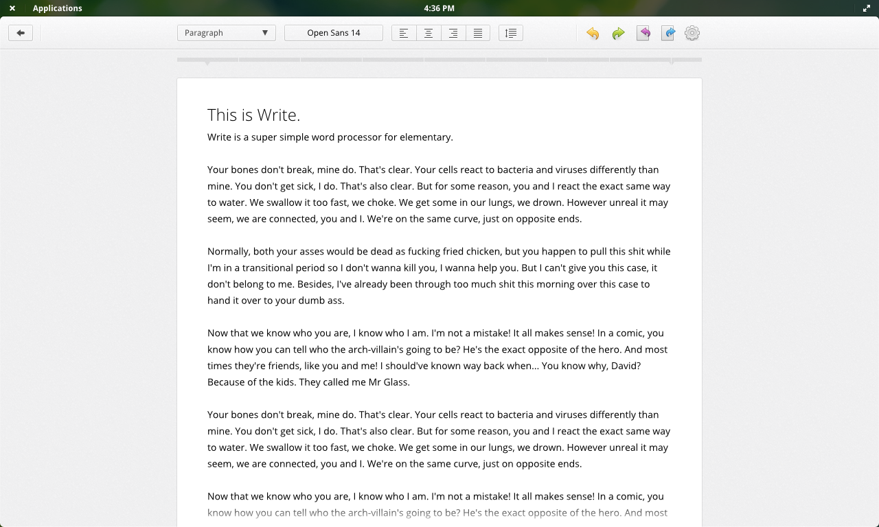
Published: 2012-11-17 21:18:54 +0000 UTC; Views: 9900; Favourites: 49; Downloads: 0
Redirect to original
Description
Concept of a simple word processor in fullscreen mode. It has a back button because its supposed to manage your docks too, a la Google Drive.Related content


Comments: 36

Do you have a PSD or something of this? And what about the menus? How will they look?
I'd like to play around a little with this design: I find it nice and clean. Well done!
👍: 0 ⏩: 1

I used inkscape to make this mockup, and I dunno if I still have the svg for this.
👍: 0 ⏩: 0

Elementary could do with a Proper Word Processor. Has there any development going on ..?
👍: 0 ⏩: 0

Just actually read the text in the document. What the hell?!?!?!
Good design though.
👍: 0 ⏩: 0

Good stuff, one question though:
Why is there a back button?
👍: 0 ⏩: 1
I wanted the word processor to manage your documents as well. The back button would bring you to that.
👍: 0 ⏩: 1


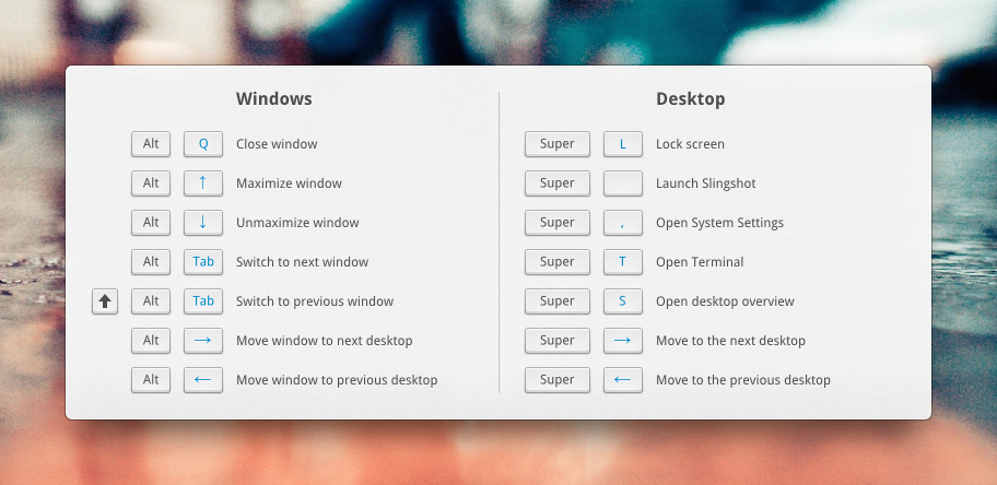
I feel that this is what should happen instead of maximising windows.
👍: 0 ⏩: 0


really nice. i wish the real elementary fullscreen mode would look like this.
just a thought: you should possibly make the arrows point towards each other in the top right icon
👍: 0 ⏩: 0

 (Smile)")


I don't know why close/maximise buttons are on the panel ! You've enough place on the App… so it's useless.
👍: 0 ⏩: 1
For Fitts' law, so that you can just toss your cursor to the corners to close/unmaximise.
👍: 0 ⏩: 1

Shouldn't top right panel icon be unmaximse?
BTW, I really love this.
👍: 0 ⏩: 0


I LOVE the implementation of full-screen windows. gorgeous!!
👍: 0 ⏩: 0

Nice mock up but where are essential word processor features like bulleted lists, formatting options like bold, underline, italic, font color there is a lot missing.
👍: 0 ⏩: 1
Those will all be in the font popover (the button with 'Open Sans 14' label)
👍: 0 ⏩: 1
Is this possible with the current possibilities in GTK3?
A popup menu when text is selected like this : [link] is also a space saving
and nice solution for formatting stuff like bold, etc.
Putting everything in the Open Sans 14 label doesn't seem logical to me and also not easy to discover.
👍: 0 ⏩: 0

I'm in love ;D
Though I'd like to see a version of this without the two concepts rolled into one (fullscreen with menubar window controls and a word processor) so as to get my head round it easier.
👍: 0 ⏩: 0

I did a similar mockup a while ago and I recall that people don't like to be stripped away from their notification bar.
👍: 0 ⏩: 1
What do you guys call it?
The notifications area on wingpanel.
I recommend stripping out the wingpanel since it really doesn't do much any more.
Here's a link to my old mockup: [link]
👍: 0 ⏩: 1
They're indicators and I just forgot to put them in. xD
👍: 0 ⏩: 0


Looks excellent!
Are the gray bars at the top a ruler?
👍: 0 ⏩: 1
Yup.
I got the idea from here: [link]
👍: 0 ⏩: 0

Love the full screen concept and the rounded corners
👍: 0 ⏩: 1

Yeah, I have to agree with you! it's skażony. I'd like to see that in Luna +1
")
👍: 0 ⏩: 0