HOME | DD
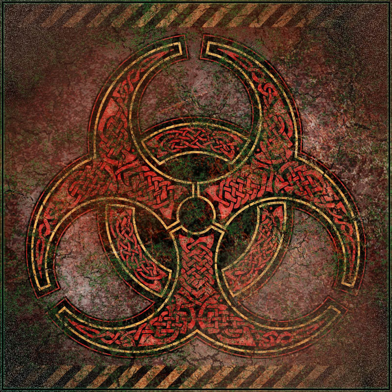
 BWS — Knotwork Biohazard Symbol
Published: 2005-08-06 15:37:31 +0000 UTC; Views: 29298; Favourites: 475; Downloads: 6849
Redirect to original
Description
This Deviation is based on a knotwork Biohazard symbol I did for a T-shirt design ([link] ) - but here I've placed it in a setting where it really seems to belong. Like on the tomb of Balor, maybe. You know, one of those ancient, cryptic inscriptions which - thirty seconds too late - is translated as "You idiot, don't even THINK about opening this!"Related content


Comments: 79

All of your knotwork just utterly astounds me! I can barely even do a four strand braid, which there's probably some official name for that I'm unaware of. 

👍: 0 ⏩: 1

Graph paper's good for repeating patterns, since you can lay out a single section that'll match up when it's repeated. That's how I used to start all my repeating borders. When I did this design I started with a traditional pattern at what I guess you'd call the base of the stem of the large sections, then did freehand knotwork to fill up the area of the design. Any time you're filling a weird shape that's pretty much what you need to do. That freehand work was done in Photoshop. I've been trying to do more of my layout digitally now, which is good in some ways.
If a design is interconnected you should not mirror it, at least not after the overlaps have been laid in - that's because mirroring the two sides of a design will interrupt the over-and-under sequence. You'll get a band that goes over, over at the join, where you want it to keep going over, under.
It's much better to rotate than to mirror. Even though the segments of this design don't connect I have rotated them, which you can see if you look carefully at the way they overlap and underlap.
Like I said, I have been trying to do more layout digitally these days, even for repeating patterns. I'm not sure it's better but it does seem to integrate better with the way I do most everything else.
👍: 0 ⏩: 1
*nods as she reads intently* Ah, so the way to do it is just draw out all the sections/strands without regard to overlap until later? I think that may be part of what's been giving me problems with trying to do any sort of knotwork. I have an odd thing about erasing, maybe because I haven't really gotten my hands on a good, quality eraser.
But thank you so much for taking the time to share all of this! It's beyond appreciated and I definately have a few things to think about and keep in mind for my next knotwork attempt, whenever that may end up being.


👍: 0 ⏩: 0

Stunning!! I like this setting better than the T-shirt. Exellent!!
👍: 0 ⏩: 0


Wow, thats amazingly detailed and yet another fav for you
-S
👍: 0 ⏩: 0


You know, one of those ancient, cryptic inscriptions which - thirty seconds too late - is translated as "You idiot, don't even THINK about opening this!"
I remember reading somewhere that the person who came up with the biohazard symbol HATES the fact that it's become a popular design for jewelry / clothing / accessories / etc., because of the potential for people who see something marked with it to not realize that it's a serious warning!
👍: 0 ⏩: 1
Well, I guess I'm doing my best to annoy this person I don't know, then  (Smile)")
👍: 0 ⏩: 1
We all do what we can. ^_~
It's his own fault for making it look cool, instead of just some dorky logo.
👍: 0 ⏩: 0

")

I love the textures. There is such an aged quality to it. It feels ancient.
👍: 0 ⏩: 0

This is pure awesomness & waaaay cooler and intimidating than the plain black 'n' yellow stickers I have in my lab. I bet this one wouldn't get ignored so often. On the other hand I'd still love to witness a story to submit to the Darwin Awards some time so I might just stick with the plain version...
 (Wink)")
👍: 0 ⏩: 0

")

awesome piece... i really like the fact that you added the caution strips. makes it look kind of post-apocalyptic.
👍: 0 ⏩: 0

sos this is what a modern nuke dumb station would look like in england had the Celts been allowed to continue in their pre-roman ways.....Awesome!
👍: 0 ⏩: 0

Excellent design! I'll have to get one of those shirts, too.
Anachronism at it's best.
👍: 0 ⏩: 0

Very cool, I really love the aged feel. Your description summed up the feel of the piece, it has an ancient discovered look.
Hmmmm, that would be a wake up call for the scientists if they disovered this in an ancient tomb, a true Kodak moment.

👍: 0 ⏩: 0


Dear Bradley:
You are a knotwork god, or if not god, then some other supreme being far above the human plane of existance, with which I congratulate you. Looking forward to more of your incredible designs in the future.
👍: 0 ⏩: 0

i like this, but I think there is too much motley green that ruins the fine detail in the symbol. too grainy
👍: 0 ⏩: 0


Terrific! Another of your outstanding works. I'm not toooooooooo jealous.
Well, okay, I am.
👍: 0 ⏩: 0

It's a nice blending of what feels like old and new. if that makes any sense?
👍: 0 ⏩: 1
This is something that always makes sense to me
👍: 0 ⏩: 1
Good thing, because I ( whoever I may be, lol) think it works!
👍: 0 ⏩: 0
<= Prev |