HOME | DD
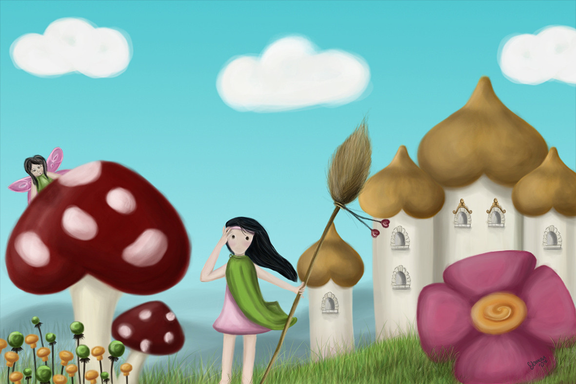
 c-osmos — Thumbelina

Published: 2011-03-31 01:47:02 +0000 UTC; Views: 4490; Favourites: 91; Downloads: 24
Redirect to original
Description
I think I worked my colors better this time, It's more colorful!Constructive comments please
 (Smile)")
Related content


Comments: 88


This could look better is you extend the artwork more so that the main subject miniature size could be well delivered.
Overall, a praise worthy job! Keep it up!
👍: 0 ⏩: 1

thank you for the constructiveness (is that a word?...)
👍: 0 ⏩: 1


")


Ohh, this is so very cute! I think the coloring is fine, and I love the coloring of the flower!
Man, it's bigger than her! xD I hope no one will step on her...
👍: 0 ⏩: 1

Lovely work! Colours are very nice, she seems to be in a land of dreams!

👍: 0 ⏩: 0


Her eyes are awesome. I really like how you drew this--she's so cute! As for critique, I'd recommend more detail. Make the grass more individualized instead of one mass. Also, if you can since she's so small, draw her fingers. Otherwise, lovely job.
👍: 0 ⏩: 1
thank you very much for the contructive comment
👍: 0 ⏩: 1

Oh my jesus, this is utterly adorable.
You made this in a very cute style, which totally works for this. The light coloring also works very well for this light and a beautiful theme.
I like like the fact that, even though you used two clashing colors in this picture, you made it work by incorporating them in multiple places. That helps direct the viewer's eyes to the entire piece and all it's wonderful details rather then one or two spots. The faded border is also a nice touch.
My only suggestion is that you should maybe add a shadow to miss Thumbelina. The rocks and flowers have shadows, but she doesn't appear to have one. Makes her almost seem ghostly, you know?
A simple, yet beautiful style.
Nice work.~
👍: 0 ⏩: 1
I appreciate your comment a whole lot, it made my day. I feel very flattered that you took the time time compliment it and tell my what I should improve, I'll definitly put your advices to work.
Millions of thanks!
👍: 0 ⏩: 0


Very cute! I think the colors could still use more contrast to clearly define light from shadow.
👍: 0 ⏩: 1
Yeah....I'm having big time trouble with that... thank you!
👍: 0 ⏩: 1
Keep at it, you'll figure it out.
👍: 0 ⏩: 0


the colors are certainly more vibrant than your past works. I for one, think it's great. Although I am a little distracted by the one line crossing over the bud on the right
👍: 0 ⏩: 2
haha! wow. ok then, now it's perfect. Keep it up
👍: 0 ⏩: 1
I can fix that
thank you very much
 (Wink)")
👍: 0 ⏩: 0
<= Prev |