HOME | DD
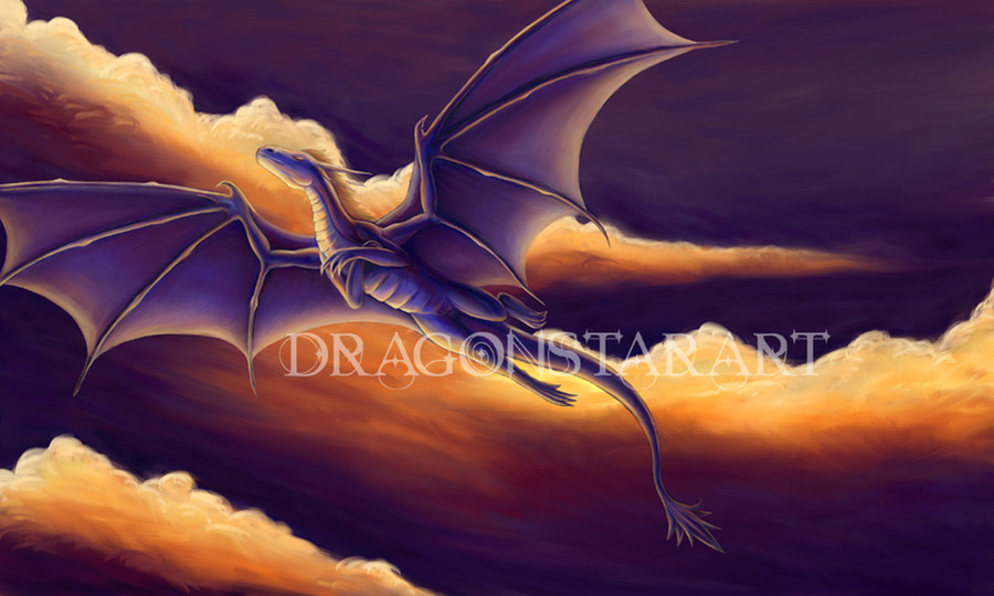
 Chromamancer — Evening Flight - Temeraire

Published: 2010-08-24 01:17:03 +0000 UTC; Views: 27621; Favourites: 1233; Downloads: 943
Redirect to original
Description
This is what I've been working on lately. A while back, I decided to use one of the backgrounds from my quick sketches, and turn it into a piece of fanart.I was having some difficulty making a sketch that I found satisfying, and I was searching for some new fantasy novels to read. I found out about Temeraire from the contest, and those books really hit the spot.
 (Smile)")
Lawrence is in there, too. If you can find him. I tried to size him appropriately.
 (Wink)")
The color scheme is one of my favorites, but it is one I have used before. The bright warm and cool colors looked much better on this picture than earthy tones. I'll have to make another one that uses those colors soon. Maybe I'll do some more speedpaints for a while.
There might be one more piece of fanart coming, too.
Buildings are one of my weak areas, but I think they turned out decently well in this one. I tried to use a bit more perspective and straighter lines. Comments and criticism are always welcome.
")
Edit: Improved building textures, using a brick texture from [link]
Download for 2225x1440 size.
Related content


Comments: 261

Must be something about the art of Ciruelo Bob Eggleton, but it can't be helped to be incredibly epic even for simpler works, and it always seems to follow your work as well. The clouds did remind of this boy here [link] almost instantly. Am I correct in my assumption they are significant influences, without any previous knowledge of what they might be?
👍: 0 ⏩: 1

I'm sure I've seen his art in all sorts of places. It looks very familiar, but he isn't actually an artist that I've been following...
The artist that first inspired me to learn was Miho Midorikawa. [link] She does a lot of concept art and illustrations for things like card games. M:tG and D&D, and have also been a large influences, I think. I always love to see things like [link]
After looking him up, I see that Ciruelo Bob Eggleton has made quite a few monster and environment designs, as well as many book covers. So, I've probably studied his art plenty of times without actually realizing who the artist was. I'll have to look into him some more.
👍: 0 ⏩: 1
Yeah that's where i missed the and, it's two different people, if you didn't catch that after.
👍: 0 ⏩: 1
I see now. I thought it was farther down.
Anyway, I just looked up Ciruelo, and found some other art that I recognize.
I'll have to look through some of the things that both of them have made again now.
👍: 0 ⏩: 0

Thank you.
I'm rather happy with how it turned out.
👍: 0 ⏩: 0

You even added the gold chain and platinum pendant!! Beautiful!
👍: 0 ⏩: 1
Thank you, I'm glad you enjoy it.
I had to get the pendant in there.
👍: 0 ⏩: 1
What do you mean by that?
👍: 0 ⏩: 1
I like adding those sorts of details. If I left out things like the pendant and the blueish spots on the wings, it might not look much like Temeraire.
Sometimes the small details are just as important as the large ones.
👍: 0 ⏩: 1

hi
well.. I don't see much of the texture... be more rough! take some grungy-texture and lay it over some parts of the stones and then the same again with another grunge texture on other parts
the sky is really awesome
I see you've used the rimlines
but what is really important, is that not every object reflects the light on 100%.. think about it
The rimlines of the rocks need disturbances.. they are a bit too.. mountainlike imo
and one last thing:
take the dragon and put him into a forest (in mind / imagination)
would someone get, that this dragon used to be on a very bright place ?
(now only talking about light influence on the dragon)
greetings
👍: 0 ⏩: 1
Hello.
Thanks for the advice. I see what you're talking about, especially with the rocks.
I think I'm going to try to use some more texture.
Coloring the dragon was a bit tough in this case, because Temeraire is a black dragon. So, I tried to make him look the part. Black and white dragons usually give me difficulties, because it's easy to mess up the lighting, even in grayscale.
Thanks again for the helpful comment!
👍: 0 ⏩: 1
hey,
not only more texture but also more rough texture for the rocks
yeah you are right, well.. a black dragon.. hmm
I would say just white highlights and darkblue around the highlights, know what I mean?
because this dragon has no shading at all kinda
And no problem mate. I am happy, that someone learns out of my comments instead of crying about one comment that is not like "wow, great work" or "cool" or "like it".
Because this only shows you that you have skill, but that doesn't helps you to improve yourself.
And we artists know, that you are never good enough ;]
👍: 0 ⏩: 1
Indeed!
Every time I learn a little, it always seems like it opens up more possible techniques and paths.
That is one way to shade a black dragon that might turn out quite well. That's quite a good idea.
Texture is definitely one area that I need to work on. I tend to struggle with it.
I've just taken the time to learn how to make brushes in Photoshop, and apply texture to the brushes, so I'm hoping that using a few different ones while shading and sketching will help add a bit more texture to my art, in general.
I always suggestions and critique like this, because it shows me different ways that I can look at my art, and helps me learn new methods. I think critique like this has really helped me develop as an artist.
👍: 0 ⏩: 1
Heh,
yeah
I think creating brushes is unnecessary.. there are a lot of brush sets of great artists which include nearly everything you can imagine.
Well.. I know it's hard.. but you should try to create a focus with working more rough where no one pays attention to
greetz
stryke
👍: 0 ⏩: 0

Love the bg and soft shades-The only thing that bugs me is the left wing that juts out instead of folding or spreading behing the body rather than infront of it. But again great pic and awsome castle work !
👍: 0 ⏩: 1
Thank you. I tried to balance out the lighting and color in the background, so it's good to hear that it turned out well.
I see what you're talking about there, too. I'll make sure to do some extra sketching when defining the anatomy in my next picture. I've had minor errors in this one, and the quicker piece I made right after this, so it gives me a rather good idea of some things that I need to work on. Thanks again. Your comments have been very helpful.
👍: 0 ⏩: 1
Sorry for the late reply but no prob your very welcome! I love how you take soo much time into your bgs and charas its very refreshing
👍: 0 ⏩: 0

I love this series so much <3 I need to get the later books! But anyways you really did a great job.
👍: 0 ⏩: 1
Thank you. I'm glad to hear that I did them justice.
I need to get the next few books, as well. I've only read the first three so far.
👍: 0 ⏩: 0

Devious Rating
Vision:
Originality:
Technique:
Impact:
Ok, so the vision of the art was brilliant, you can clearly see the dragon and the landscape.(as well as Lawrence) The background though could've been improved on, detail wise.
No matter wheather it's fan fiction or completly made up, you always find a way to make your art original. That is something very important for any artist, and you've mastered it
Chroma, I know, you could done better with the details, the clouds could be more soild, and the ground could've had either the grass or rocky details in the terrain. Like in your Authority or Respite art works. Aaanyway, the rest of image was done with care and I love how you made the dragon so life-like, not 2 mention how you also scaled it to size.
Woah, it sure did impact a lot. The whole scene with the dragon is so, well it for some reason dramatic, because there's the dragon looking over the land with Lawrence, while there are all the hills and moutains in the background, thatr just make it look somewhat dramatic. The castle/fort, and walls give it a fantasy veiw, that's another one of your mastered skills. Some times having a themed colour is really breath taking, but also some times, using various colours can be just as good.
:sweat:Errr, sorry there's over 200 words. I hope the critique wasn't 2 critising, but you know how improvements can happen
So, great job Chroma, hope this helps towards your art improvement.
The Artist thought this was FAIR


👍: 0 ⏩: 1
I don't mind it if you use more words.
This was quite helpful.
I'll be trying a few epic pieces of art for that calendar project soon, so I'll try to put extra care into the background details, and take those points into account. I'll continue to do my best to learn and improve.
Hopefully, I'll be able to improve by a similar margin over the next year.
👍: 0 ⏩: 1
'Cause you'll be a world-wide known artist some day
I'm sure your calender will be awesome.
Wow, 2 see your art improve, will be a beautiful sight.
Yeah, I still hope it wasn't too critising.

👍: 0 ⏩: 0

No too beautiful for my eyes to see! But I’m going to staring at it anyways XD Love the dragons and it’s wings. The buildings are amazing, then again all your art is amazing
👍: 0 ⏩: 1
Thank you. It's good to hear that.
I think these are probably the best buildings I've made. I'm quite happy with how this one turned out.
👍: 0 ⏩: 0


Thanks. I'm glad you like it.
Epic is what I aim for.
👍: 0 ⏩: 1

lol I've been trying to learn how to us my art program for a long time

👍: 0 ⏩: 0

Stunning. Absolutely stunning.
👍: 0 ⏩: 1

It's an amazingly beautiful piece and yes I can see the itty bitty Lawrence there.
👍: 0 ⏩: 1
Thank you.
I tried to size him right, relative to Temeraire and the landscape.
👍: 0 ⏩: 1
You're most welcome.
I think you managed quite well; since we can only just see him which is what one would expect from this distance.
👍: 0 ⏩: 0

Thank you for absolutely wonderful art. Set as wallpaper.
Just amazing!
👍: 0 ⏩: 1
You're welcome.
Thank you for following my art. It's an honor to hear that you're using this one as your wallpaper.
👍: 0 ⏩: 1
I think this is the best wallpaper I've ever had!
Thank you!
👍: 0 ⏩: 0

two words: AWESME, BEAUTIFUL!

👍: 0 ⏩: 1
Thank you.
I'm glad you like it.
👍: 0 ⏩: 0

Amazing art. I hope you enter into the Temeraire art contest with that.
I finished the 6th book recently. Sadly imo the weakest of the series. And it will take another year for the next book to come out.
👍: 0 ⏩: 1
Thank you. I did.
I heard about the series from the fanart contest, actually. So, I decided to read a few, and they were quite good, so I decided to enter.
On average, I think they tend to leave a few things hanging for the next book, rather than wrap up the ending completely. That's not a bad thing, as long as there are more books to read, but I assume it is a bit annoying when you're all caught up.
👍: 0 ⏩: 1
Then I wish you good look.
The problem with the 6th book is in my opinion that Laurence/Temeraire are separated from pretty much all established characters except one and it doesn't look like they will be reunited soon. And at least for me the characters and the interaction with each other are the best things in the books.
Also, the plot become a bit too widespread and modern for my taste.
Well, 1 year or more till the next book. I just fear that it will introduce yet another location with even more loose threads. "Crucible of Gold" sounds a bit like they will visit the Inca.
👍: 0 ⏩: 0

Pretty, and very very nice. I rather love the colours.
👍: 0 ⏩: 1

Love it! ♥
Set as wallpaper!
[link]
👍: 0 ⏩: 1
I'm glad you like it.
It's an honor to see it as a wallpaper.
👍: 0 ⏩: 0
<= Prev | | Next =>