HOME | DD
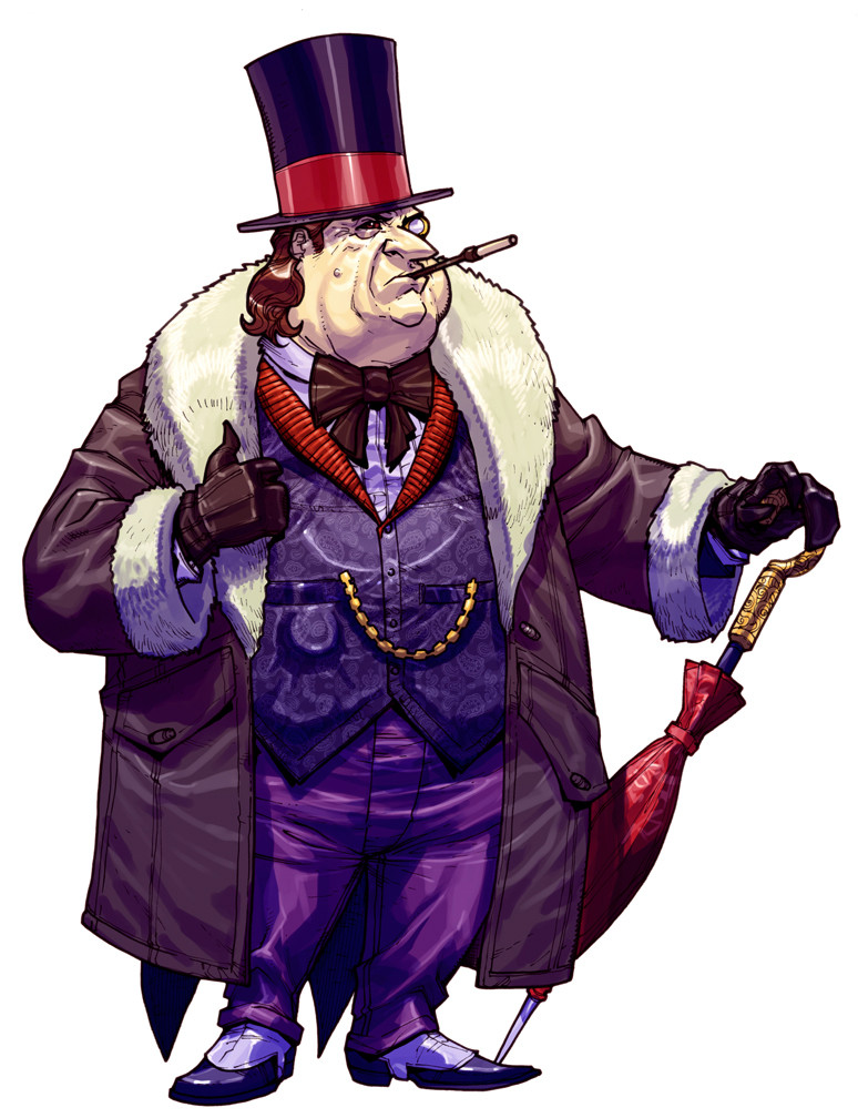
 Chuckdee — Arkham Asylum: Penguin
Published: 2011-05-14 01:16:43 +0000 UTC; Views: 37098; Favourites: 887; Downloads: 3939
Redirect to original
Description
this bastard is always fun to draw... he's such a caricature, BUT an eeeevil one! (Smile)") ...I tried to dress him as 'pimp' as possible while still looking kinda' 1950's... in hindsight, I should have pushed it a bit more... oh well!
...I tried to dress him as 'pimp' as possible while still looking kinda' 1950's... in hindsight, I should have pushed it a bit more... oh well!
Related content


Comments: 65

i like your drawings, can you do this whitout the color
👍: 0 ⏩: 0

This version of the Penguin looks like Bruno Pressack, the mayor from Bibi Blocksberg/Benjamin Blümchen, and nothing like the arkhamverse Penguin.
👍: 1 ⏩: 0

The Penguin was always an odd case for me. I loved the design of the Danny Devito version but felt that his character was a little too raunchy and unsympathetic. Wheras I liked the comics suave and gentlemen like atitude and personality but felt the design was a little bland.
So whenever I see someone blend both aspects, it's practically the best of both worlds for me. It's also why I loved Batman TAS's version of the Penguin.
I might even prefer this design over Batman TAS's version, since it's a lot more colorful.
Overall, great job.
👍: 1 ⏩: 0

you did it perfectly just one thing though... his hands its hard to tell since hes wearing gloves but does he have regular hand or the cool flipper hands like the kind danny devito had because from what i can see it looks like the latter
👍: 0 ⏩: 1

I like the idea of the deformed hands, I think I did this one with that in mind!
👍: 0 ⏩: 1
awesome and if you ever meet artist tim sale tell him its cool the way he draws penguin like that too
👍: 1 ⏩: 0


Why was this design not used in Arkham City??? It was perfect!
👍: 1 ⏩: 1
if you look at the final design in the game, it's fairly similar, the main difference was the broken bottle as a monocle (which I thought was GENIUS!!!) and instead of the bow tie, he's wearing a scarf (ascot?) in the game, other than that, it's pretty much the same!
👍: 0 ⏩: 1

Wish they kept the Top Hat, though.
👍: 1 ⏩: 1

that is a awesome peguin, would have love to have fought him in arkham city
👍: 1 ⏩: 0

")


just so you know, this concept of the penguin is what got me into the batman franchise in the first place
i was playing arkham asylum at a friend's house, saw this art when i got the riddle that opened up his profile, and simply fell in love
i've been a rapid batman (er, well, penguin) fan ever since
cobblepot for mayor, waugh waugh waugh! *shakes tailfeathers*
👍: 0 ⏩: 1
thank you very much, ur TOO kind!
👍: 0 ⏩: 0


Oddly enough, every time I look at this image I remember the Burton/Keaton/DeVito Batman Returns movie and how DeVito was portraying Penguin as a character who pulled himself up by his own bootstraps to become something stronger. There's something about your version here that would make the average passerby in Gotham take one look at this guy on the sidewalk and realize he's not to be pitied or treated with disrespect anymore. Good work!
👍: 0 ⏩: 0

I do like this design but I prefer the one in Arkham City, the explanations for his accent and monocle are superb.
👍: 0 ⏩: 1

👍: 0 ⏩: 0

it's fairly similar to this I think... there are some tweaks here and there, but I think it's kinda' sorta close to this, isn't it??
👍: 0 ⏩: 0
ozzy is the best, and i'm so excited that he's in arkham city, considering he's easily my favorite batman villain ever
wish they had used your design more for him in the actual game, but i remember getting so excited when i got this bio in arkham asylum XD i squealed with fangirl joy
👍: 1 ⏩: 0

The face and the expression are the best.
Anyone who never saw Oswald would know one thing or two just looking to his face. Absolutely fantastic.
👍: 0 ⏩: 0

Awesome stuff, as per usual. Loved all your designs in the game (for bios, and of course, the final ones that made it into the final product), especially Joker, Scarecrow, and Penguin's bio picture. You probably aren't at liberty to discuss Penguin's final design for Arkham City (despite the fact it's pretty much out in the open, at this point), but if you are, I'd just like to say: he looks great, you've once again done justice to one of my favorite characters. He seems like a fairly radical departure from this image, though. Was that more your aesthetic choice, or the developers', if you don't mind me asking?
👍: 0 ⏩: 0


Faaabulous! Lovin the highlights and shadows. He looks so badass like this. B)
👍: 0 ⏩: 0

I've been meaning to ask, did you draw multiple portraits/bio images for the characters and the devs just picked the ones the liked the most for the biographies, or did you draw the bio images we see in the game first and didn't have to make more? I'm hoping the question makes sense.
👍: 0 ⏩: 1
Rocksteady and WB asked me to do a number of the bio-images for the game, so I knew what their purpose was
👍: 0 ⏩: 1
When you have the time or when you find the files, will you also upload the ones you weren't too happy with? I'm pretty sure a lot of fans (me included with love to see the other pieces as well. Either way, keep doing what you're doing. Your work is awesome.
👍: 0 ⏩: 1
hell no, I am burning those and sending them to the bottom of the ocean!!! hahaha, I'll put 'em up, even if they are my bastard children!
👍: 0 ⏩: 0


I absolutely love his costume but maybe the colours of his suit might resemble the Jokers a bit too much? idk i'm just trying to make some constructive criticism.. But I do really like the combination of red and purple
👍: 0 ⏩: 1
constructive criticism is always welcome!
👍: 0 ⏩: 0

Looks like danny devito! great effect on the colors of the vest.
👍: 0 ⏩: 0


God you do detail so well. The pattern on his vest, the fur on his coat, the outline of his pocket watch. . !

👍: 0 ⏩: 0


Wow, looks great! I especially love the way you've colored the clothes. And yes, Mister Cobblepot is always a fun one to draw
👍: 0 ⏩: 0

")


| Next =>