HOME | DD
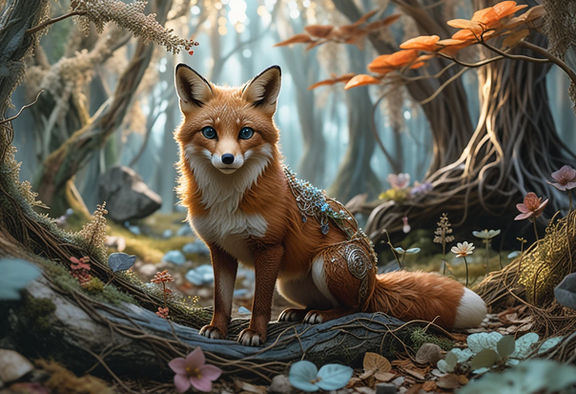
 CodeFly — Fox in a Forest

Published: 2013-04-10 21:30:00 +0000 UTC; Views: 224; Favourites: 4; Downloads: 3
Redirect to original
Description
Update: Sharpened and re-balanced the colors based on the suggestions from *Silvixen . Reload the page to see the changes... it's like a piece of muddy green glass has been removed from the picture.After watching Johis (=Lhuin ) paint on livestream, I had the urge to try making something realistic.
I actually only spent about 4 hours on this one. I painted it in black and white, and then added color and leafy glow effects afterward.
Once you learn to paint, this stuff really isn't as hard as it looks like. I feel that painting is actually easier (and much faster) than making inked drawings. That said, my art still tends to be a little bit blurry if not reduced this far.
Related content
Comments: 11

Wow, this does look really realistic. Looking at your older work and comparing, there's already a drastic improvement. [link] Haha it's funny... I'm not sure if you made this realistic fax off of that deviation that you submitted previously, but it looks like an improved version of the fox! I guess if I could put my 2 cents in, there are tons of fur brushes out there for free download here on dA. I used them in [link] and it looked a lot better than my initial drawing, which was just gonna be flat color. But the fox's fur still looks great. Maybe you could have made his eye smaller. Or maybe that's how foxes normally look. I DUNNO
👍: 0 ⏩: 1

Yeah, I realized it looked like the other picture after the fact. XD
I wanted to learn to paint well using regular brushes before learning to use special ones. I watched both Rukis and Johis (on FA) make AMAZING fur detail with just the default circles and/or a comb made from a few circles placed side-by-side, so I knew it could be done!
Also, I was never able to achieve a result I liked with the fur brushes.. they tend to be a bit confusing. I bet they work really well IF you know what you're doing, though. Right now I'm more about learning to paint well overall than simply making a pretty picture with perfect-looking fur, so I'm sticking to the basics of my toolset as much as possible.
About the eye, I think I actually mis-positioned it... it's too low on the head.
👍: 0 ⏩: 1

I see 
👍: 0 ⏩: 0

Ooh ooh one more thing that I didn't do but would look good. The cheek fluff seems to blend into the neck rather than stick out like on an actual fox. The shading is there and in the right place but around where the white meets the red it seems to vanish which makes all the fur blend into one. Always remember to shade like there's been absolutely no colour change whatsoever. On a real animal the markings do not (often) effect the fur length or direction so the shading should be consistent as if it's all the one colour.
Aaaand I'm done whining. This is still very epic.
👍: 0 ⏩: 1

Thanks for the suggestions... when I compare the new version against the old one, it's like a piece of muddy green glass has been removed from the image. I re-did the adjustments myself so I could learn how to do it, and I was even able to get rid of the excess glow without destroying the sharpness (I just painted it out using a layer mask on a sharpened copy of the image). Mine ended up a little bit blue-er than yours, and yours still has better contrast, but it still looks an order of magnitude better than the original. (I still can't figure out how to color balance effectively... I think I removed green from midtones and added blue to shadows)
👍: 0 ⏩: 1

Very cute!
I have some advice for you. I took this image (sorry) and played with it in photoshop for about 30 seconds... literally that's all. This is what I came up with: [link]
If you like the difference this is how I did it so fast. First I applied a sharpness filter. Using 'paint daubs' with the brush size turned right down and the sharpness at a smallish number (adjust til you get it right) will bring our the edges (see the little light highlight above the ear that pulls the fox forward a bit in the image?) and highlight the fur and eyes. It's also great for pieces with line art. I've used it twice now and I find it's worked for me perfectly both times. Then I used levels to bump up the contract just a little. I figured the whites in this image needed a bit of a boost. That's the trap you can get into with starting in greyscale. It can leave the image very neutral and flat rather than bold and colourful (unless that's what you want). Finally I went to the 'Colour Balance' slides. By adjusting the balance for the whole image you don't take the character/s away from the background because all the colours change accordingly. I added a bit of extra red and dark blue which really highlighted the fox and made the trees in the back more noticeable.
Basically use the tools photoshop gives you when given the chance. They're there for a reason
I hope I helped and didn't just steal your picture and destroy it.
👍: 0 ⏩: 2

I really like both the sharpening and the brightening and everything else, with the exception of the "over-filtered" glow it creates around his ears and nose. Then again, maybe I could just place the filtered image on top of the non-filtered one and simply erase out the bad parts?
It was supposed to be a shadowey forest (which is why he is very green and the shadows are splotchy), but I think I like your version better anyway.
👍: 0 ⏩: 1

The glow would be avoided or rather less obvious on a larger image. Because this is so shrunk down there was little I could do about it without simply painting over it. I wasn't that dedicated to the process.
👍: 0 ⏩: 0
