HOME | DD
 CrabTasterMan — Red + Yellow Funky Dragoon
by-nc-sa
CrabTasterMan — Red + Yellow Funky Dragoon
by-nc-sa

Published: 2007-03-18 14:57:52 +0000 UTC; Views: 8090; Favourites: 87; Downloads: 134
Redirect to original
Description
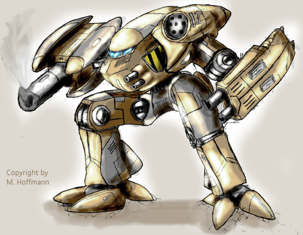
Red and Yellow Dragoon! I colored my picture in [link] here so now it has color. This is my first complete attempt at coloring something I penciled! Yays!I used a new way to shade and highlight in this picture. I color all the basic tones in one layer, and do another "shadows and highlights" layer on top of that. Then I use low opacity White for reflecting lights, like the leg on the front, and then use low opacity black for dark shadowy places! Its so much more useful than directly applying darker brown or something directly onto the basic tones layer! How do you shade and highlight your pictures? Tell me!
Related content


Comments: 73


awesome work. It looks like you got all the mechanics spot on, and the pose is pretty cool.
I color mine basically the same way, only with separate layers for shades and highlights.
the Dragoons were so badass in the cutscenes.
👍: 0 ⏩: 1

Yar! The terrans really had a problem with assessing their futility in the face of the zenith of protoss warfare! Recall + Goons = splizzjism of photon doom!
👍: 0 ⏩: 1
yeah really lol
marine: spotted one. I think its hurt...
Arbiter: (uncloaks massive dragoon army) *snigger*
👍: 0 ⏩: 0

Hey. It´s very good. I love that mechanic designs. Nice work
👍: 0 ⏩: 0


hm... they say Dragoons will disappear in SC2? so it may be one of the last great drawings of it
perspective doesn't work good here, IMO. nice, clean style and overall look
 (Smile)")
👍: 0 ⏩: 2
his rear legs are a bit "rotated" compared to the main part and front legs. you should lean them to the right slightly
👍: 0 ⏩: 0
.......perspective... everyone hates it.... so... what part should i do to make people perk their thumbs up high?
👍: 0 ⏩: 0


Great work! There isn't all that much StarCraft art here on dA - particularly Dragoons. Kudos!
👍: 0 ⏩: 1
THANKS! Hey, do YOU have any Starcraft fanart?
👍: 0 ⏩: 1
Yeah! So far only two though... I normally play as Protoss when on B.net, but I could never really draw them.
[link]
[link]
👍: 0 ⏩: 0

Sorry for multipost, bad dA.
👍: 0 ⏩: 0
I... well... i dunno. I like seeing new stuff but i am expecting the gameplay to be different from SC BroodWar... It probably doesnt appeal as much to old fans than the new fans of the Starcraft Universe... I wish it were the old SC creators making SC2, not commercialist WarCraft3 employees.... once again, THIS IS NOT WARCRAFT IN SPACE AND IT SHOULDNT BE!! ONLY MAKERS OF SC CAN MAKE SC2!!!
👍: 0 ⏩: 0

Wow, commenting late, yes, but...a great way to shade pictures, which is more realistic than low opacity black, is set your paintbrush to low opacity and use a dark shade of the opposite of whatever color you're shading. (blue/orange, red/green, purple/yellow). In reality, black rarely occurs naturally; even shadows on your skin have a bluish tone to them (as skin has a strong yellow-orange base tone). So here, shading the yellow dragoon metal with dark purple, then overlaying with maybe a little dark brown, would make for better shadows than the black. White is always good for brilliant highlights; you generally have the highlight idea going here. Shift your colors a little when doing so, such as highlighting red with maybe a pale orange-red or even just orange, because things tend to have multiple color tones in them.
Nevertheless! Awesome mechanical drawing! I can't draw machines for crap. The details here are very awesome; love the pose; it all comes together very nicely.
I want to see more of this.
👍: 0 ⏩: 1
Thanks! that was really helpful. I was confused when a lot of artists put coloring tutorials where they'd put a shade of any wacky color but black on their pictures, and i was confused. Thank you for clearing that up!
👍: 0 ⏩: 1
No problem.
MORE STARCRAFT ART DARN YOU.
^_^
👍: 0 ⏩: 1
Yeah, I'm interested in the Protoss Tempest now. But SC is going a bit too far and liberal on unit designs, I dont feel at home anymore with those races looking like something way to colorful from StarWars.
👍: 0 ⏩: 1
I'm a little miffed at how mechanized the Protoss are -- back in the day, we had Zealots, Dark Templar, High Templar, and their respective Archons as major ground units. Dragoons and Reavers were the only major mechanical ground units, unless I'm missing something. Now, we have two kinds of Dragoon parallels, Colossus, and so forth. Darnit.
The Zerg changes should be intriguing.
👍: 0 ⏩: 0

I kinda do that too. Although... my shade layer's on multiply nd I just apply low opacity black brush strokes for the shading. Then my Highlight's on normal with low opacity whites.
Anyways, that's awesome dood. Way to draw em dragoons! What drew me was the awesome detail. Where'd you get reference for that (hasn't actually looked yet XD (Wink)")
👍: 0 ⏩: 1
reference: [link]
yeah but now i manually choose my different tones of colors now. i vary my paintbrush, deviating from the basic colors i used for the 1st stage coloring. multiply the shadow layer? That is a good idea! I'm so stupid i have not thought it. ")
👍: 0 ⏩: 1
lol, glad it helped a little. 
👍: 0 ⏩: 0


Hey, back alive again?!
* I go Check your gallery*

👍: 0 ⏩: 0


The red and yellows set it off nicely. I also love the pose, it looks like it's coming right at someone! ")
Man, to think I still play that... Ahh... happy days...

👍: 0 ⏩: 1
Heehee, thats the half attempt at a crosssection of a dragoon's foreleg. It was done for Starcraft Encyclopedia artwork.
👍: 0 ⏩: 1
Ahh... Starcraft. Now THERE'S a classic!
👍: 0 ⏩: 0

Looks good. The mechanical detailings looks pretty nice as well.
Anyway, a tablet helps but I've found it's not a "be-all, end-all." It's just another tool in the toolbox that's really not better or worse than anything else (well, it's better than trying to draw with a mouse). Most of my coloration-work was done pre-tablet with a mouse. I haven't done anything recently with my tablet that's on 
The way I color is: I first create a clean line-art layer. The easy way to do this is to adjust levels or brightness/contrast until the paper tone and gray tone goes away, then change the layer to Multiply. What I do is (after levels adjustment) go into Channels, make a new one, then COMMAND+click an RGB layer (on a PC it's probably Alt or something). What this does, or is supposed to do, is create a selection pane that selects all the white of your drawing. So you go into SELECTION from your tool menu and choose INVERT, and you've selected all your line/pencil/pen/whatever.
Anyway, going back to LAYERS tab, I make a new layer (with the same selection) and do a FILL in black.
Viola, pure line. Not really necessary, but I does it that way.
Anyway, from there I create a BACKGROUND layer, for the background obviously, and usually make it some weird color like lime green for the coloration process. That way I won't accidentally miss coloring stuff during the solid color process (like forget to color the white of the eyes if the background is white) and generally won't miss any accidental holes either.
Then I make a SOLID COLOR layer, keep it at normal, and just color from there in flats. Sometime during this part I make a PALETTE layer and put it at the very top, so I can EYEDROPPER pure colors from quick messy palette brush-strokes.
When that's done, I make a SHADOWS layer, and set it to multiply, and then use the same colors that I did for the solid color layer, using the palette layer. Multiply will darken anything underneath it, generally speaking. Most of the time this works, sometimes (like with skin tones) it doesn't really work that well, so then I use a kind of light to mid gray color instead.
After that, I make a HIGHLIGHTS layer and set that to Screen. It's like the opposite of multiply, and it'll brighten everything, generally speaking.
Oh, I forgot. Most of my shadow/highlights is on a softest edged brush at like 2-15% flow, depending on what I'm doing.
Anyway, at that point if I want to make the picture more contrasty I add a DEEP SHADOWS and ULTRAHIGHLIGHTS layers that are the same as the shadows and highlights (multiply/screen) and just go over those again.
Then at this point I typically go back into the BACKGROUND layer and adjust it accordingly.
I find the biggest help for the coloring process is an idea of how light and color works, more than any fancy tools or gimmicks. I got most of the information from my art education.
Hope that helps.
👍: 0 ⏩: 1
Thanks for the really detailed really helpful critique! I havent had one of these for quite a long long time now...
👍: 0 ⏩: 0

so thats how they look like up close. whats your reference?
👍: 0 ⏩: 2
oops, sorry wrong link for the second link i gave you. This is the correct link:
[link]
👍: 0 ⏩: 0
[link]
Some damn good Technobabble stuff they make for STarcraft units. And some of the artwork this person used on the site for units like the protoss probe, are using some unique stylish art. Go checkit out at:
[link]
👍: 0 ⏩: 1
awesome. where does HE get his inspiration? is there an official blizzard picture release for close ups of all the units?
👍: 0 ⏩: 1
The dragoon 3d render is official release of a dragoon picture.
👍: 0 ⏩: 0

Wow. This Goon is so gorgy!
I hate shading, and I'm not too into Tossers, but it's really nice! Genius!
👍: 0 ⏩: 0

Salve:

En Taro Adun
👍: 0 ⏩: 1
I'll templar up the next colored image yo.
👍: 0 ⏩: 0

wow ur like my hero now lol... +fav of course but dam...its owns so hard and its a drawing on sc ")
👍: 0 ⏩: 0

looks pretty awesome to me, always wanted to draw a dragoon by msyself but didnt found the time yet.
👍: 0 ⏩: 0
| Next =>