HOME | DD
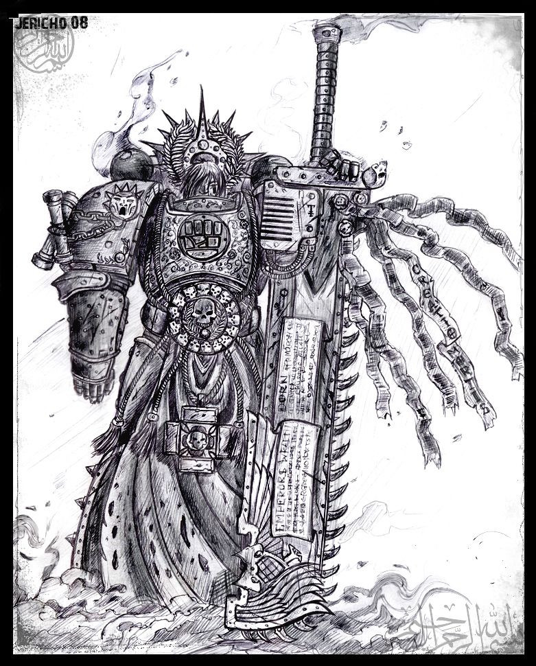
 cyphercodicer2 — Black Templar knight ink

Published: 2005-10-30 03:56:56 +0000 UTC; Views: 14478; Favourites: 153; Downloads: 1838
Redirect to original
Description
hey, first stages of inks, waiting for the copic markers so i can do further work on the background and such....hope you all like it!!
Related content


Comments: 39


I've Colored him as practice to get used to working with photoshop again. Enjoy. Credit's all yours of course. not 100% done but like, 80-90%
[link]
👍: 0 ⏩: 0


This one is purely amazing. I could use all my "prise" English vocab and probably I wouldn't be able to express how great it is. So detailed... So fantastic! The essence of Warhammer.
👍: 0 ⏩: 0

A great masterpiece, THe lines, the details, the perspective, Oh so wonderful
Keep them coming, you're doing a great work!
Also going to my faves
👍: 0 ⏩: 0

That's quite positively the most awesome thing I have ever seen in my life. I still need to learn texturing and detail, so that my drawings have the chipped, dented look of that guy's armor.
👍: 0 ⏩: 0


Very beautiful, the design is sleek and sexy, also I quite like the banner in the background, it adds depth to the character.
A question if I may though?
I notice on a lot of Warhammer40K art that members of the Imperium *huzzah!* wear those red insignia, what exactly are those?
*note: If it isn't obvious yet , yes I am a novice in the world of WH40K
👍: 0 ⏩: 1

cheers hey!!  (Smile)")
👍: 0 ⏩: 1
Ah! I see, sort of like little devotion bonuses to show your extraordinary loyalty to the Emperor, he he, neat
Thank you very much for answering my question!
Can't wait to see more of your art
*goes off to join the Adepta Sororitas*

👍: 0 ⏩: 0

Ze details! My god! Ze details!
That must've been a pain to do, but it sure gives it an awesome result!
Good luck on coloring it, I can't wait to see that done!
👍: 0 ⏩: 0

I always liked the Black Templars for the Knight looks, though I still like my Dark Angels.I love the helmet and sword/shield. Beware of the future Knights, the Adeptus Astartes.
👍: 0 ⏩: 0


so wow it's very Impressive it like from a kind of warhammer i like your work
👍: 0 ⏩: 0

And in the category of (hopefully) constructive criticism (believe me I'm not trying to bag on you):
The sky's a little funky, perhaps a bit too regular and uniform. Watch the debris on ground. I'd try to mute it a bit so that it doesn't distract from the figure. There's a lot going on down there, particularly in the lower left where the dead marine gets a bit muddled in with the cloak. I think the cloak, tabard and banner are fine as they are as it let's you show off the heraldry, but realistically they may be blowing around just a bit more given what's going on with the purity seals and banners in the background.
Just trying to help, hope I haven't overstepped myself here. It really is a fine piece.
👍: 0 ⏩: 1
cheers hey, yeah those points are good thankyou, i did look at the sky, and i will be attempting to do something about it when my copics arrive and perhaps a blur on photoshop, just to destroy the edges, plus counting on the fact i downloaded a whole bunch of different brushes for clouds and so forth from the net.
with the banner and such, when i was doing them i was thinking along the lines of paper being thinner than say... weighted curtains, paper is going to flap around much more than heavy cloth...
and from a tactical point of view,... its hard to snap off a shot when your cape and loin cloth are flapping around you.... lol
but no you have not over stepped your mark at all, thankyou for your critique!!!
ET
 (Wink)")
👍: 0 ⏩: 0

looks gfreat now i have a greater urge to get the crusader spreu with some brettonia bits
👍: 0 ⏩: 1
lol, so many possiblities....
as i may have said before, many people look upon the space marines as too uniform, too constricted in what you can do with them... i hope i prove a point that with all my models and drawings, they are maintining the constraints that have been laid out but are showing in fact that each marine is their own person...
ET
👍: 0 ⏩: 1
it's so true
people need to read more of the great novels
👍: 0 ⏩: 1
for instance the Uriel Ventris trilogy and Ragnar Blackmane series....
best novels ever in my opinion, coming second is the Soul Drinkers series and for books that are rather funny to read (Warhammer 40k bineg funny??!! shock horror) the ciaphas cain novels
👍: 0 ⏩: 1
and i am a huge ragnar fan
")
👍: 0 ⏩: 0
Nice work. Your like art is improving by leaps and bounds.
👍: 0 ⏩: 2
lol, know that feeling and thankyou!!
working 50+ hours a week can be a bit draining!!!
👍: 0 ⏩: 0
feh, I'm sleepy, I mean "line art" of course.
👍: 0 ⏩: 0

Diggin it...did you decide to kill the script on the sword or are you just gonna color it in?
P.S. Assault termies next week w00t
👍: 0 ⏩: 1
cheers hey, no the script will be worked into it, just finding the right devotional latin to draw on it!!
i know, i have the codex templars on advance order, and will be looking at buying either the scouts or the termis!!
👍: 0 ⏩: 1

I've said it before and i'll say it again... WOW!!

👍: 0 ⏩: 1

Very Very Impressive!
I'm itching for the new Black Templars now.
👍: 0 ⏩: 0
Arrow-WS [2005-10-30 09:58:13 +0000 UTC]
woah, that's some awesome detail you've put in there!

👍: 0 ⏩: 0

Very nice. Has a less cartoony feel than some of your previous works.
👍: 0 ⏩: 0
Shimpaii [2005-10-30 09:32:01 +0000 UTC]
Absolutely beautiful. Excellent attention to detail! keep up the good work!
👍: 0 ⏩: 0

awesome pic! I was looking at the cocept art for the new black templars and now i see this!!! awesome stuff! good job
👍: 0 ⏩: 0

wow man, I am seriously impressed. This guy puts your early work to shame, and much of mine as well. truly amazing amount of detailo especially with the battle damage and the purity seals. the broken equiptmen at his feet is also very cool. All in all, extremely impressive.
👍: 0 ⏩: 1
cheers man, yeah i did the inking on this one at a 12 hour shift where i was by myself... i had to keep the mind occupied.
when i get my copics over from the states i will be doing the shading and the background, then it shall be coloured on the comp!!!
👍: 0 ⏩: 0