HOME | DD
 DanielaIvanova — Portrait for Rainylake
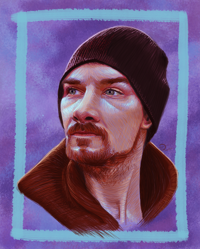
#beanie #beard #brown #brush #cyan #digitalart #digitalpainting #handsome #hat #intuos #man #moustache #orange #painting #photo #photoshop #portrait #purple #red #study #tablet #texture #photoshopcc2017
Published: 2018-01-27 18:46:27 +0000 UTC; Views: 3791; Favourites: 187; Downloads: 0
Redirect to original
Description
The second portrait from my 300 watchers portrait giveaway. This one was done for Kathy based on this photo: Forest AdventuresCheck out some of her other gorgeous work:
Thank you for participating and for supporting my work!

------------------------
Painted in PS CC2017, 4-5 hours, one layer, pencil brush.
Process here
This was super fun to draw. It's my first time painting something semi-transparent and I love the look - both the texture and the "paper" peeking from underneath. Again, no overpainting and color picking so I consider it a success.
If you like this check out the other two portraits:
Related content


Comments: 54


Hello! I’m here from with some constructive criticism.
First of all, I like the way the man in the portrait is facing the opposite direction as he is in the photo you used for reference. I also enjoy looking at the details that give the piece a clearly painted look, like the texture in the man’s face and the way the brushstrokes in his collar overlap the blue border. Changing the color of his jacket was another interesting choice; I think the dark red works nicely with all the other colors you used. Overall, I think you did a great job making this piece look not like a copy of your reference material, but its own distinct work of art.
You were clearly very mindful of how the direction of your brushstrokes would affect the piece. I do think that the creases under the man’s eyes should be a little less noticeable, but other than that, you did a fantastic job mirroring his facial features precisely as they were in the reference image.
I also like the way you added white highlights to the man’s eyes, skin and hat. I think you should’ve actually gone even further with that and lightened up his jacket collar as well. As it is, everything’s a little dark, which makes it difficult to see the fine details and shading. I also think the background should be a few shades lighter so that it will contrast better with the darker hues of the man’s clothing, though that part might just be personal preference.
Speaking of the background, I like the hand-drawn look of the blue border, but I think it would’ve looked better if you aligned it with the edge of the paper. As it is, it seems to be tilting to one side, which makes the whole piece look kind of crooked. It’s not a huge problem, but it’s a little distracting, so just keep that in mind next time you decide to use a border.
Overall, I really like what you did with this piece! Apart from the small issues I pointed out, it looks great, and I love how you were able to balance realism with artistic style. Keep up the excellent work!
👍: 0 ⏩: 1

Thank you so much for such a detailed and thoughtful comment. It means a lot to me that you took the time to pay such close attention to the details and to analyze its highlights and drawbacks. I'm taking your advice into account, since I've been planning to rework the piece a bit for a while now.
It's been such a fun piece to work on and it pleases me so much that you found the brushstrokes particularly note-worthy. It's been a challenge for me to shake off the urge to paint everything realistically so this was definitely a breath of fresh air.
👍: 0 ⏩: 1
You're very welcome!
Yeah, it's nice to work outside your comfort zone every once in a while. I also have the urge to try to paint everything as realistically as possible, so I can totally relate to that.
👍: 0 ⏩: 0


Thank you so much for checking it out and for the compliment ^^
👍: 0 ⏩: 1


Thanks so much for the compliment and the high grade!
👍: 0 ⏩: 0

I´m from
I really can not understand why there are such great portraits
This portrait is spectacular, due to its composition, due to the great retail features it presents, its expression, the quality executed in the range of colors that gives it a realistic lighting and contrast ...
The background highlights it even more, it is a portrait that does not seem to be handmade and that if it were not for the background, it would look like a recently taken photo.
It is a great portrait. Without a doubt and unanimously, you have a great talent for the future ... What do I say future, if the future is now

👍: 0 ⏩: 1
Thank you again for a very sweet comment. I'm very glad that you think I managed to capture the subject realistically. My goal was to use a painterly technique and texture and unusual colors but still retain the realism. It pleases me so much I succeeded in that.
👍: 0 ⏩: 0


Thanks for stopping by <3
👍: 0 ⏩: 0

I'm from , here to, well, comment!
This is visually striking. It definitely shows a grizzled mountain man or someone else who spends a lot of time outdoors, in the backwoods someplace where winter is really cold. It's a nice, photorealistic painting. I'm sure it looks exactly like your subject. The shapes are all very sharp and well defined. And it's a nice effect how somehow the guy's clothes seem to be overlapping the border.
You really nailed it on the facial expression. The man certainly looks confident and no-nonsense, and his beard and his hat contribute to that effect. I don't think I would get quite the same impression from him if those were different. Strangely enough, his coat looks the same color as his hair, so they run together in my mind. Yet I do like how his inside collar gets darker and darker as it approaches the back of his neck. Nor did I realize one could get a highlight effect by using blue, and purple. So this taught me a little bit about how color theory works. And since you clearly could not afford to mess up the highlights, you must have known that it would work from the beginning! (The ones on the hat are even more technically impressive, because I usually associate purple as being dark.) And the background has a nice alternating effect to it. I've seen that style before, but it must be really hard to pull off.
👍: 0 ⏩: 1
Thank you so much for the sweet and detailed comment. I'm really pleased about the things you mentioned stood out to you since I had pretty concrete goals with this portrait - use adventurous colors, get a painterly effect while retaining the realism.
Using cool colors as highlights is something I really like, it's indeed a bit more unusual because natural light is warm and gives yellowish highlights. The photo was taken on a cloudy day, though, so the light was more on the cool side. Also I let some of the background peek from under the brushstrokes and the end effect turned out very pleasing.
Thank you again for stopping by!
👍: 0 ⏩: 0

Ofc I did, there are process shots in the description.
👍: 0 ⏩: 0

Interesting technique!  (Smile)")
Oh, ich habe gerade gesehen, dass du in Deutschland lebst: Hallo!
👍: 0 ⏩: 1
Danke! Ich habe früher bemerkt, dass du deutsch bist, aber ich war zu schüchtern, weil mein Deutsch nicht so gut ist
👍: 0 ⏩: 1
Zumindest aus deiner Antwort jetzt, merkt man nicht, dass deutsch nicht deine Muttersprache ist.
👍: 0 ⏩: 1
Danke, dass du das sagst. Schriftlich ist es ein bisschen leichter, aber sprachlich habe ich noch viele Schwierigkeiten Leute zu verstehen.
👍: 0 ⏩: 1
Du bist auf jeden Fall auf einem sehr guten Weg!
So jetzt von dem, was du geschrieben hast - da war ja kein einziger Fehler drin!
👍: 0 ⏩: 1


I really like this technique you have used! Its awesome because there's nice texture and a painterly feel to it. Thank you for adding WIPs as I'm always like to learn a thing or two.
Going for cool highlights with skin tones was a nice touch imo. You have to forgive me for not liking the background much but It's a personal opinion so don't worry about it at all. However, his beanie looks bit flat due to the hard highlight on the right side. I'm not sure weather this was intended but, i think taking the semi-spherical form into account, if you add some more highlights to it, that would give more definition to it, making it look more solid. just a thought.
The other thing which worries me the highlights on the forehead. I'm not sure about this but if you take the planes of the forehead into account, is that possible not to get a highlight on that plane in the middle of the forehead?
i.pinimg.com/474x/05/77/32/057…
anyways, these are all minor issues and I'm not trying to pick on this amazing painting! Besides, doing this in 4-5hrs? that's some real talent imo.
Great job! Can't wait to see the next piece!.
👍: 0 ⏩: 1
Thanks! I really like how it came out, too. I've been trying to get that look in other works of mine before but I think what did it here was that it's quite a simple portrait and that allowed me to shake off the constant drive to realism. I usually feel very bored about simple portraits so I felt compelled to add something interesting to it. That and I got a new PS version that has a very nice pencil brush
I forgive you ")
About the highlights, I disagree with you there. The forehead generally has an underlying v-shaped line in the middle where the muscles meet the tendon. The muscles usually bulge a bit over the brows along the curve of the browbone but right on top of that bulge there is usually a slight depression. Over that there is again a bulge where the skull's dome shape starts and the tendon shows up between the muscles but that part is hidden by the beanie. That being said I think the issue is mainly with me not shading the beanie properly to show that it's casting a slight shadow. 
Anyway, thank you once more for checking it out and giving me helpful feedback, I really appreciate it.
👍: 0 ⏩: 1
You are welcome friend! Experimenting is always great as you can learn lot of new things. Also, if you keep drawing the same things same way at some point you are going to get bored which is natural. So trying your hand at this new technique was a great idea. I assume that would be CC latest version. That's really cool.
You don't have to change it now. That was not a big issue anyway.
hmm good point. I just checked the muscle structure and you are right! Even though Andrew loomis books use these planes, there's a different sections with muscles, in there, its divided into different planes. Thanks a lot for the clarification!
No worries! I was happy to help in some way!
👍: 0 ⏩: 1
I agree, experimenting has been super fun and keeps me engaged.
Was happy to help, too. It's always very helpful to explain such things because it helps me internalize them, too.
👍: 0 ⏩: 1
Aye, this is why I love offering constructive criticism. works the same way
👍: 0 ⏩: 1
Tweaked it a bit because there were a few things that bugged me. Not much, just as much as my laziness allowed me
👍: 0 ⏩: 1
oh wow! see now that's what I was talking about haha. Looks way way better with those minor changes!
👍: 0 ⏩: 1

👍: 0 ⏩: 1
haha well that's totally fine! It looks great already
👍: 0 ⏩: 0
Thanks so much for the compliments
👍: 0 ⏩: 1

You're very welcome! 
👍: 0 ⏩: 0


Beautiful
PS: the process here link just leads to the notification center

👍: 0 ⏩: 1
Glad you like it. Did I get his likeness alright?
Thanks for letting me know, it should work now.
👍: 0 ⏩: 1
Yes 
👍: 0 ⏩: 1
| Next =>