HOME | DD
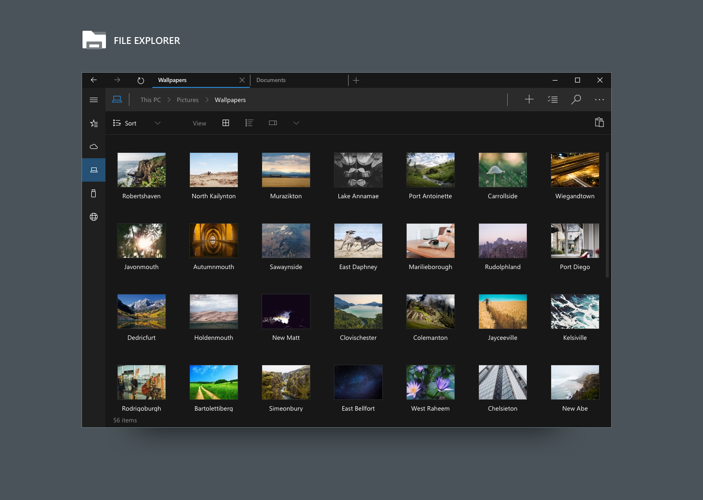
 danielskrzypon — [NEW Concept] Windows ONE - Modern UI
by-nc-nd
danielskrzypon — [NEW Concept] Windows ONE - Modern UI
by-nc-nd
Published: 2014-06-17 12:57:04 +0000 UTC; Views: 13803; Favourites: 73; Downloads: 0
Redirect to original
Description
FULL CONCEPT "Windows ONE" HERE:danielskrzypon.deviantart.com/…
Related content


Comments: 13

👍: 0 ⏩: 0

👍: 1 ⏩: 1

👍: 1 ⏩: 0


You and jay machalani (jaymachalani.com/blog/2013/12/… should work for Microsoft.. Amazing, and similar ideas
👍: 0 ⏩: 0


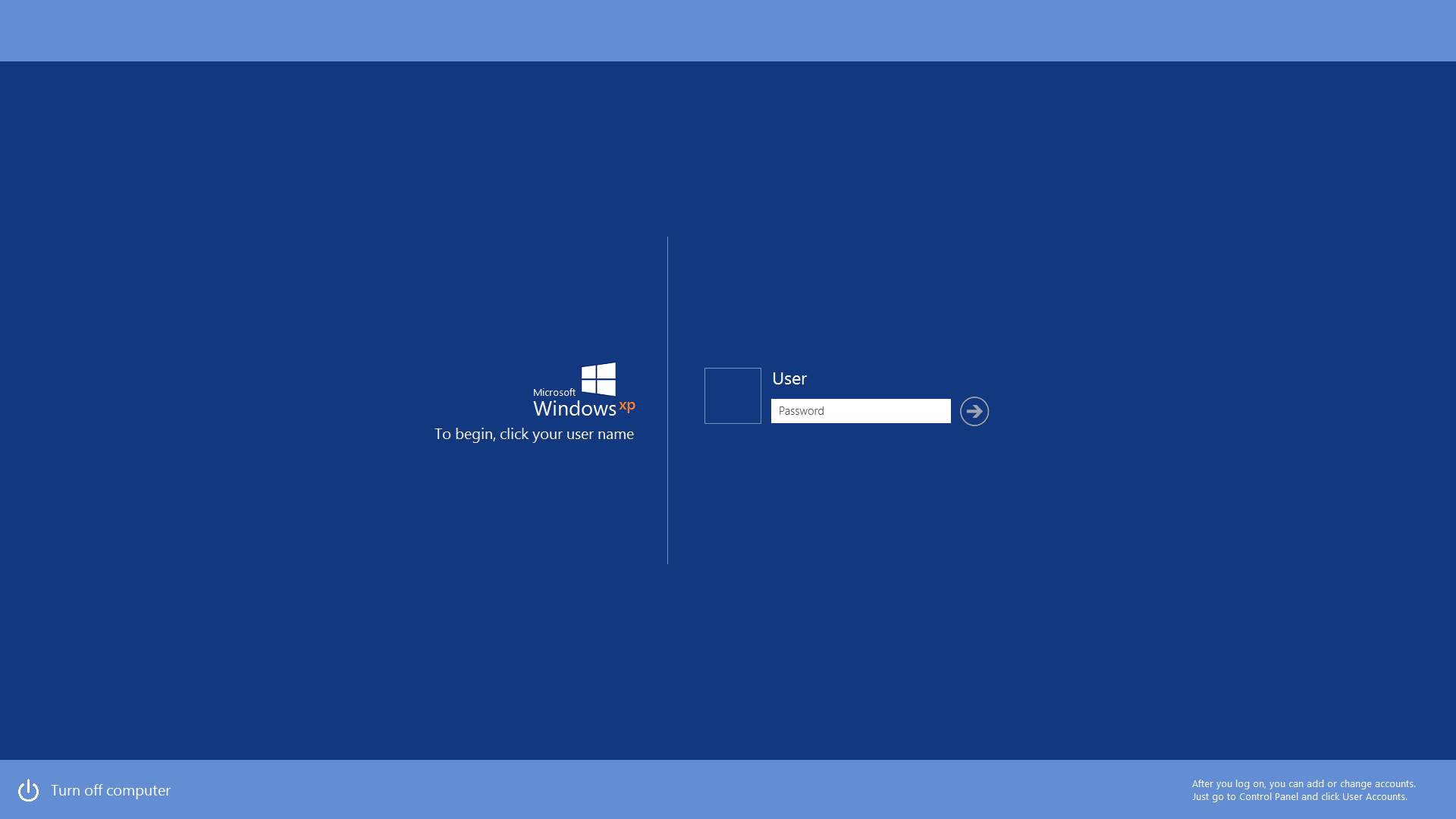
 (Smile)")

Like:
- Transparent tile
- its accent
- interactive tile
Maybe like:
- smaller charm, if its opened by swipe
Don't like
- "all apps", "desktop", "taskmgr", too cluttered
👍: 0 ⏩: 1

I think it looks fine. I don't think it looks cluttered at all. In my opinion I think that the "all apps", "desktop", "taskmgr" makes it more easy-to-use and makes it look better. Then again, that's my opinion. Everyone thinks differently when it comes to UI design.
👍: 0 ⏩: 0