HOME | DD
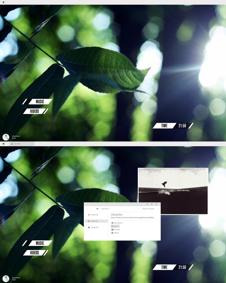
 danielskrzypon — Windows Blue Concept
Published: 2012-12-16 17:24:04 +0000 UTC; Views: 7820; Favourites: 45; Downloads: 0
Redirect to original
Description
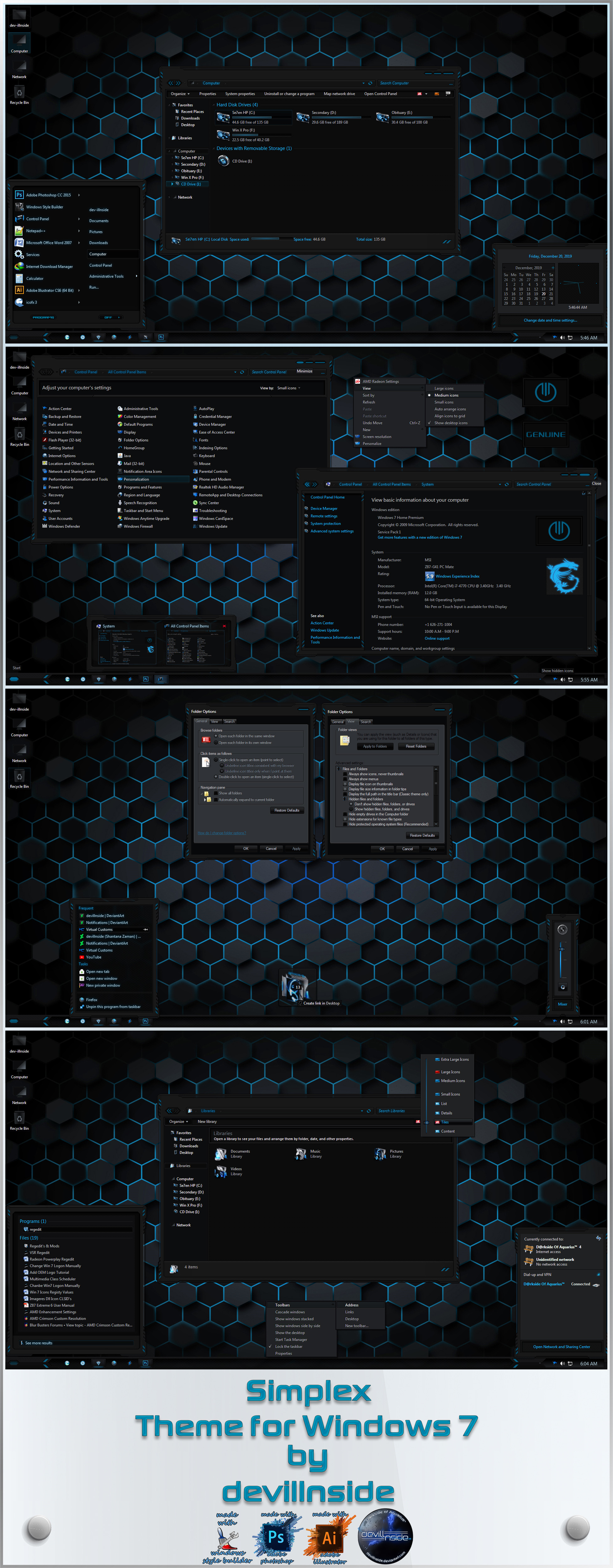
Windows Blue ConceptRelated content


Comments: 15

kiedy dadzą aero do win 10 i będzie się dało 100% przezroczystość menu to jesteś najbliżej
")
👍: 0 ⏩: 0

I don't like the task bar very much but the rest is amazing!
👍: 0 ⏩: 0

This Concept looks really like a step forward from what Windows 8 and all the desktop apps look right now. I hope this is where Microsoft goes for. Maybe they need to create a design guide like this one for developers, and if developers all follow up updating their interfaces, Windows would look more complete. The layout is very open and the big buttons make it touchable
👍: 0 ⏩: 0


it reminds me of my idea of K.Oing the desktop +icons an leving the taskbar and start screen great job
👍: 0 ⏩: 0


looks to much like Chrome OS, but hey, that's a great concept!
👍: 0 ⏩: 0


I'm new to concepts.. and want to do one, so could you send me the link to the psd file? Just asking. Amazing work btw
👍: 0 ⏩: 0


Oh wow. That is very blue. It looks great!
I have an idea for fixing those WMP controls: redraw the actual buttons with shapes (I noticed you just copied them from a screenshot,) set the fill to 0% and add a white stroke. For the button icons, redraw them (or get new ones) and make them white. Hope this helped!
👍: 0 ⏩: 0

This actually looks damn sexy. Good job. The only thing that sort of stands out a bit oddly is the play/pause controls for WMP.
👍: 0 ⏩: 1

I know WMP buttons does not blend in with the rest  (Smile)")
👍: 0 ⏩: 0