HOME | DD
 danimation2001 — Wonder Woman
Published: 2008-09-15 11:14:07 +0000 UTC; Views: 6813; Favourites: 100; Downloads: 230
Redirect to original
Description
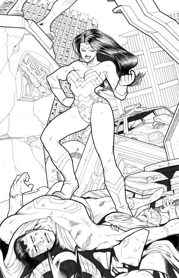
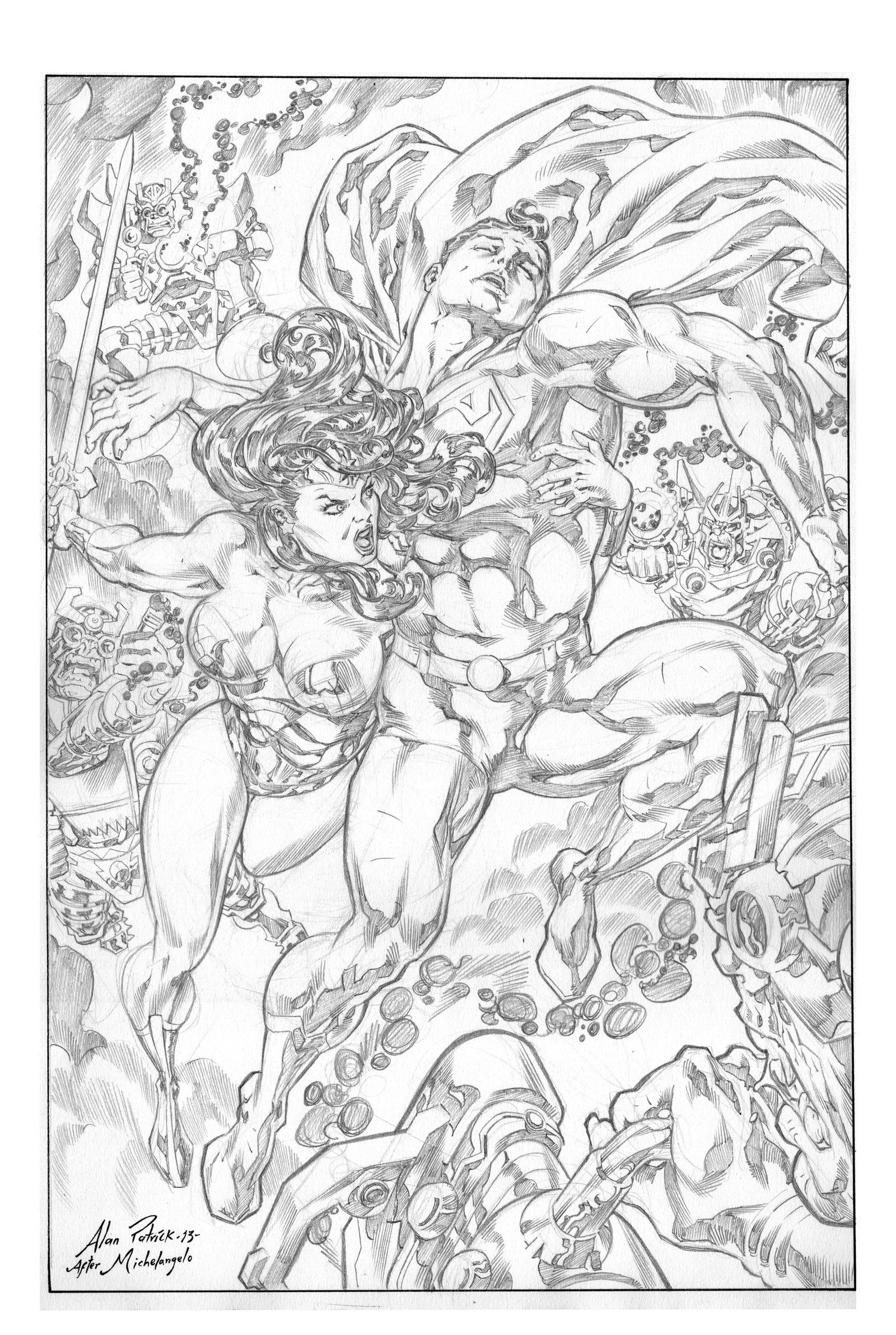
Wonder Woman,Still trying to wrap my head around the inking process.
edit: Ok I took a lot of things into consideration for this piece. Namely the line weight for everything, as well as Wonder Woman's face which I made bigger and as well edited up a bit more. I also added in more damage and edited up supes face more.
Let me know your thoughts
Related content


Comments: 30

Great inks. Super clean linework [if I wanted to nitpick, i'd bring up the beveling on the text of the Justice League statue to the left of Diana, but i'm not gonna nitpick because this piece is owning me at this point in time].
Ya gotta feel for the boy Bats too, 'cause he's physically the weakest of the entire lot here and he's stuck at the bottom of the pile crushed by debris and fallen heroes and such [lol]. No further crit, since you addressed most of it in the colored version. Nice stuff.
👍: 0 ⏩: 0

I see you went with a body builder type look for her. Oo I think her expression is wrong. Reminds me of when you force yourself to smile and you're trying to hold it and wait for the stupid flash to go off.
The BG is prefect and the guys are well done too. *nurses batman back to health*
👍: 0 ⏩: 0

I dig it! I love the layout and the idea. Great line weight too!!!
👍: 0 ⏩: 0


ok, well I think it has improved (its a pitty I didnt save the previous version  (Wink)")
but there was still something wrong with wonderwoman's head in my opinion, and I think I figured out what was bothering me.
the head by itself looks large enough but the face is too small. the head exists of the face, here headthing (dont know how to say this in english .. the thing with the star on that she wears) and the hair. The way you drew the hair is like we would be looking on top of her head, although the pose clearly shows a view from below, that's why the face looks so small in my opinion.
Furthermore, the eyes are aligned horizontal while the hairline is more diagonal (maybe you should rotate the star also).
sometimes things look just weird and you don't really know what is wrong
greets Soulrailer
👍: 0 ⏩: 0


flash nose looks like the pianist nose.
nice job with the head, i like who wonder woman hair looks.
👍: 0 ⏩: 0


Her nose looks a tad small (and maybe a bit low-down), but I suppose that could be interpreted more as style. I really like what you've done with the line-weighting. Looks like you were careful to make a background that didn't distract from the majestic lady up-front.
Great piece. 8D
👍: 0 ⏩: 0


Detailed review
Your backgrounds are at there prime. Not more is needed. nothing should be taken out.
Superman's facial expression needs work. and a nose. If all you are doing is inking then this is incomplete. If you are 100% sure you are coloring its just fine. so much could have been done to the other characters.
Wonder woman, you can tell shes been hittin the GYM hard. but a shrink ray hit her in the face, and now she is an anime character. Where is her nose btw? Same deliama as Sups.
If you penciled it, it came out great, although, personally I would have put batman more in the spotlight just cause he is really popular right now (with the 2nd movie and all) for synergy and stuff. did I mention your background is amazing?
Inking... Seems to me, you have prepared a good penciling for a good coloring. I know in this day and age inking is sorta the middle child in the family. I still love a good inked piece. But a good inking can bring life even in to a dull image. Forunately for you this is very motivated image / pin up. The "damage" work on Sups just isnt enough to convey that message... and I noticed no one else had any serious damage at all... flash, martian, batman's mask... there is no bruises, cuts, broken bones, rips & tears or anything? just looks like they were caught is a dust storm?
Review over
backgrounds = 10
foreground characters on the floor = 7
Wonder woman = 8
pencil work = 9
ink work = 7
Sorry, Im negative, I dont hold any punches.
👍: 0 ⏩: 1

nah man that's exactly what I need, good criticism.
And you're absolutely 100% right on the money. Her heads too small, damage isn't great, and noses aren't rendered. A lot of this has to do with the fact that I do think too much about colors and not enough about black and white images. For future pieces I will definitely try to remain in the Black and white area and refrain from Relying on color to really flesh out a piece.
👍: 0 ⏩: 0

very nice man, i think she could use a nose though, she looks a little alien with just 2 nostrils
👍: 0 ⏩: 0

Nuuu Batmaaaan! Lovin' how Wonderwoman is kicking so much ass. Girl power right there.
Can't wait to see some colors on this because sadly WonderWoman's face is lookin' a bit like Freeza's with the nose and the lips.
👍: 0 ⏩: 0

he inks too!
definitely good, not too much crosshatching or anything else going on which isn't necessarily a bad thing (might be a good thing). definitely looks as if it's been created with coloring in mind. nicely drawn
👍: 0 ⏩: 1
See that's the thing that I think really hinders my inking. I never create a piece thinking of keeping it in black and white or giving it simplified colors. I usually fight myself and say why do cross hatching when I know I'm going to color it and have a colored gradient there instead.
I would prefer to do open lineart for the colors, but I don't know if that the right thing to do to improve on inks. Ugh... I'm a bit lost. I see a lot of great art out there that have great black and white work. Do I have to forgo color in order to improve my lineart?
Like what if I force myself not to rely on color to wrap it up, but instead rely only on the pen 100%.
Hmm... I'll probably be hating what I create for a while, but I think I have to get use to not relying on colors so much in order to flesh out a piece.
👍: 0 ⏩: 4

I think practice the inking never hurts but the most important is the outcome. You are a master of color, so why dont take profit of it?. With practice you will improve your lineart anyway.
Also I think you need to practice proportions, the girl is a mess, the head is too small, the mouth should be lower and the legs thinner and shorter, the shoulders are too wide and too near the legs.
Cheers.
👍: 0 ⏩: 0
I really don't see anything wrong with it personally. The thing with most line art today is that it's created with all the classic elements of ink value such as crosshatching and all that, but isn't necessary because it gets colored anyway, and then there's that conflict between the inks and colors. Rarely do over crosshatched inks work 100% well with colors.
If you're able to think ahead and create visually pleasing inks that are still able to do a good job of capturing the image while at the same time still being functional for colors, then I think that's more of a possible than a negative.
That said, I would like to see what you could do if you pushed yourself to do a piece without colors in mind. I've been following your work for some time now, and I know you're more than capable of turning out something impressive on your first try.
There's a really talented artist that goes by the name of 'Nar', you may have heard of him. His work is worth a look if you're looking to pick up some general tricks of working with crosshatching and line-work. Even his pencil works show strong elements of inking. Give him a look, for sure.
[link]
Let me know if you decide to do a classic ink piece.
👍: 0 ⏩: 1
Thanks for the link, yeah, that's actually the way I think about cross hatching. I generally feel if somethings going to be inked most over with cross hatching etc, it's either meant to stay black and white or have simplified colors.
I'll definitely try to do some pieces only black and white way and try and see If I can make a piece stand on it's own without colors.
👍: 0 ⏩: 1
I agree with that. I'm sure you'll be able to turn out a successful piece on the first try. I'm looking forward to seeing it.
👍: 0 ⏩: 0

I agree that the way you do lineart now is not a bad thing...
If you're gonna hate it then how would you make lineart that you don't hate? Don't limit yourself to what you'll be doing later.
This style works great for something you'll color later on, but if you want to challenge yourself then make of something look great just with pure inks. Anyway, great job!
👍: 0 ⏩: 0

Hum, you definitely have a very open lineart, clearly color-oriented. I'm not sure it is a bad thing though if you plan on coloring it afterwards.
If you want it to stand on its own as b&W art, or have someone else color it (but why would you want that ?")
But why alter your method though, if it's what you do, and it works?
If your goal is to modify the way you approach inking, or even drawing, it might be a good idea to ink someone else's lines. Just a thought.
👍: 0 ⏩: 0
I think I like the background more than the characters. both sup's and wonderwoman's head are too small compared to their bodies. Superman's left hand looks a bit weird also
the inking looks nice in my opinion  (Smile)")
greets Soulrailer
👍: 0 ⏩: 1
11 by 17 paper but I had to scan this in three sections for my scanner.
I was considering making the head bigger, I'll probably edit that.
👍: 0 ⏩: 1
I see, I should definitely try drawing on larger pages to see if it makes much difference, now I allways use A4 (European standard) which is a bit smaller (but matches my scanner ")
👍: 0 ⏩: 0

"seeing as no one listened, it was only a matter of time before diana would try to find out who was using her conditioner"
awesome
i like supe's pose the most, but
the blood on flash's nose is the best touch
👍: 0 ⏩: 0
