HOME | DD
 DanRabbit — Slingshot Column View

Published: 2011-09-15 19:08:51 +0000 UTC; Views: 13697; Favourites: 37; Downloads: 121
Redirect to original
Description
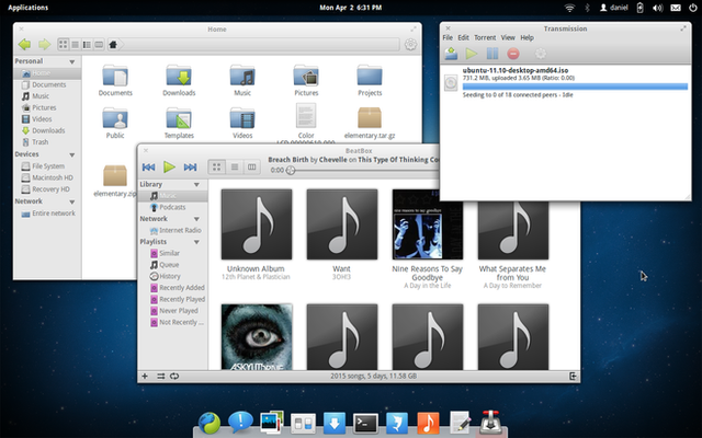
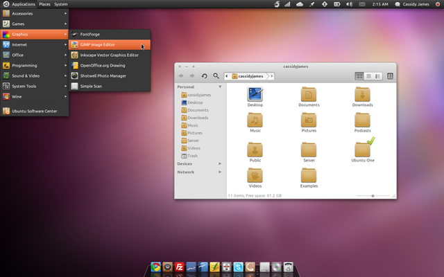
Okay so some people have been whining about seeing something more traditional from Slingshot, so I thought about giving Slingshot another view in addition to the regular icon view.Also, wanted to play with what Slingshot could look like in the white menu style that I've been dabbling with lately.
Related content
Comments: 78

Question. The current slingshot use grid layout on the right in kategory mode. Would this mockup be implementet how it is here? Since it is the same funktionality when the grid is used also in kategory mode. There is nearly no difference to kategory mode in kurrent slingshot.
👍: 0 ⏩: 2

Sure, I think it can use a list view instead of a grid, and I'm not opposed to showing two columns like your mockup. There's an open bug report for it here: [link]
👍: 0 ⏩: 0

What do you think about this [link] How discoverable is it?
👍: 0 ⏩: 0

The regular icon view will probably be default, but the view switcher is already implemented.
👍: 0 ⏩: 1

the categorie's "folders" too? nice
👍: 0 ⏩: 0

why did you make it white?
the wing panel is black, hence slingshot would better match to wingpanel when it's black
👍: 0 ⏩: 1

Couple of reasons:
* The panel is a permanent item, Slingshot is only temporarily shown. So one thing we're doing with the objects material here is distinguishing it's level of permanence in the interface.
* Another is contrast level. At first, menus and popovers were dark. But because of their nature, they end up have a lot of text entries and things that create a really intense level of contrast. Having them white instead lowers the contrast and makes it easier to read over without encountering too many visual "bumps".
Again with the panel, the intention is to lower contrast by making it the same color as your display bezel. It's a permanent UI element, but it's importance is low and it should only really "appear" when you're looking for it.
👍: 0 ⏩: 0

Perfect, i love all your work on elementary so far.. simple, elegance and useful.. !
Is it possible to involve in elementary work.. i'm also graphic designer.. it will be very good, and i will be very happy 
Thanks.
👍: 0 ⏩: 1

Absolutely. If you'd like, we have a deviantart group here that you can submit artwork to: [link]
Also, please stop by our IRC channel: #elementary-art on irc.freenode.net
👍: 0 ⏩: 0

I ike the bright styling. Don´t get distracted from your way. You´re really making my PC fun again.
👍: 0 ⏩: 0

It´s really beautiful. I so hope you guys can stay on track and don´t get distracted with all the "noise" coming from other projects such as Unity or Gnomeshell. The way wingpanel and slingshot and plank interact is unique and really simple. That´s what I love about it. The brighter styling looks much better imho. And keep the search in place. Linuxsystems tend to get crowded with apps.
👍: 0 ⏩: 0

Greaaat!!! This is way better than the normal slingshot. it reminds me a bit of the KDE kickoff menu...
👍: 0 ⏩: 0

Om nom nom nom. Please, yes, give us this popover/category combo, and I will offer you the soul of my firstborn child.
👍: 0 ⏩: 0

Would the DE and apps be ported to other Distros? like say... Arch?
👍: 0 ⏩: 1

There's no reason it couldn't be. In fact, IIRC, there are already some elementary packages for Arch.
👍: 0 ⏩: 1

I want to move to Elementary so bad, flash, nvidia drivers are all there, just I need "SOME" customizing, I can't even change the panel! come on, not everyone will click that!
👍: 0 ⏩: 1

If you want customization, use Arch
👍: 0 ⏩: 1

on Elementary now. Still nice to look at, to be honest most shots of Arch are with just WMs and such, too little for me. I need a full desktop. So I'll stay here a bit.
👍: 0 ⏩: 0

I think you should add glyph icons to the left of the categories
👍: 0 ⏩: 0

It would be a good addition tot he other view.
I'd prefer the default colour to be the same as it was before and then maybe allow for changing it from switchboard or having an option of it taking the colour of the background like in ubuntu 11.10 (only as an option though! Not forcing it like unity)
👍: 0 ⏩: 1

Slingshot (like other popovers) will most likely inherit the style from the menu class
👍: 0 ⏩: 1

Will it be possible to change the colour of Wingpanel as well? It doesn't seem to be possible at the moment.
👍: 0 ⏩: 1

IIRC, Wingpanel is theme able with GTK3
👍: 0 ⏩: 0

Not sure how much this would be used, but I guess the categories would be good if you have a lot of apps (?)
The white styling in the mockup has grown on me, but I feel like it'd be kinda odd to have white indicator menus unless all menus were white...but then you'd be copying OS X.
👍: 0 ⏩: 0

I'm wondering why have categories at all? Why do we need to have 100 apps preinstalled by default.
Look at mac and win, they don't have categories. Or they can be there if you have over 50 apps installed or something i guess, Just an idea.
👍: 0 ⏩: 2

What I've always loved of Linux is that it categorizes applications.
When I was a Windows user, I manually created category folders to easily find my apps. And then an upgrade would break it all :S .
👍: 0 ⏩: 0

I agree, like I said I'm not a categories user myself and we don't really ship enough apps by default that it makes sense. But there have been quite a few users (apparently with a lot of apps) that have asked for the feature and they are very vocal.
👍: 0 ⏩: 1

Offer categories for the users who want them. If a user odes not want them he can disable them. I'd personally like to have categories
👍: 0 ⏩: 0

Want... NOW! 
👍: 0 ⏩: 0

I think it is always nice to see traditional features. I am totally in favour of this design. (and i hope it Will make it into Luna!)
👍: 0 ⏩: 0

Could work. Could not work. Would be nice to see how it blends in with the rest of the interface/desktop. I'm using Ubuntu 11.04 with unity on one of my computers and I can't really say I'm that much of a fan of this popup bubble boxes where you search or go through the categories. I like the "standard" that we can find in the current release of Elementary and so many other distros
👍: 0 ⏩: 0

Nice idea, I certainly like being able to filter by category.
Not a fan of the gray/ white version of Slingshot though, I do think it looks a bit dull and sort of inconsistent compared to the current black, transparent theme.
It's quite nice in those popover mock-ups you did, but then the theme for "apps" is gray anyway so obviously it fits in those cases. It doesn't really fit with Slingshot as it's connected to Wingpanel and so I think black -as well as, in my opinion, looking better- looks more consistent.
👍: 0 ⏩: 0

Nice idea, I certainly like being able to filter by category.
Not a fan of the gray/ white version of Slingshot though, I do think it looks a bit dull and sort of inconsistent compared to the current black, transparent theme.
It's quite nice in those popover mock-ups you did, but then the theme for "apps" is gray anyway so obviously it fits in those cases. It doesn't really fit with Slingshot as it's connected to Wingpanel and so I think black -as well as, in my opinion, looking better- looks more consistent.
👍: 0 ⏩: 1

color can be changed. The design is great!
👍: 0 ⏩: 1

Yeah, I agree the design is great. I just loved the black version
👍: 0 ⏩: 0

I've noticed that some people prefer the old fullscreen slingshot (I don't 
👍: 0 ⏩: 0

Looks awesome! It's great that you give users a choice instead of forcing one method upon them
👍: 0 ⏩: 1

At least there is one new DE that gives users choice
👍: 0 ⏩: 0

Pretty nice, although I would end the separator with a gradient, rather than ending it abruptly.
👍: 0 ⏩: 0

I really like this new mockup, although I prefer the black theme.
👍: 0 ⏩: 0

I would prefer the themeable and theme inheriting slingshot in order to maintain the uniformity. But the highly customable apps is really a great challenge to the developers.
👍: 0 ⏩: 1

This should be possible to do fully adhering to the system's theming. In fact the current code that we have is very very GTK3. The only problem is the actual menu itself (since it's got the arrow and rounded corners and that). But I don't see why we couldn't just have Slingshot inherit the menu class
👍: 0 ⏩: 0

this white popovers are kicking butts.
just a question: in earlier versions of wingpanel, when i cliked the Apps button I got no kind of visual response from the panel (some glow, change of color...), the only response was thar slingshot was opened, it was weird. Have you guys fixed it?
👍: 0 ⏩: 1
| Next =>
