HOME | DD
 DanRabbit — Some Tabs

Published: 2011-10-27 00:52:07 +0000 UTC; Views: 7897; Favourites: 25; Downloads: 89
Redirect to original
Description
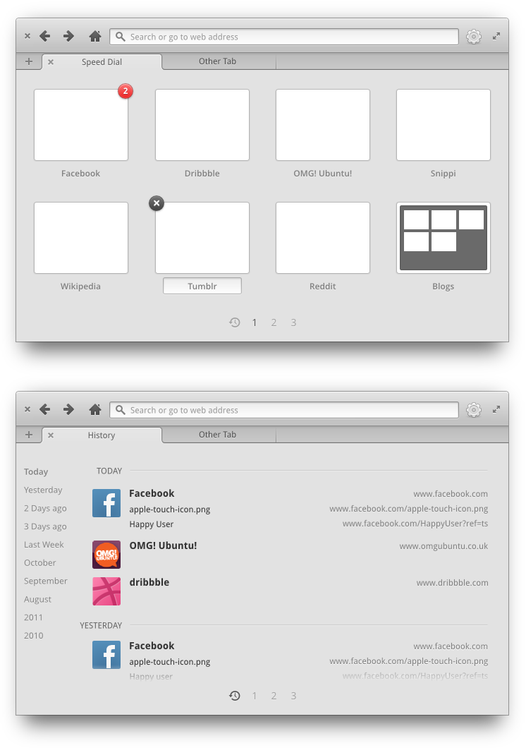
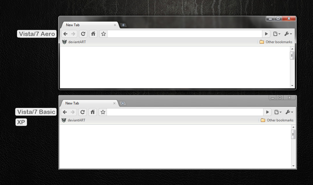
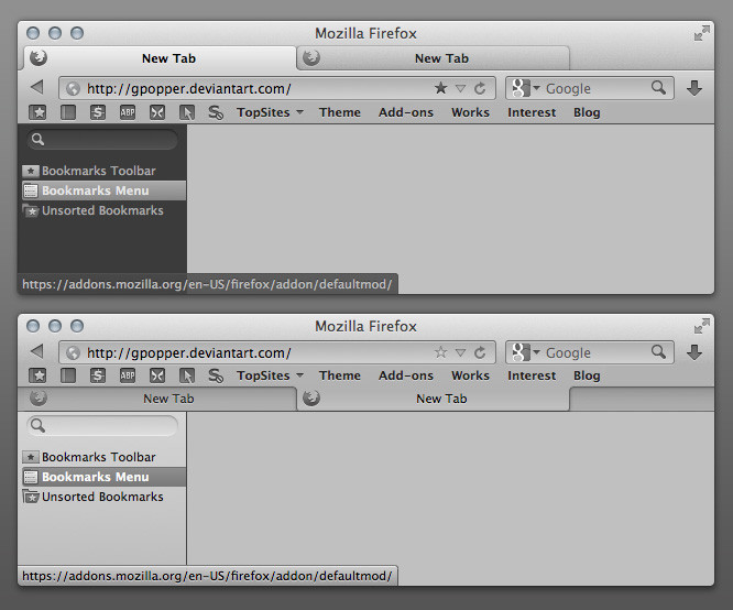
Comparing different kinds of tabs, specifically in the case of a web view.One major drawback of the current notebook widget is that the open side of the tab makes this really jarring transition into a backgrounds that don't match it's color.
One solution is to invert the tabs so that the open side faces the content above.
Another is to move the tabs to the top as seen in Opera, Chrome, and Firefox.
Related content


Comments: 59

You are absolutely right brother (:
👍: 0 ⏩: 0

Just an Interesting article about tabs, [link]
👍: 0 ⏩: 0

Dan, by the look of the Midori webpage mockup, I believe you went for the second solution: upside down tabs.
But how would it work with the shortcuts bar enabled? I mean because of that bars gradient, it would imply changing the tab color depending on the presence of the bar. Do you have a solution for that?
I already had that solved with the tabs on your egtk widget mockup, but this new design will delay my theme update release
👍: 0 ⏩: 1

shhhh, you're not supposed to notice that I haven't figure that out yet xD
👍: 0 ⏩: 1
ahah, ok! I'll just wait for your brilliant idea on that, while I finish the normal tabs ")
👍: 0 ⏩: 0


Does GTK support this kind of tab style?
[link]
I think it would be a differencial over Firefox and Chromium.
👍: 0 ⏩: 3

This is incredible. A completely re-thought UI for a web browser. Dan, check it out! It's quite inspiring.
👍: 0 ⏩: 0

Like this? [link]
I couldn't find an up to date screenshot from linux, but i looks pretty much the same. This is an old version: [link]
So it would still not be the only linux browser with that kind of tabs
 (Wink)")
👍: 0 ⏩: 0


I'm loving the first one, although it is basically Firefox.
Are these tabs even currently possible?
👍: 0 ⏩: 1
yes, they're pretty standard stuff.
👍: 0 ⏩: 0

First one appears as having an enormous titlebar with few tabs open.
Second is spot on.
Third looks like a mess of horizontal lines and upside down tabs.
👍: 0 ⏩: 0

The first one would be good. However, I think that it would be better to move the new tab button to the left so as to reduce mouse movement since tabs start from the left. This would also eliminate the problem of having the close tab button too close to the close window button.
But then another problem that would arise with that is the new tab button is dangerously close to the close tab button...the complexity of interface design...
👍: 0 ⏩: 0

First design looks the best, but the close glyph needs to differentiate from the window captions.
👍: 0 ⏩: 1

I already registered a blueprint in launchpad. It is better when elementary has own styled close window button. Cause it is used also in Linux Mint.
👍: 0 ⏩: 0

I think the first one (tabs on top) is the best if refresh, back and forward buttons remain in toolbar (like in Jupiter, Midori 0.3.2) since those buttons affect only current tab, not the whole browser.
Second one looks good, but doesn't make sense.
New tab button should be near currently open tabs if it isn't against HIG. If it is against HIG, I wonder what is the reason behind that decision.
Very clean and good-looking mock-ups. Keep up the good work!
👍: 0 ⏩: 1
As I outlined in another comment, putting the new tab button next to the tab creates a moving target. You can never develop a muscle memory of where that action is, you're always looking for it. This is especially bad when we're talking about buttons that are used frequently, like the new tab button.
👍: 0 ⏩: 2
After using Midori for some time I have now grown used to clicking on the button at the top left corner to get a new tab and now I prefer it to the one in Chromium or Firefox. I think it's very true what you say about the moving target.
👍: 0 ⏩: 0

I usually just double-click (in Firefox) or middle-click (in Midori) in an empty space to create a new tab. The New Tab button is too far for me.
👍: 0 ⏩: 0

Tabs on top is a much preferred alternative for me but the example doesn't look thought through. You have the close tab button dangerously close to the close window button. You can easily click the wrong button and close the entire application. The new tab button would be better located next to the other tabs instead of at the other end of the application. That way it's more apparent and logical what the action will be when clicked
 (Smile)")
👍: 0 ⏩: 0

The first one, no other browser has that style for background tabs.
👍: 0 ⏩: 0


I've noticed that tabs on top takes less space.
👍: 0 ⏩: 0

The first one, but it looks to redundant. There are two close buttons mere pixels away, and "Website" is shown twice... just go similar to chrome and ditch the titlebar altogether.
👍: 0 ⏩: 1
I don't think you can just ditch the titlebar in Metacity.
But for the repeated Website, I think that the window title should be the application name (Midori), with each tab just showing the page name.
👍: 0 ⏩: 0

I'd say the major problem with the upside-down tabs is that it doesn't immediately say to the user, "The content below the tabs has to do with the tabs." It doesn't follow true life, I guess; it makes it look like the tabs correspond to the address bar only, and not the page. I personally prefer the tabs-on-top method, but wasn't aware that that caused a programming issue. Hm..
👍: 0 ⏩: 0

Come back to me when you have a single design published and then I'll find something that it looks like too. But to be honest I've taken cues from several browsers, lately a lot of Firefox.
👍: 0 ⏩: 0
I really like the second one (how it looks). But I think the las one would be more appropriate since a tab is related to the content on that page and not the navbar and bookmarks as some people have already mentioned. Tabs on top would be the best option but then again you just mentioned the difficulty so I'm in favour of the last
👍: 0 ⏩: 0
I couldn't help but notice the email bookmarks, are you planning on merging postler and midori and make an internet suite or is it just filler text?
")
👍: 0 ⏩: 1
I was just too lazy to change the text xD
👍: 0 ⏩: 1
ah, it would have been an interesting project though, but I believe it's better to keep them apart
👍: 0 ⏩: 0

The second one is the more polish.
But I prefer the firefox style, so "tabs on top"!
👍: 0 ⏩: 0
what a stupid coincidence.
I just remade (last night) my firefox tabs according to your gadget mockup. check it out: [link]
about the upside down tabs, I have an old theme with those, but I eventually prefer the tabs being related to the content and not to the navbar.
to solve that transition, you could have a thin darker line separating the tab from the page. like this [link] although it would be a little inconsistent with the tabs rounded corners.
👍: 0 ⏩: 0

I prefer the first two, but that's only because it "looks nice."
Oh, and I expect the "LOL NUB WUT, YOU COPY MAC" guys to be coming.
👍: 0 ⏩: 0

I prefer the last one, makes more sense and has a better contrast to separate browser UI from page content.
👍: 0 ⏩: 0
I still think the last one looks better because that way the tab is visually linked with its content.
👍: 0 ⏩: 1

I think this is true for the first one as well. With the exception of the AppMenu, everything below the tab bar is logically related to the tab.
👍: 0 ⏩: 0

I dont think that is a drawback at all. I'd call it a good thing. I dont want my web browser blending in with the page i'm viewing.
👍: 0 ⏩: 0


i really like the first and second, blends amazingly well with the browser.
👍: 0 ⏩: 0

feels like I can make a new theme for firefox in next few weeks when I may start to use linux again
👍: 0 ⏩: 0

Or you could do like Firefox does and put the tabs on top. It works well, too, and makes more sense than having upside-down tabs.
👍: 0 ⏩: 1
I was also considering tabs on top and the big drawback with that is that it's a lot of work on the third-party developer end. We're looking at tons of existing apps that are going to have to do some major UI work not only to move the notebook widget put also to pack their toolbars into every page of that widget. It's something that is a lot more technically difficult when we're talking about the way that GTK works. But if there's a way we can make it easy to do, I'm not opposed to trying it.
👍: 0 ⏩: 4
| Next =>