HOME | DD
 DanRabbit — Sound Plug

Published: 2011-08-23 19:50:58 +0000 UTC; Views: 7473; Favourites: 19; Downloads: 74
Redirect to original
Description
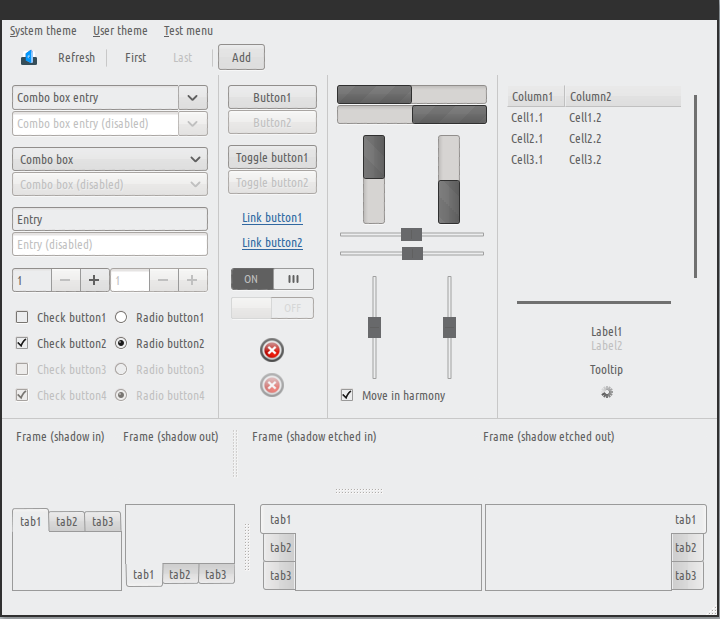
A sound plug.Related content


Comments: 25


I like it but the switch widget looks a little off to me, maybe it's too big, I would rather stay with the regular check-box.
👍: 0 ⏩: 0

All of elementary's stuff are just awesome!
Keep it coming!
👍: 0 ⏩: 0

Really nice, but in my opinion there'is a important change to do:
i think the Apps category should be the first at left because is the most used.
👍: 0 ⏩: 0

Hm, not bad. I really like the way this one looks.
👍: 0 ⏩: 0


It is nice, though I find the knobs on the sliders a bit too metallic compared to, say, the buttons. Maybe make it a bit more matte/reduce the contrast between the shades of gray in the knob?
👍: 0 ⏩: 0

One more question. How many outputs and inputs volumes can it be? I know for input (in and mic).
👍: 0 ⏩: 0
very nice !
Why is a there no section header for Output volume? May be is it better to make icons to represent Output, Allert volume like for Beatbox and Empathy it looks nicer and provider better orientation I think.
 (Smile)")
👍: 0 ⏩: 0

i like this, like all elementary project but i think that a white background could make it cleanner
👍: 0 ⏩: 0

Very nice, just to check, is this mockup or actual development screens?
👍: 0 ⏩: 2
Okay, well like the last Postlr mockup, I'd absolutely love for it to be brought to life. It's stuff like this that is making me so excited for switching to Elementary when Luna is released.
👍: 0 ⏩: 0

Mockup. Though we're undergoing a plug sprint right now, so hopefully someone will bring it to life! More info here: [link]
👍: 0 ⏩: 0

Of course goot work.
How about make deviantart group called something like "Switchboard plugs mockups" ?
👍: 0 ⏩: 1

I am legitimately looking for to seeing this in action.
👍: 0 ⏩: 0

Damn these plugs are just getting nicer and nicer. Awesome work!
👍: 0 ⏩: 0
That selected item color is a bit intense... otherwise, looking great. Question (and it could be related to the widget alignment rules you were talking about): Why are the select boxes so wide when the contents are so short? Just a thought.
You're really doing a great job at bringing design to complex apps. I shudder to think what this would look like with all the same features, but without you design touch.
 (Wink)")
👍: 0 ⏩: 2

Oh I also forgot to add that I was thinking about adding another column to the list to show whether it was an internal, external, or even networked audio card.
👍: 0 ⏩: 0
I'll work on it
I need to make this section a little more clear: [link]
But basically it goes like this:
We follow a rule where widgets are "justified". You'll notice that all the sliders are the same width, the combo box is the same width as the sliders, the list box is the same width, etc. However, you'll notice that in this alignment I don't include "descriptor" widgets like the icons or switches. In this way, all my sliders and boxes line up even if they don't have icons.
Actually, that was the intention, but I did one of the panes wrong xD I need to fix that.
Thanks!
")
👍: 0 ⏩: 0

Nice, but I don't like the selected row. But the on buttons are sexy!
👍: 0 ⏩: 1
Yea, I'll play with it more
👍: 0 ⏩: 1

Could I suggest radio buttons? I think that would seem less intrusive, the selection list really pops out in a bad way.
Good anyhows.
👍: 0 ⏩: 1

Yeah! Radio buttons are a good idea
👍: 0 ⏩: 0