HOME | DD
 dawnbest — Test Comic Page

Published: 2008-07-09 00:27:16 +0000 UTC; Views: 3283; Favourites: 51; Downloads: 63
Redirect to original
Description
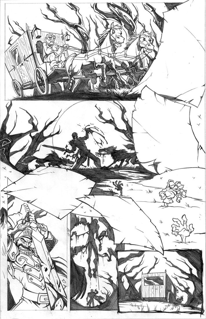
First glance at pencilwork and colors for a proposed comic book of an already licensed property. Can you guess which one? Please note that I've put this in the category of game fanart.Art + Late nights x Metallica = this
Related content


Comments: 20

That is an awesome piece! I think I like the pencil more!?
👍: 0 ⏩: 1

I think I do too! Thank you!
👍: 0 ⏩: 0


well, not to ruin it for everyone if you haven't figured it out, but I know the property because this was linked to another club. If you want a hint, check out my username.
Although, if this wasn't linked I would have never guessed it... there's no frickin' Dinosaurs! I'm not sure what you were going for here, but the draw-ring is pretty nice.
Hey, is that Keena!?
👍: 0 ⏩: 1
*ahemcough* The full comic is posted here [link]
I update on Saturdays. I don't think you're ruining it for anyone here, dude.  (Smile)")
👍: 0 ⏩: 0

Astounding, both the finish and the line work look great.
👍: 0 ⏩: 0

Wow, thats really fantastic. Great job!
👍: 0 ⏩: 0


Hmm...interesting.
Its actually nice to see how different something can turn out when colored is added. Plus its nice to see a comparison between the both of them.
Really nice work on the lineart version. The color is nicely done too. A bit dark for my taste but I really like that grainy feel that you gave to it. Pretty action packed page too.
lol I can't figure out from what game this is from but sweet none-the-less.
👍: 0 ⏩: 0

Excellent comic art, Dawn. Such stunning and exciting action.
👍: 0 ⏩: 0


Looks awesome and really active! Overall I think the color selection is a little too red and/or dark, it looks rather dull especially when viewed from the small size, I can tell there's detail and interesting stuff, but it just isn't very eye-catching to me.
Also, the placement of red on and next to the punching caveman kind of makes it look like he's got boobs and is wearing a red bra.
👍: 0 ⏩: 1
That's not a caveman... it's Kristy Brinkley.
Hehe, okay, no it's not. Great critique, thanks! I admit the colors and lines were put together on a separate level and then kicked down in transparency over that red color in the background for a final version, because I'm going for kinda sorta grainy. It's part of my ongoing exercises in "how fast can I turn out a quality Photoshop paint job".
")
👍: 0 ⏩: 0

I'm sure somebody has guessed it right already. This is mega awesome by the way, I love busy pieces of artwork such as this!
👍: 0 ⏩: 0


I really like the doom-type feeling I get from the sky in the finished version. :3
👍: 0 ⏩: 0

")


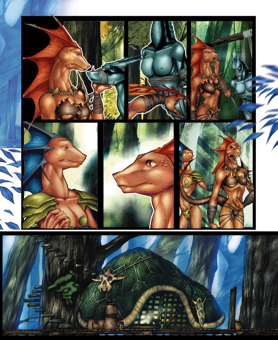
nice but i don't know what licensed property it's based off of....WoW...exiles?
👍: 0 ⏩: 0