HOME | DD
 Dediggefedde — CSS-fragment: round thumbs with text-hover

Published: 2013-11-05 19:40:34 +0000 UTC; Views: 4377; Favourites: 110; Downloads: 0
Redirect to original
Description
=Trisste asked me to make something similar as in the recent HQ journal with the thumbs-hover.Well, as CSS3 is not supported by journal-skins, animations couldn't be made.
However, I was able to mimick the rest and though, others might enjoy, too!
This is a code-fragment, for free use in any journal-skin or web-design.
Although I would enjoy being mentioned now and then^^
So, what to do to implement this?
Insert the following CSS into your journal-skin!
.image, .image a img{
width:200px!important;
height:200px!important;
border-radius:100px;
position:relative;
overflow:hidden;
display:inline-block;
cursor: pointer;
}
span.shadow{
padding:0;
}
.credit{
border-radius:100px;
width:190px;
height:190px;
position:absolute;
top:5px;left:5px;
opacity:0;
display:inline-block;
background-color:rgba(100,100,100,0.8);
background: linear-gradient(to bottom, rgba(236,178,156,0.5) 0%,rgba(118,35,2,1) 60%,rgba(190,109,77,1) 65%,rgba(236,178,156,0.5) 100%);
}
.credittext{
width:190px;
height:190px;
border-radius:100px;
display:table-cell;
vertical-align:middle;
text-align:center;
}
.image:hover .credit{
opacity:1;
}or from pastbin: pastebin.com/BXSEDQX9
Then use the following Code within journals:
This awsome Deviation was made by :devdediggefedde:
As you can see in the picture above, you have to replace "yourthumb" with the thumb.
If you just use a thumb (code or from media), the quality may be poor.
You can prevent that by making the thumb larger (e.g. hover over it in edit-mode to see the 4 little squares and drag it larger). It will still have the defined size inside the CSS...
Related content
Comments: 18

Absolutely wonderful! Thanks so much for this.
👍: 0 ⏩: 1

Thanks! ^^
I'm glad you like it!
👍: 0 ⏩: 1

Very much! I'm playing with it in setting up my feature journal for tomorrow. 

👍: 0 ⏩: 0

Could you translate this to work on profile custom boxes?
👍: 0 ⏩: 1

Sadly that's not possible as custom boxes don't use user-CSS but only predefined dA-Classes...
The only way would be to put a journal featured into your profile where you use this CSS.
👍: 0 ⏩: 1

No worries
I'm just struggling to find the right code 
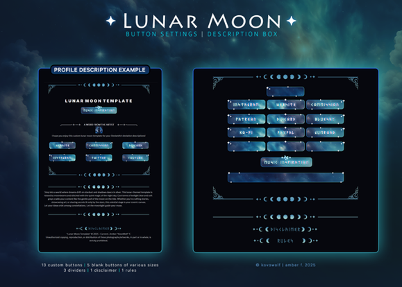
Like this:
That principle would be great if I could find a basic code to get the job done. And the transitions like on this would be great if they were obtainable:
XD I might have to just buy one of those and plug in images, but there's got to be a basic code floating around somewhere that'd get the job done 
👍: 0 ⏩: 1

Well, as you can see the icon at the top-left indicates, this isn't a custom box but a deviation-widget.
So, to get something like this, you just need to goto your stash.writer, make a journal with a nice journal-skin, submit it to your gallery and feature it on your profile, using the "Featured Deviation"-widget^^
You can see an example when you visit nekozumi's profile and visit her gallery.
👍: 0 ⏩: 0

o.O
I love this~! 
👍: 0 ⏩: 1

Thanks^^
Glad you like it^^
👍: 0 ⏩: 1

Hey, the # in CSS is used to tell the CSS it's got to look for the class, so you don't need to use the #'s in the tags. you can also just do <div> too. to make the &, use &
👍: 0 ⏩: 1

Thanks for the tip... but I was probably just lazy as <#div><#div><#div> is faster to change than <div><div><div>^^
But I guess it's nicer to look at with the right appearance... : for : was a bit hard to find, though^^
However, # is used to identify ids in CSS, . is for classes...
and I didn't use any # within CSS, just inside the HTML, if I see that right^^
So at least there shouldn't be an error...
👍: 0 ⏩: 1

yeah, but it's easier for people to directly copy. soemtimes, the few extra seconds done is a LOT better for public image. you could look here too.
👍: 0 ⏩: 0

Great... I can't find the edit-button... otherwise I would correct the white space at the top...
👍: 0 ⏩: 1

So edit-button is now available again^^
👍: 0 ⏩: 0


