HOME | DD
 detectivelyd — Cease and Persist

Published: 2012-06-26 12:54:51 +0000 UTC; Views: 9500; Favourites: 198; Downloads: 51
Redirect to original
Description
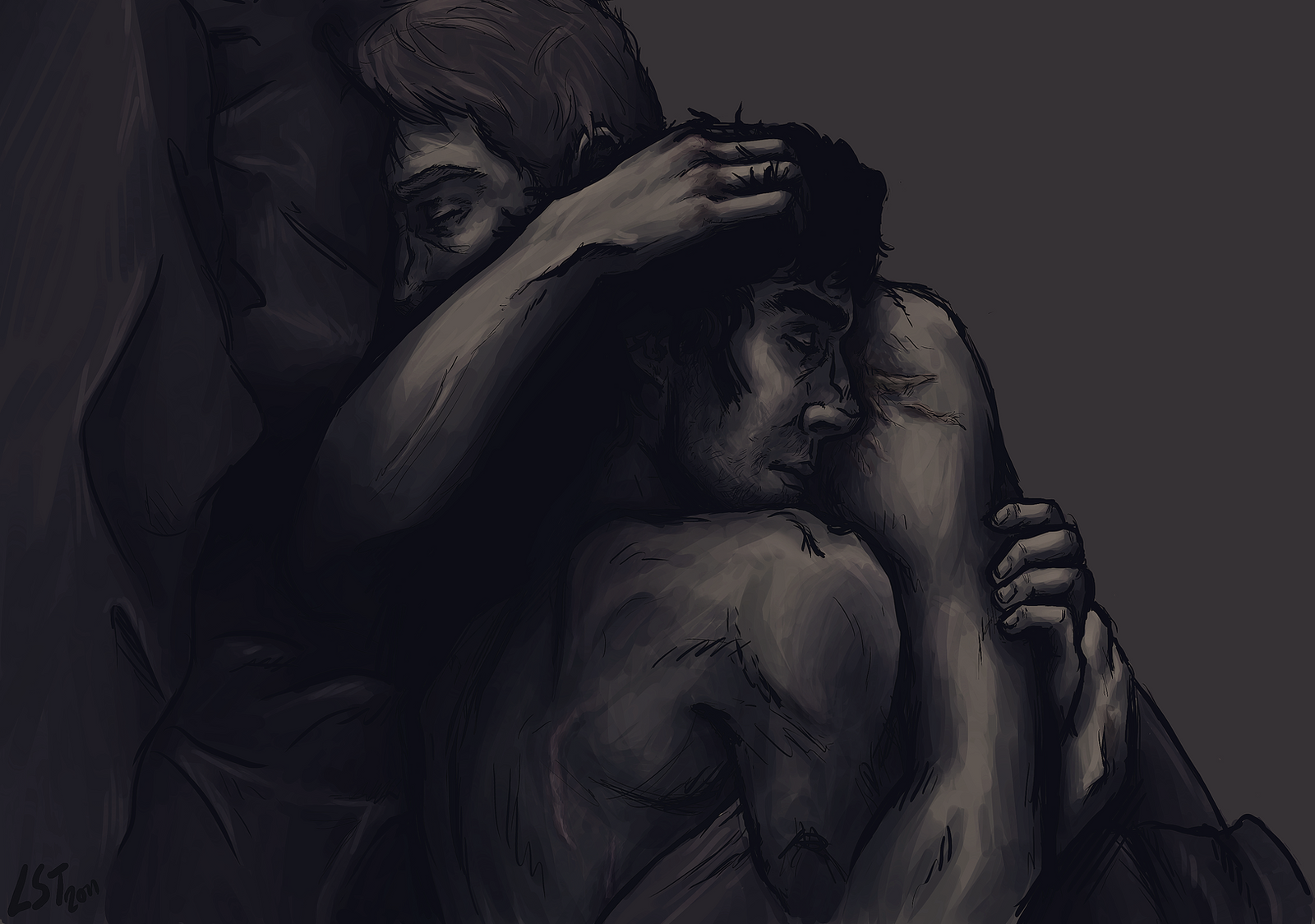
Do NOT repost, either on tumblr or anywhere else unless you've specifically asked beforehand - bafflingly this still seems like a monumental task for some people. It's here on tumblr, so you can reblog it from there.Just a relatively quick sketch to warm up again, it's been ages since I last did anything. If I could just keyboard smash and use that as a title without it being awful, I would, so instead I used a song title by El Ten Eleven.
Related content


Comments: 13

ALL OF THE HOTNUSH... had to get that out. Nice work!
👍: 0 ⏩: 0


Beautiful m'dear, great expression for John and I love the tones used! Agree with garik about the lines though.. But it's easily forgotten because of the brilliance of the subject matter and just about everything else!

👍: 0 ⏩: 0


Loving the gritty-dark quality. Feels very elicit~
👍: 0 ⏩: 0

It's undoubtedly beautiful, compo is well balanced and pallete is hormonous,
but that perioral lines... something about them looks a bit distracting.
👍: 0 ⏩: 1

Yeah, I'm going to be honest, I'm not really that pleased with it either. I did change the texture from something else initially, just because it looked too flat otherwise, but I'll have to have a look around for something more fitting! I do have a tendency to get lazy with things and just leave it, even if I'm not happy with it
")
👍: 0 ⏩: 1
Oh. I, personally, am happy with it.
Why, the unobtrusive texture works good on it, flat colours
leaves the priority to the ink rendering which you are master of.
What I meant is a hare-lip effect

👍: 0 ⏩: 1
OH I totally see what you mean, the area around where his philtrum is meant to be? It kinda looks like that part got mistakenly moved way too far down when I was messing about with the lineart. I didn't even notice it before to be honest!
👍: 0 ⏩: 0


")

Wow 
 (Smile)")
👍: 0 ⏩: 0