HOME | DD
 DKF — Celestial Beauty

Published: 2004-04-21 06:42:24 +0000 UTC; Views: 2800; Favourites: 47; Downloads: 605
Redirect to original
Description
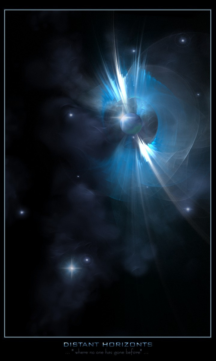
By far my largest psd with 294 mb. I didn't bother to count the layers (Wink)") My second piece that is based on a nebula and i think it worked out pretty good. Haven't got much more to say about it so i'll let you guys do the talking. Comments and favs appreciated as always.
My second piece that is based on a nebula and i think it worked out pretty good. Haven't got much more to say about it so i'll let you guys do the talking. Comments and favs appreciated as always.
Related content


Comments: 38


no matter what anyone says, that nebula is a piece of art in itself. whos to say something like that doesnt actually exist? not like they've seen it, the entire reason for you not making a standard nebula is what makes celestial art a limitless medium. awesome work
👍: 0 ⏩: 0

man this peice rocks...
i think it looks more like a massive planet explosion, rather than a nebula...
i mean with the great texture and detail, i t seriously looks like rocks flying out at high speed... like an exploding planet...
well i thing it is MAD...

👍: 0 ⏩: 0

those planets are really nice but the nebula itself is a bit too sharp for me
")
👍: 0 ⏩: 0

very good work, I like this pieces. maybe a little too many colours for my taste, but still good. the planets are also well done and detailed.
all in all everything works fine here
memod *wave*

👍: 0 ⏩: 0

I love it!!! really good work...
how do you do this type of nebulas? Some type of star field conjugation?
👍: 0 ⏩: 0

I think I would make it a bit less grainy, even though that may be veery hard to do afterwards.
Apart from that, it's good. Maybe a bit dull compared to your other stuff, but not bad at all.
👍: 0 ⏩: 0

nice work dkf, i havent been on msn so couldnt offer pre-release suggestions however, this is a very nice peice as usual
personally i would say the green in the top/top left is bit tooo green, if you know what i mean  (Smile)")
however, thats my personal opinion
i love the middle the reds and blues and colors you somehow get multicolor to look extremely nice together
i like the way you sed smaller planets dotted around to give depth *cough* great way to add depth aint it
love the texture you always use, its like your trademark...and you use it very well
nice planets as always, however i think the planets lack the "wow" that you always used to have, nonetheless i love the planets and the planet placement
nice work as usual, keep it up
oh and abouthat green, its not that bright green isnt good, but mabey it doesnt suit this particular image
👍: 0 ⏩: 0

amazing lightshow in the skies tonight,
👍: 0 ⏩: 0

awesome piece, looks alot different from most nebulaes i see nowadays, very cool.
👍: 0 ⏩: 0

Great combinations of colours, light and main concept! Congratulations!
👍: 0 ⏩: 0

Very nice pic m8.. great planets.. and lovin thre colors.. keep it up
👍: 0 ⏩: 0


Interesting. I like it, makes me think of the Matrix for some reason--That's a good question. Does the matrix simulate space, too?
")
👍: 0 ⏩: 0

wow..thatz huge! very cool! amazing color...nicely done!
👍: 0 ⏩: 0

I don't particularly like the nebula. The rust/metal texture you used is too apparent, it makes it look more like an exploding rock.
Otherwise, it's great.
👍: 0 ⏩: 0


Thats Mint!! Love the rockyness look coming from the nebula blast thing, thats pro!
👍: 0 ⏩: 0

I think that the "explosion" is some sort of nabula. Don't know how but it does like that, al those different colours makes it really speciaal. Verry nice the only thing i that there is one big open piece of space which is a little weird though. You should had made a comment there.
Although this is worth a +fav
👍: 0 ⏩: 0

yeah thats cool...
good mix of colours there in the nebula
very nice job again.
👍: 0 ⏩: 0


wow, love the central blast/expansion thing. so... dark and sinister.
um... i know i say this a lot, but i think there are too many objects for the composition. maybe even moving them around would help the busyness. that satellite wedged between the two larger planets might look good in the top left or something.
👍: 0 ⏩: 0

looks good , but idunno.. maybe too much colors.. good work tho
👍: 0 ⏩: 0

Awesome piece man, Im really feeling the depth in this one. The colors are outstanding as well.
👍: 0 ⏩: 0

That's beautiful, I like how there is so much colour in the center.
👍: 0 ⏩: 0

absolutly BEAUTIFUL. Once again mate you've pulled off an amazing piece. The nebular is gorgeous fantastic colour, great shape. And the bottom planet is awesome. Treuly amazing stuff
👍: 0 ⏩: 0

very nicely done indeed dude, the neb is looking better, and those planets (Especially the ringed and moon) add a great sense of 3d and depth
👍: 0 ⏩: 0

2 words: HOLY CRAP! That is a really well done picture, and I dont think I've seen too many people using green in their explosions, but I like it.
👍: 0 ⏩: 0


Thecolorsi n this piece play off really nicely, good work
👍: 0 ⏩: 0

Very generous use of color! It all blends very well, for such an amazing amount of contrast in one piece. The texture of the piece is also very nice.. Very nice work.
👍: 0 ⏩: 0

Hey man, i'm sorry i wasn't around when you sent me the picture, something came up. But what i was going to say was..
The lower half of the image is nice, but i really aint feeling the explosion/nebula/color thing at the top, its just.. Weird and doesn't look that good.
Sorry to say if it took you a long time. It just doesn't work.
👍: 0 ⏩: 1
I think the reason being is because it doesn't look like anything. But i'm sorry for saying this.
👍: 0 ⏩: 2

*long time looker now a poster*
hey, im not sure it looks like w/e it is either but then again it still looks damn fine.
I think i would really see that if i was under a night sky that beautiful and had a bit of LSD with me.
a fine peice of art it is though, even though i dont think it looks like much of anything up there it still looks cool and the colors are so vivid that it just makes it better
👍: 0 ⏩: 0

np, i appreciate your honesty altough i don't agree
👍: 0 ⏩: 0