HOME | DD
 DSil — Sentien Portrait 2

Published: 2006-11-18 06:35:29 +0000 UTC; Views: 1089; Favourites: 23; Downloads: 42
Redirect to original
Description
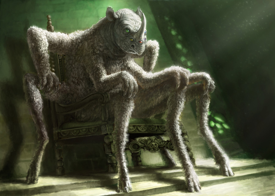
Same as "Sentien Portrait," only with increased contrast and some faint color. I'm not sure which version I like better, which is why I posted both.Related content


Comments: 35

no thank you, i feel i must go into your gallery and return the awesome favor you have bestowed upon me, thanx so much for all the comments and faves, i will return the act of kindness, it was much appreciated, no doubt you'll be added to my watch as well.
👍: 0 ⏩: 1

Gee, that's mighty nice! ")
👍: 0 ⏩: 0


Thanks very much! 
👍: 0 ⏩: 0

This one with color is definately the better of the two.
👍: 0 ⏩: 1
Word. That seems to be the verdict.
 (Wink)")
👍: 0 ⏩: 0

now this is awesome, i love the realistic look, the skin textures and tones are awesome to say the least. Very impressive work for sure
👍: 0 ⏩: 1
Thanks so much!  (Smile)")
👍: 0 ⏩: 1

The eyes are really neat. By the way, did you ever see Star Trek Voyager? There was a species kinda like this (but not really) and they were awesome. The sentien aren't really like them, but I get the same vibe from them. That wierd ancient otherworldliness.
Also, the coloring technique is really improved I'd say
👍: 0 ⏩: 1
Thanks very much! Glad ya like it. I've never seen voyager, but I'll check it out.
👍: 0 ⏩: 0

good subtle use of color and the soft tones add a sense of atmosphere. on top of that, the creature appears very intellegent, as if it is in deep thought. fine work.
👍: 0 ⏩: 1
Thank you! I really appreciate the compliment of such an outstanding artist.
👍: 0 ⏩: 1


The little crest seems off. Like, in the other ones, it's directly on top of the spine, but in this, it's all, you know, wacked out. AND SHIT.
Otherwise a wicked drawing. Damn.
👍: 0 ⏩: 1
Since the other ones were profiles, they didn't show that there is actually a row of antennae thingies above each eye. You can kinda see the fuzzy hint of another row in the portrait. Thanks for the comment.
👍: 0 ⏩: 0

It's really nice, I like both versions about equally. The 'building up' method is a good one, and you've managed it perfectly here. This is professional grade concept work.
👍: 0 ⏩: 1
Thank you so much!
👍: 0 ⏩: 0

I think i prefer the slight color (#2) makes him come out from the background and seem a little more alive
👍: 0 ⏩: 1
Thanks! I'm glad I posted that one too.
👍: 0 ⏩: 0

ooohhh...I like the lurid eye colour...very creepy..


👍: 0 ⏩: 1
Thank you!
👍: 0 ⏩: 1


Thanks very much!
👍: 0 ⏩: 0

")