HOME | DD
 electricnet — Article Style CSS
by
electricnet — Article Style CSS
by

Published: 2008-07-26 11:09:20 +0000 UTC; Views: 7435; Favourites: 61; Downloads: 477
Redirect to original
Description
Okay, I know. This is the worst journal CSS name ever. But yeah, I couldn't think of anything better.
ANYWAY, this is my entry for the cool *eCSSited contest for journal CSS, and the rules were that no (large?) images were allowed to be used. I've used a single 6x6 overlay PNG image for the top right part, but other than that, this journal CSS has no images.
And I tried to turn no imagery into an advantage to create a more professional look, and one could call this Narro with a pro tint.
 (Cool)") It's based on Narro, so it has its similarities and has some of the flexibility inherited from it.
It's based on Narro, so it has its similarities and has some of the flexibility inherited from it.But, it isn't as simple to configure, unfortunately. Now that it has both sidebar and pre-header text, you need to change two CSS values when you submit a journal with it, to make sure it matches the length of the texts in the header box. Further details and more support can be found in the README file included within.
And that's it! Hope you liek-a.

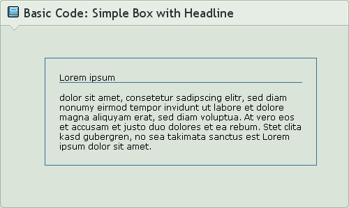
 The journal CSS IN ACTION!
Related content


Comments: 24

I love it! Adding it to my 
DAE

👍: 0 ⏩: 0


i LoVE this! i'm interesting in getting my hands on this css code.. *grabbing motion*
👍: 0 ⏩: 0


 (Smile)")


Wow, I really like the looks of this. Very nice and sleek.
👍: 0 ⏩: 0


Sexy and simple as i love it! I think i am gonna use it for my upcoming journals. So customizing is really ok?
👍: 0 ⏩: 1

Customizing is alllll okay. 

👍: 0 ⏩: 1
")

I love it!
Your CSS designs are always so clean-looking. And you make them so easy to use!
Great job on this one!

👍: 0 ⏩: 0

Nice one Andy. A really clean, simple and no messing about journal CSS. Easy colours to digest, but the fact that it's easily customizable is great and I'm sure people will love that.
Also, your presentation of it is rather nice as well! All in all, great work
👍: 0 ⏩: 0

I love it! Do you think you could make something similar for =DailyDeviants and include the featured deviants below the article. And add a blockquote with the authors id, sn, and link of there choice to the right or left, of the blockquote.
This would be great CSS for =DailyDeviants when we add writers to our daily news.
👍: 0 ⏩: 1
I'm glad you like it! I can surely help you guys, but I'm not quite sure what modifications would be needed, as you can already in the journal skin include featured thumbs, blockquotes and more.
The format for a blockquote is the same as in Narro, and is outlined in the FAQ for that: [link]
If you have more questions, please note me and we can talk.
👍: 0 ⏩: 0


Could call it maCSSense... or yeah... stupid Mac users and your snobbery. :\
👍: 0 ⏩: 2
Lmao, the journal skin has nothing to do with Mac at all. Excuse me for using a window as a means for a natural "boundary" between the journal CSS and the presentation of it.
👍: 0 ⏩: 1


Pfft - I am soooo much better than you
We don't possess snobbery, Jordan

👍: 0 ⏩: 1
Screw you for not being on MSN.
👍: 0 ⏩: 0

The simple ones are always the best - especially when you can customise certain aspects and it still looks stylish ;D
Nicely done, Andy! Looking forward to using this soon!
👍: 0 ⏩: 0

ohhhh that looks really awesome Andy!!!
I don't think it's worse at all, I think you're improving your CSS's along the way no matter how different they look
I like it! Good luck in the competition!
")

👍: 0 ⏩: 0