HOME | DD
 elusive — Journal - Elusive

Published: 2007-05-07 15:05:34 +0000 UTC; Views: 7102; Favourites: 58; Downloads: 0
Redirect to original
Description
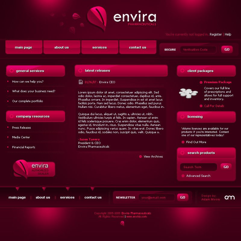
Pretty close to the final version I was hoping for. I don't think it's quite done yet though. Something is missing in my mind. Keep checking back for updates.*I'm trying to keep the whole 'Dark Fella' theme going, that's why it's so dark.
Related content


Comments: 193

much improved now man , really good work , i am inspired to change my own css now ,

👍: 0 ⏩: 1

You change it like once a week
 (Wink)")
👍: 0 ⏩: 1
lol i know , i like t experiment with new code etc
👍: 0 ⏩: 0

You're right it's missing something, don't know what....
But the result is pretty good!
👍: 0 ⏩: 1
We'll see if I can work out the problem
👍: 0 ⏩: 0

 (Smile)")


yaar how to add journal to ur proflie page.. plz tell me..
👍: 0 ⏩: 1
It's done in CSS, or to add it to your gallery just add to the jounal css section. To do the CSS, go into Update Journal, and at the bottom it says "CSS Beta". Enable it, and go at it! ")
👍: 0 ⏩: 1

This is just an awesome design. The way you have the mood box lined out horizontally. Very different from how you usually see it. I tried that in one of the layouts I'm working on but it's very buggy and wouldn't work in IE at all!
👍: 0 ⏩: 1
I'll figure out something ")
👍: 0 ⏩: 0


dat's really nice work.. Oh shit who can expect a bad work you have just on top of DA.
Love your art.

👍: 0 ⏩: 2


This looks great! Very simple and clean...nice work!
👍: 0 ⏩: 1
univrsltransl8r [2007-05-08 02:59:48 +0000 UTC]
Looks great, man! I would like to see some glowing under the buttons or something, but that's just my taste. I like things glowing.
👍: 0 ⏩: 1
univrsltransl8r In reply to elusive [2007-05-09 22:55:32 +0000 UTC]
OH!! And, bevel/emboss!!! LOL!
👍: 0 ⏩: 0

There, this version is MUCH BETTER. Exactly what I was talking about.
👍: 0 ⏩: 1

I'd make the your "Fello" look toward your journal. This way it directs the viewer toward the the journal instead of off and away from it. Or were you wanting it look toward your dA gallery?
And, I agree with Jaded-Mandarin about the logotype in the header appearing small. However, proportionally, I think it's the right size for that space. I think making "JOURNAL" a little smaller would make the logotype appear larger than it currently is without making the entire logotype too large for that space.
As for the "Not sure what to put here yet" area... Just leave it out, imo. You have links to everything you want people to visit. You also have three featured projects which is plenty. And to be (brutally) honest some of the friend avatars may distract from your overall clean and fluid design of the journal. Especially if they are animated or the colors contrast sharply with your design. But they are friends so that's a tough one :-/
👍: 0 ⏩: 2
Hey, thanks for the really detailed feedback. I really appreciate people who take the time to do these kind of things
I got a lot of work left on this, I have a feeling.
👍: 0 ⏩: 1
or actually... why not just place your "fella" on the right side of your logotype? This way it's looking toward your dA gallery as well as your journal. You would need to switch the shadowed "fella" (currently on the right) to the left, though, or possibly remove him completely.
👍: 0 ⏩: 1
Yeah I think the whole header is getting redone
👍: 0 ⏩: 0

i think it's looking beaut, only thinkg i'd change is the larger logo on the header, just doesn't flow with the rest, just me though.
👍: 0 ⏩: 1
yeah the whole header needs work I think.
👍: 0 ⏩: 0
Very nice Adam, I love the pattern in the header.
👍: 0 ⏩: 1

I love that you added that little hint of color! it adds to the entirety of the piece and it makes the black look even darker than before..real nice so far!
👍: 0 ⏩: 1


This is my favorite so far! Good job elusive!
- Adam
👍: 0 ⏩: 1


'store' isn't centered.
and for the bottom divide it into 3 sections with vertical bars 'inset' in that blue glow and put:
listening to (etc) | friends | stamps/clubs
👍: 0 ⏩: 1
| Next =>