HOME | DD

elusive โ€” Journal - Elusive

Published: 2007-05-07 15:05:34 +0000 UTC; Views: 7102; Favourites: 58; Downloads: 0
Redirect to original
Description 
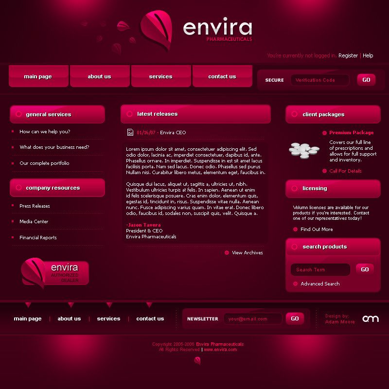
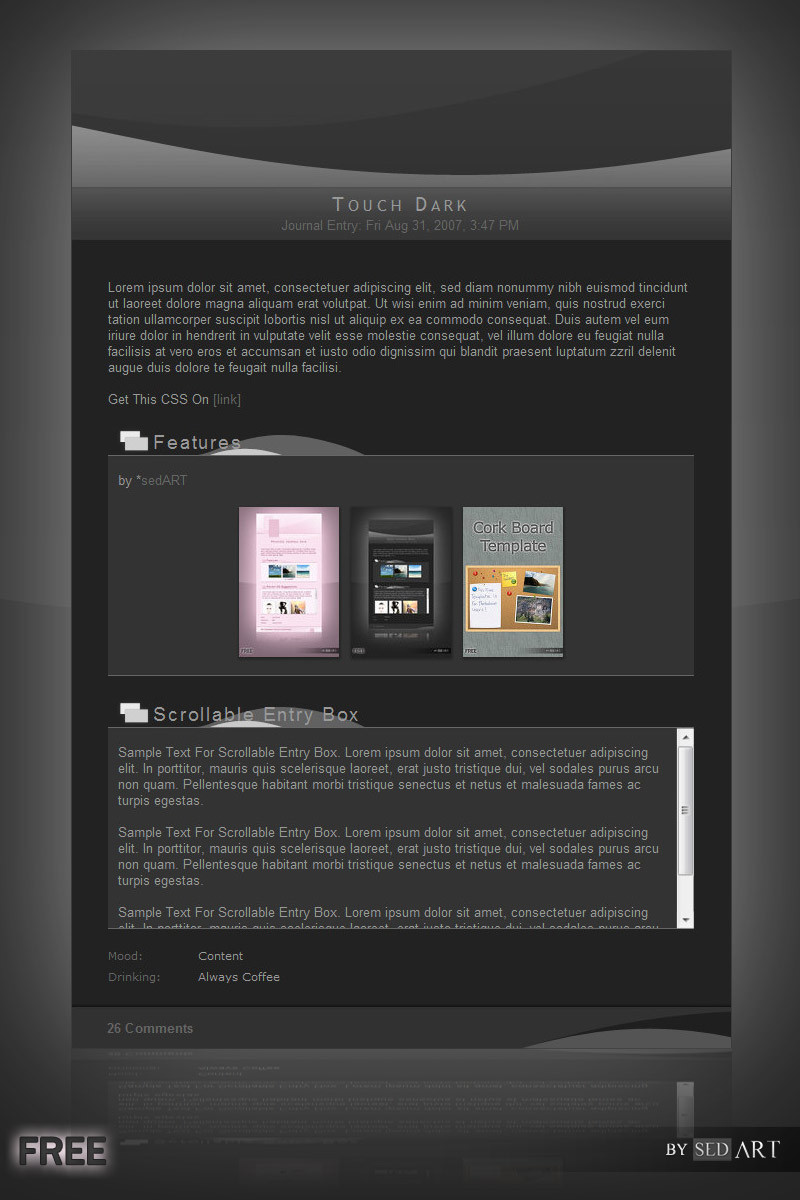
Pretty close to the final version I was hoping for. I don't think it's quite done yet though. Something is missing in my mind. Keep checking back for updates.

*I'm trying to keep the whole 'Dark Fella' theme going, that's why it's so dark.
Related content
Comments: 193

elusive In reply to ??? [2007-05-07 22:21:07 +0000 UTC]

The store thing doesn't matter -- it's just text, i'll fix it when the CSS is done.

hmm...that might be too much blue on the bottom - drawing attention from the top. How do you like it besides that stuff?

๐Ÿ‘: 0 โฉ: 1

f1lly In reply to elusive [2007-05-08 02:09:29 +0000 UTC]

its good. simple and to the point.
wha-bout mine?

๐Ÿ‘: 0 โฉ: 1

elusive In reply to f1lly [2007-05-09 14:21:46 +0000 UTC]

Definitely to the point

๐Ÿ‘: 0 โฉ: 0

shokenshin [2007-05-07 22:07:16 +0000 UTC]

pretty slick man!

๐Ÿ‘: 0 โฉ: 1

elusive In reply to shokenshin [2007-05-09 14:21:26 +0000 UTC]

ty

๐Ÿ‘: 0 โฉ: 0

alias-unr [2007-05-07 21:18:50 +0000 UTC]

I think you need some nice glowy blue headers?

For like

each section of your journal?

I mean, my journal has several miniposts in it.

I think your should too?

๐Ÿ‘: 0 โฉ: 1

elusive In reply to alias-unr [2007-05-09 14:21:23 +0000 UTC]

Yeah I'll have to figure out something.

๐Ÿ‘: 0 โฉ: 0

rodrigofalco [2007-05-07 20:25:53 +0000 UTC]

how can you do that?!
I just have to fave ALL your designs.
They're so good
LOL

๐Ÿ‘: 0 โฉ: 1

elusive In reply to rodrigofalco [2007-05-09 14:21:09 +0000 UTC]

thanks. Practice

๐Ÿ‘: 0 โฉ: 0

EnzuDes1gn [2007-05-07 19:29:37 +0000 UTC]

nice work man , looks pretty good to me , plus should be real easy to code too , now go and finish making your darn portfolio site

๐Ÿ‘: 0 โฉ: 1

elusive In reply to EnzuDes1gn [2007-05-09 14:21:01 +0000 UTC]

Yeah someday I'll never use this journal either I don't think.

๐Ÿ‘: 0 โฉ: 1

EnzuDes1gn In reply to elusive [2007-05-09 14:22:34 +0000 UTC]

lol you suck

๐Ÿ‘: 0 โฉ: 0

krynnie In reply to ??? [2007-05-07 19:14:35 +0000 UTC]

damn that looks sexy!
did you use a gradient for the gloss on the buttons or is it just white?

๐Ÿ‘: 0 โฉ: 1

elusive In reply to krynnie [2007-05-09 14:20:51 +0000 UTC]

It's a gradient

๐Ÿ‘: 0 โฉ: 1

krynnie In reply to elusive [2007-05-15 14:31:21 +0000 UTC]

it's sometimes tricky to figure out.
thank you.
just a little critique:
i think the insets on the top souldn't cover the blue, but that's just my view.
great work.

๐Ÿ‘: 0 โฉ: 0

Limetastic In reply to ??? [2007-05-07 18:08:55 +0000 UTC]

It's nice. I rather fancy it.

๐Ÿ‘: 0 โฉ: 1

elusive In reply to Limetastic [2007-05-09 14:20:27 +0000 UTC]

It's never gonna get used

๐Ÿ‘: 0 โฉ: 1

Limetastic In reply to elusive [2007-05-09 16:40:36 +0000 UTC]

D:

๐Ÿ‘: 0 โฉ: 0

BloodGhost [2007-05-07 18:00:08 +0000 UTC]

pretty ballin' styll good work

๐Ÿ‘: 0 โฉ: 1

elusive In reply to BloodGhost [2007-05-09 14:20:22 +0000 UTC]

ty

๐Ÿ‘: 0 โฉ: 0

spit--fire [2007-05-07 17:32:22 +0000 UTC]

great! nice layout design

๐Ÿ‘: 0 โฉ: 1

elusive In reply to spit--fire [2007-05-09 14:20:11 +0000 UTC]

thanks man

๐Ÿ‘: 0 โฉ: 0

cyberchaos05 In reply to ??? [2007-05-07 17:00:40 +0000 UTC]

In my opinion, a few minor changes would make this a great journal skin, my suggestions are:

1. As synthes said make the navbar and footer glossy just like your carbon interface
2. Add some shading to the background
3. Lastly add glow effect to the bar underneath the navbar

Here's a quick example

Other than that it doesn't lack anything.

๐Ÿ‘: 0 โฉ: 1

elusive In reply to cyberchaos05 [2007-05-09 14:12:52 +0000 UTC]

I need to do a bunch to this. It makes me unhappy haha

๐Ÿ‘: 0 โฉ: 1

cyberchaos05 In reply to elusive [2007-05-09 19:00:14 +0000 UTC]

Why not make a new one? You're a talented designer and you can create much better journals than what could be seen in this piece!

For instance, by looking at your Atom it's very apparent that you are capable of producing top notch works and you just need to concentrate more and add more details to your works.

IMO in very certain cases when you work on something a lot you'll kind of get drained of ideas and you just need to start a new one rather than insisting on finishing what you've done so far.

I'll look forward to seeing your new journal alive!

๐Ÿ‘: 0 โฉ: 1

elusive In reply to cyberchaos05 [2007-05-09 19:03:09 +0000 UTC]

I will likely do a few more designs Thanks for the comments though, those were pretty true to what life is like haha. Thanks

๐Ÿ‘: 0 โฉ: 1

cyberchaos05 In reply to elusive [2007-05-09 19:16:52 +0000 UTC]

No worries man. I'll keep an eye out.

๐Ÿ‘: 0 โฉ: 0

zLk [2007-05-07 16:56:53 +0000 UTC]

nice i like that metal feeling in the background

๐Ÿ‘: 0 โฉ: 1

elusive In reply to zLk [2007-05-09 14:12:35 +0000 UTC]

Glad you like that effect

๐Ÿ‘: 0 โฉ: 0

amandhingra In reply to ??? [2007-05-07 16:49:28 +0000 UTC]

very fine..

๐Ÿ‘: 0 โฉ: 1

elusive In reply to amandhingra [2007-05-09 14:12:27 +0000 UTC]

ty

๐Ÿ‘: 0 โฉ: 0

o-pie In reply to ??? [2007-05-07 16:36:10 +0000 UTC]

pretty cool. i like it

๐Ÿ‘: 0 โฉ: 1

elusive In reply to o-pie [2007-05-09 14:12:25 +0000 UTC]

Glad you like it

๐Ÿ‘: 0 โฉ: 0

BartZt In reply to ??? [2007-05-07 16:32:51 +0000 UTC]

ยข ??? , nice dark style

๐Ÿ‘: 0 โฉ: 1

elusive In reply to BartZt [2007-05-09 14:12:16 +0000 UTC]

ty

๐Ÿ‘: 0 โฉ: 0

studioNioo In reply to ??? [2007-05-07 16:31:04 +0000 UTC]

heeeeee, nice work buddy
but one bad point imo, the submenu is too dark.
dno a bit more contrast could be better.

x

๐Ÿ‘: 0 โฉ: 1

elusive In reply to studioNioo [2007-05-09 14:12:13 +0000 UTC]

It's a work in progress; That's for sure. I will keep you posted

๐Ÿ‘: 0 โฉ: 0

Leichim [2007-05-07 16:29:07 +0000 UTC]

Nice, nice, nice, but the text under your navigation bar is so dark that is hardly readable (by purpose?).

๐Ÿ‘: 0 โฉ: 1

elusive In reply to Leichim [2007-05-09 14:12:01 +0000 UTC]

I'll fix that up some

๐Ÿ‘: 0 โฉ: 0

ipholio [2007-05-07 16:15:31 +0000 UTC]

Need a coder?

๐Ÿ‘: 0 โฉ: 2

elusive In reply to ipholio [2007-05-09 14:11:39 +0000 UTC]

What's wrong with myself?

๐Ÿ‘: 0 โฉ: 0

proj In reply to ipholio [2007-05-07 22:12:34 +0000 UTC]

I was just about to say, find a coder and you've got a nice slick journal.

๐Ÿ‘: 0 โฉ: 1

elusive In reply to proj [2007-05-09 14:11:46 +0000 UTC]

I am not incapable haha

๐Ÿ‘: 0 โฉ: 0

vincentvc In reply to ??? [2007-05-07 16:13:45 +0000 UTC]

Nice work, maybe make like a holy light on the bottom.
Now it looks all a bit to dark :-/

๐Ÿ‘: 0 โฉ: 1

elusive In reply to vincentvc [2007-05-09 14:11:28 +0000 UTC]

Yeah I don't think i'll even actually use this.

๐Ÿ‘: 0 โฉ: 0

pickupjojo In reply to ??? [2007-05-07 16:09:50 +0000 UTC]

Black is so beautiful!

๐Ÿ‘: 0 โฉ: 1

elusive In reply to pickupjojo [2007-05-09 14:11:15 +0000 UTC]

ty

๐Ÿ‘: 0 โฉ: 0

csjwcr In reply to ??? [2007-05-07 16:07:23 +0000 UTC]

sexy

๐Ÿ‘: 0 โฉ: 1

elusive In reply to csjwcr [2007-05-07 16:08:04 +0000 UTC]

Something is missing. I'll keep working on it

๐Ÿ‘: 0 โฉ: 0

Fel1x In reply to ??? [2007-05-07 16:03:41 +0000 UTC]

the lower part... would be great 2 find sum logos there!

๐Ÿ‘: 0 โฉ: 1


<= Prev | | Next =>