HOME | DD
 elusive —
Relic
elusive —
Relic

Published: 2008-08-13 16:09:45 +0000 UTC; Views: 59241; Favourites: 455; Downloads: 0
Redirect to original
Description
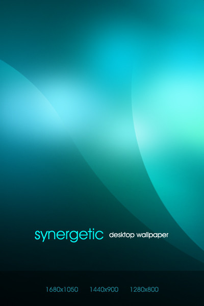
Just playing around; I figured I might as well do a design to go with the logo.Related content


Comments: 114


Hi There
I like your work. I need a web designer to design my new project. Could you please contact me at ankit@eyenus.com.au
Thanks
👍: 0 ⏩: 0


i like your works...i hope i make a design like yours...
 (Wink)")
👍: 0 ⏩: 0


OMG, I am so jealous that people can do this! Amazing work!
👍: 0 ⏩: 0


great work! did you also figured out how the menu with this over-glow effect work? ...i see some big problems if u have to code it...

👍: 0 ⏩: 0


A very neat design - great colors and overall style.

👍: 0 ⏩: 0


All good things come to those who play
I like this very much.

👍: 0 ⏩: 0


Great layout, easy to the eye!  (Smile)")
👍: 0 ⏩: 0


 (Cool)")


It's awesome, i love it!
Looks elegant and interactive, I don't know, it's lovely!
👍: 0 ⏩: 0


Never never never never never use all caps in lines of text! Even on the buttons it is hard to read.
You have to think to read all caps, while reading mixed or even all lowercase comes naturally. This is because we learn to read mixed and expect it, and don't recognize most words in all caps. We have to read out the letters and not just read the entire word as a word.
👍: 0 ⏩: 0


great design, but too many black "dark" colors.
👍: 0 ⏩: 0

Looks great. I keep looking at it and feel that there's something wrong with the flow of the black tones, and I think its the fact that the "Featured Release" background color is so different than the panel below it, even though they're together. It almost looks like "Featured Release" is for the red laptop, since the colors match more.
When I first looked at it, my eye had trouble figuring out what elements went together.
Just my observation, but I love it though. Nice work, very sleek looking!
👍: 0 ⏩: 0


Probably not immediately. But not impossible.
👍: 0 ⏩: 1

Nothings impossible, says always my coder friend ")
Anyways, not so impressive this time. You haven't tried your best mate! Keep up the good stuff
👍: 0 ⏩: 0


i love it man! i really want to know how you make all your images all glossy and shiz.
👍: 0 ⏩: 0

| Next =>