HOME | DD
 Emberblue — Easter WIP
Published: 2013-02-15 18:38:03 +0000 UTC; Views: 2595; Favourites: 115; Downloads: 0
Redirect to original
Description
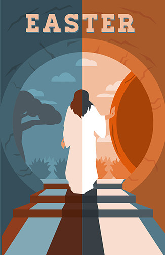
**Edit** The final version is here:This is a concept I am working on for some Easter Service promotions for one of my clients. I might do some custom lettering at the top, and try to find a creative way to put the service times and info at the bottom. I tried to include some symbolism of night/day, light/dark, life/death, etc.
Any ideas how I can improve this? What do you think?
This was inspired by this amazing drawing by I really liked the different perspective of Jesus coming out of the tomb. Usually people illustrate this scene from the outside of the tomb, not the inside. Her drawing is so simple, yet so expressive of light, life, joy and hope.
Jesus is alive, and He has the power to rescue us from the punishment of all the wrong things we have done.
"I am He who lives, and was dead, and behold, I am alive forevermore. Amen. And I have the keys of Hades and of Death."
Revelation 1:18
Related content


Comments: 29

Your image has been featured in #Holidays Easter Feature 2013 !
👍: 0 ⏩: 1

You are so sweet! Thanks! Hope you had a blessed Easter!

👍: 0 ⏩: 1

Hey, beautiful work! Can I use this on FB to make Easter wishes for my friends and family? Of course linking back here.
👍: 0 ⏩: 1
Sure, thanks for asking. But this one was a work in progress. The final one is here: [link]
A link would be appreciated. Thanks! 
👍: 0 ⏩: 1
You are so sweet! Thanks! ")
👍: 0 ⏩: 1

You're welcome and God bless.

👍: 0 ⏩: 0


You're welcome, and God bless!
👍: 0 ⏩: 0

shoulders seem really...boxy? the horizontal there where the hair and shoulders are seems a bit broad... I know part of that is the "robe" (don't know the terms of the clothing items, sorry..) maybe drawing the line where the sleeves are, the armpit area- up a bit higher would fix that too? just a couple of ideas.
👍: 0 ⏩: 1
Good point. The shoulders do look kinda weird, and I do want to change the shape of the hair. Adding some details to the robe is a good idea. I wanted to keep things simple...but the robe needs a few more simple details. Thanks so much for the feedback!
👍: 0 ⏩: 0

Amen! God is forevermore alive and He is righteous!!!!
👍: 0 ⏩: 1


it is a cool idea i like the overall. however.. just being completely honest from one artist to another, the fact that it is divided in the middle with dark and light or different colors including Jesus himself makes it seem like Jesus has contrast in himself you know what i mean? in Art concerning Christianity where everything can be taken symbolically, it kinda makes it seem kinda strange... I like the over all idea but that was something that came into my head that maybe should be addressed  (Smile)")
👍: 0 ⏩: 1
Good point. I really appreciate getting the feedback of how different people interpret my work. I think I will change the colors of His robe. People do read symbolism into things and I need to consider that. Thanks!
👍: 0 ⏩: 0

Wow you did a beautiful job, I'm so happy to have inspired you with my piece! Thank you for the nice things you wrote about it as well. You are very talented! God Bless
👍: 0 ⏩: 1
God uses you through your artwork. 
👍: 0 ⏩: 0

It looks great, and I love the color combination, but maybe you could change the orange a bit or make the blue darker? I'm saying this because at a first glance this reminded me of a computer game called Portal. So you know, unless the client asked specifically for the color scheme, maybe you could make some adjustments, so it doesn't distract from the message.
God bless! ^^
👍: 0 ⏩: 1
That is funny, lol! I never thought that it would remind someone of a computer game, haha! Thanks for the feedback. I'll try adjusting the colors a bit.
👍: 0 ⏩: 1

Good idea. Thanks for the feedback.
👍: 0 ⏩: 0

Very nicely done, I love the color choices and the shapes look simple yet elegent.
👍: 0 ⏩: 1

On the first look I thought it was the classic topic of choosing heaven or hell... so a little confusion from the thumbnail. Thinking about it more, I actually don't know why there is a theme of dark in this since it is a pure good and hopeful scene.
The drawing you refer to is really amazing and in my faves too.
👍: 0 ⏩: 1
Thanks for the feedback. Well, if people think of heaven and hell when they see this piece that really doesn't bother me. It's not the theme exactly, but if it gets them thinking that way I think that is a good thing.
The intention of the darkness was to represent the darkness that fell when Jesus died, the dispair that His followers felt because they didn't expect Him to die, the fact that it was later in the evening when Jesus was buried (I think).
Thanks again for the comment!
👍: 0 ⏩: 0