HOME | DD
 etc-etc-etc — Plz

Published: 2006-05-28 15:16:25 +0000 UTC; Views: 920; Favourites: 25; Downloads: 97
Redirect to original
Description
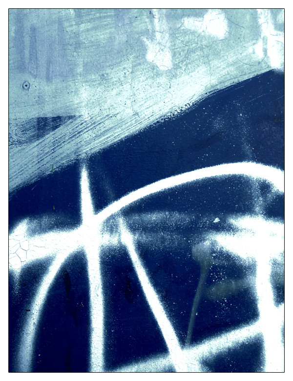
I'm not completely 100% happy with the composition here.... I think I left just a tad too much blank black space down the bottom. However, I do remember I did that for a reason when I was taking it.... I think there was something just above that peeling orange/brown bit that threw the balance off completely.... and so this was the best I could arrange it.Oh well, I think the elements within the photo make up for it. It was a fantastic wall.... a really nice black, with shiny silver and metalic powder blue tags all over it. And then there's all these fantastic intricate little lines and cracks all over it... it was almost like a map. And of course those big chunks of peeling paint, revealing the original bare orange bricks.
A lot of history here. And yet it still manages to look really fresh and cool... like it was meant to be that way.
Definately happy with this one (even if the composition isn't completely to my liking)
 (Wink)")
Enjoy!
Related content


Comments: 40


It feels like the wall itself is begging "please pelase" help me , because it's peeling away..
It's a sad wall
👍: 0 ⏩: 0

and people see that and think it needs a paint job. more work's been put into that than any paint job.
👍: 0 ⏩: 0


When I first saw this I thought that it was too dark and heavy looking but as I 've revisited it over the last few days I have come to appreciate the image more and more. The orange splash of colour is idealy balanced by the bluish/white PLZ at the bottom right and the texture provides a sort of unity and link between them. The increased darkness towards the bottom helps provide a solid base from which the other elements of the image rise and then become free from its restraint.
I really rather like this work, congratulations.
👍: 0 ⏩: 0

no, i like the black space in the bottom. i think otherwise it would be to busy.
this is just awesome ! i am loving this new stuff.
the cracking black paint is fantastic. . .and the faint circles 
👍: 0 ⏩: 0

I think the colors are very good, including the black. My only remark is that the image would win from straightening the lines, so they become exactly paralell to the edges. For the rest, very good piece.
👍: 0 ⏩: 0

yeah its great, the texture have some organic feeling to it. almost like a crocodile hide or something..
👍: 0 ⏩: 1

Thanks for the comment Martin
It does look quite organic.... ~babylon6 said it reminded him of black leather.... not quite crocodile hide.... but still skin off an animals back
")
👍: 0 ⏩: 0

omgz dats kewl. Seriously that is a cool photo. Reminds me of this fake leather couch my father had years ago in the early 90s when I was little and it was all cracked because the plastic was getting old and crappy.
👍: 0 ⏩: 1
Haha that's awesome Dominic ")
👍: 0 ⏩: 0

don't worry about the composition... its fine!!
i love this, its totally cool... would be awesome in a poster or something like that....
definite fav from me...
great work mate
👍: 0 ⏩: 1
Ooo yeah a nice big print would be nice 
Thanks for the comment
👍: 0 ⏩: 1
yeah i think thats a good idea... its just got the right balance of colour and texture to work as a really big poster i think...
👍: 0 ⏩: 0

I love the way you photograph graffiti, the orange against the black is wonderful, if there was slightly more it'd be even better, but you can only photograph what you have to work with, we can't have everything. It's so great that you're submitting more photographs nowadays, make sure you're not tiring yourself out, alright? ^^
👍: 0 ⏩: 1
Aww thanks for your concern Melanie. 
I'm really glad I've got stuff to put up to though - and I'm glad everyone seems to be enjoying it!
👍: 0 ⏩: 0

it actually looks pretty cool inverted. It's all white with bits of blue and with the black tag  (Cool)")
👍: 0 ⏩: 1
You needed me to point out it's potential to you
👍: 0 ⏩: 0


Thank you Jasmin
👍: 0 ⏩: 0

I think it's a great composition, but the bottom could probably do with a little less black...
Very good overall!
 (Smile)")
👍: 0 ⏩: 1

I don't think there's too much blank space. I think it works pretty well because of the texture of the wall; it's interesting! Perhaps if it was a smooth wall it wouldn't work as well, but it isn't, and it works bloody well, I'll have you know!
👍: 0 ⏩: 1


very crunchy, crinkly. i enjoy your fully engaged dialoguing very much as well
👍: 0 ⏩: 1
Thanks Adam - always appreciate your feedback !
👍: 0 ⏩: 0

it never ceases to amaze me how you can juggle objects (well, tags in this case) in your frame like elements in a painting!
i love it!
i love your photos.
very very very good.
👍: 0 ⏩: 1
Aww, thanks Holly!
Maybe it's because I painted long before I was into photography.... ? I do feel that I think much more like a painter than I do a photographer. It's all about arranging and balancing and bringing together.
Thanks again, for your comment. Means a lot!
👍: 0 ⏩: 0

This one is just astounding..your best ever in my opinion. What a wall.

👍: 0 ⏩: 1
Wow, best ever? Now that IS a call!
Thanks
👍: 0 ⏩: 0

At first I thought it's inverted...
Don't bother about the blank at the bottom, it's okay.
Some more sharpness would be great, though.

👍: 0 ⏩: 1
Yeah, it does look a little like it's been inverted, now that I think about it!
Thanks for the critique regarding the sharpness.... I've fixed it up now.
And I'm glad you think the blank at the bottom is okay.
Thanks again!
👍: 0 ⏩: 0
